
前言
本文先介绍uni-app的页面样式和布局,包括尺寸单位、样式导入、内联样式和选择器等;再介绍两个配置文件,即pages.json和manifest.json的配置项和基本使用;最后简要介绍了生命周期的基本使用。
一、页面样式与布局
1.尺寸单位
uni-app框架目前仅支持长度单位px和%。与传统web页面不同,px是相对于基准宽度(uni-app的基准宽度为750px)的单位,已经适配了移动端屏幕,其原理类似于rem,开发者不需要再针对不同屏幕大小的设备进行适配,只需按照设计稿确定框架样式中的px值即可。
设计稿1px与框架样式1px转换公式为设计稿 1px / 设计稿基准宽度 = 框架样式1px / 750px,换言之,页面元素宽度在uni-app中的宽度计算公式为750px * 元素在设计稿中的宽度 / 设计稿基准宽度。
举例如下:
若设计稿宽度为640px,元素A在设计稿上的宽度为100px,那么元素A在uni-app里面的宽度应该设为
750 * 100 / 640,即117px; 若设计稿宽度为375px,元素 B 在设计稿上的宽度为200px,那么元素B在uni-app里面的宽度应该设为750 * 200 / 375,即400px。
2.样式导入
使用@import语句导入外联样式表,@import后跟需要导入的外联样式表的相对路径,用;结束语句。
例如:
1<style>
2    @import "../../common/uni.css";
3    .uni-card {
4        box-shadow: none;
5    }
6</style>
3.内联样式
框架组件上支持使用style、class属性来控制组件的样式:
(1)class
用于指定样式规则,其属性值是样式规则中类选择器名(样式类名)的集合,样式类名不需要带上.,样式类名之间用空格分隔。
一般会将静态的样式统一写到class中。
例如:
1<view class="normal_view" />
之前的hello uniapp项目中,App.vue如下:
1<script>
2	export default {
3		onLaunch: function() {
4			console.log('App Launch')
5		},
6		onShow: function() {
7			console.log('App Show')
8		},
9		onHide: function() {
10			console.log('App Hide')
11		}
12	}
13</script>
14
15<style>
16	/*每个页面公共css */
17	.red{
18		color:#007AFF;
19	}
20</style>
21
pages/index/index.vue如下:
1<template>
2	<view class="content">
3		<image class="logo" src="/static/logo.png"></image>
4		<view class="text-area">
5			<text class="title">{{title}}</text>
6		</view>
7		<view class="red">
8			hello, corley
9		</view>
10	</view>
11</template>
12
13<script>
14	export default {
15		data() {
16			return {
17				title: 'Hello'
18			}
19		},
20		onLoad() {
21
22		},
23		methods: {
24
25		}
26	}
27</script>
28
29<style>
30	.content {
31		display: flex;
32		flex-direction: column;
33		align-items: center;
34		justify-content: center;
35	}
36
37	.logo {
38		height: 200rpx;
39		width: 200rpx;
40		margin-top: 200rpx;
41		margin-left: auto;
42		margin-right: auto;
43		margin-bottom: 50rpx;
44	}
45
46	.text-area {
47		display: flex;
48		justify-content: center;
49	}
50
51	.title {
52		font-size: 36rpx;
53		color: #8f8f94;
54	}
55</style>
56
修改后重新编译运行后,微信开发者工具模拟器的小程序页面如下:
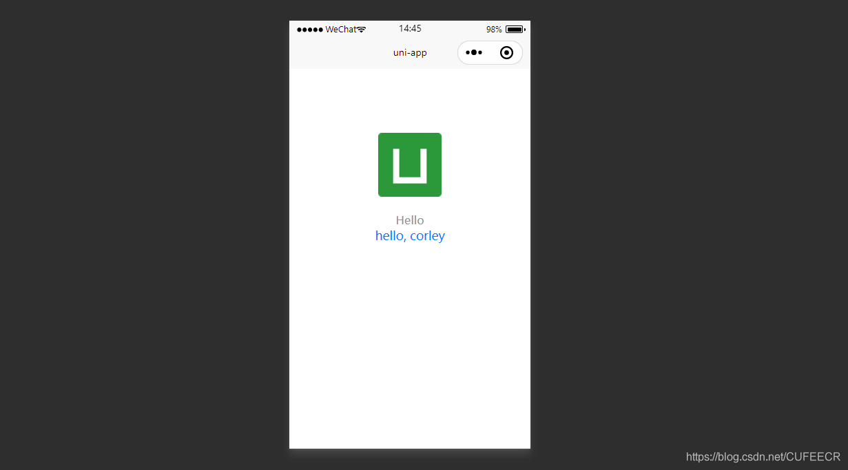
可以看到,App.vue中定义的样式对index页面产生了效果。
(2)style style接收动态的样式,在运行时会进行解析,应避免将静态的样式写进style中,以免影响渲染速度。 例如:
1<view style="color:{{color}};" />
4.选择器
目前支持的选择器有:
| 选择器 | 举例 | 意义 | 备注 |
|---|---|---|---|
| .class | .intro | 选择所有拥有 class="intro" 的组件 | 无 |
| #id | #firstname | 选择拥有 id="firstname" 的组件 | 无 |
| element | view | 选择所有 view 组件 | 无 |
| element, element | view, checkbox | 选择所有文档的 view 组件和所有的 checkbox 组件 | 无 |
| ::after | view::after | 在 view 组件后边插入内容 | 仅微信小程序和5+App生效 |
| ::before | view::before | 在 view 组件前边插入内容 | 仅微信小程序和5+App生效 |
5.全局样式与局部样式
定义在 App.vue 中的样式为全局样式,作用于每一个页面,如前面在App.vue中定义的全局样式对index页面也有效;
在 pages 目录下 的 vue 文件中定义的样式为局部样式,只作用在对应的页面,并会覆盖 App.vue 中相同的选择器,如在index页面中自定义的样式。
同时,App.vue中也可以通过@import语句导入外联样式,同样作用于每一个页面。
二、配置文件
uni-app中一般以json的形式定义配置文件,如pages.json、manifest.json等,其中pages.json更偏向小程序,manifest.json更偏向App。
1.页面配置pages.json
pages.json文件用来对uni-app进行全局配置,主要对接小程序,决定页面文件的路径、窗口表现、设置多标签等。
pages.json常见配置项列表如下:
| 属性 | 类型 | 必填与否 | 描述 |
|---|---|---|---|
| globalStyle | Object | 否 | 设置默认页面的窗口表现 |
| pages Object | Array | 是 | 设置页面路径及窗口表现 |
| tabBar | Object | 否 | 设置底部 tab 的表现 |
| condition | Object | 否 | 启动模式配置 |
一个包含了上述所有配置选项的pages.json示例如下:
1{
2  "pages": [{
3    "path": "pages/component/index",
4    "style": {
5      "navigationBarTitleText": "组件"
6    }
7  }, {
8    "path": "pages/API/index",
9    "style": {
10      "navigationBarTitleText": "接口"
11    }
12  }, {
13    "path": "pages/component/view/index",
14    "style": {
15      "navigationBarTitleText": "view"
16    }
17  }],
18  "globalStyle": {
19    "navigationBarTextStyle": "black",
20    "navigationBarTitleText": "演示",
21    "navigationBarBackgroundColor": "#F8F8F8",
22    "backgroundColor": "#F8F8F8"
23  },
24  "tabBar": {
25    "color": "#7A7E83",
26    "selectedColor": "#3cc51f",
27    "borderStyle": "black",
28    "backgroundColor": "#ffffff",
29    "list": [{
30      "pagePath": "pages/component/index",
31      "iconPath": "static/image/icon_component.png",
32      "selectedIconPath": "static/image/icon_component_HL.png",
33      "text": "组件"
34    }, {
35      "pagePath": "pages/API/index",
36      "iconPath": "static/image/icon_API.png",
37      "selectedIconPath": "static/image/icon_API_HL.png",
38      "text": "接口"
39    }]
40  },
41  "condition" : {
42		"current": 0,
43		"list": [
44			{
45				"name": "",
46				"path": "",
47				"query": ""
48			}
49		]
50	}
51}
下面进一步解释各配置项的含义。
globalStyle
用于设置应用的状态栏、导航条、标题、窗口背景色等,对所有页面生效。 具体参数和含义如下:
| 参数 | 类型 | 默认值 | 含义 |
|---|---|---|---|
| navigationBarBackgroundColor | HexColor | #000000 | 导航栏背景颜色 |
| navigationBarTextStyle | String | white | 导航栏标题颜色,仅支持 black/white |
| navigationBarTitleText | String | 无 | 导航栏标题文字内容 |
| navigationStyle | String | default | 导航栏样式,仅支持 default/custom |
| backgroundColor | HexColor | #ffffff | 窗口的背景色,对微信小程序有效 |
说明:
navigationStyle只在pages.json->globalStyle 中设置生效,并且,该参数设置为custom后,所有窗口均无导航栏。
pages.json修改如下:
1{
2	"pages": [ //pages数组中第一项表示应用启动页,参考:https://uniapp.dcloud.io/collocation/pages
3		{
4			"path": "pages/index/index",
5			"style": {
6				"navigationBarTitleText": "uni-app"
7			}
8		}
9	],
10	"globalStyle": {
11		"navigationBarTextStyle": "white",
12		"navigationBarTitleText": "hello uniapp",
13		"navigationBarBackgroundColor": "#ff557f",
14		"backgroundColor": "#fffae8"
15	},
16	"condition" : { //模式配置,仅开发期间生效
17		"current": 0, //当前激活的模式(list 的索引项)
18		"list": [
19			{
20				"name": "", //模式名称
21				"path": "", //启动页面,必选
22				"query": "" //启动参数,在页面的onLoad函数里面得到
23			}
24		]
25	}
26}
27
显示:
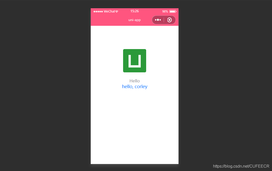
显然,导航栏的背景颜色已经生效。
pages
接收一个数组,来指定应用由哪些页面组成。每一项代表对应页面的信息,应用中新增、减少或修改页面,都需要对pages数组进行同步修改。
说明: 在指定路径时,文件名不需要写后缀,框架会自动寻找路径下的页面资源; pages节点的第一项为应用入口页(即首页),所以在开发多个页面时,可以把当前开发的页面放到第一项,便于在微信开发者工具中查看调试。
新建一个页面过程如下: 在pages目录下面新建about目录,下新建about.vue如下:
1<template>
2	<view class="content">
3		about...
4	</view>
5</template>
6
7<script>
8	export default {
9		data() {
10			return {
11				title: 'About'
12			}
13		},
14		onLoad() {
15
16		},
17		methods: {
18
19		}
20	}
21</script>
22
23<style>
24	.content {
25		display: flex;
26		flex-direction: column;
27		align-items: center;
28		justify-content: center;
29	}
30
31	.logo {
32		height: 200rpx;
33		width: 200rpx;
34		margin-top: 200rpx;
35		margin-left: auto;
36		margin-right: auto;
37		margin-bottom: 50rpx;
38	}
39
40	.text-area {
41		display: flex;
42		justify-content: center;
43	}
44
45	.title {
46		font-size: 36rpx;
47		color: #8f8f94;
48	}
49</style>
50
将其注册到pages.json如下:
1{
2	"pages": [ //pages数组中第一项表示应用启动页
3		{
4			"path": "pages/index/index",
5			"style": {
6				"navigationBarTitleText": "Uni Index"
7			}
8		},
9		{
10			"path": "pages/about/about",
11			"style": {
12				"navigationBarTitleText": "Uni About"
13			}
14		}
15	],
16	"globalStyle": {
17		"navigationBarTextStyle": "white",
18		"navigationBarTitleText": "hello uniapp",
19		"navigationBarBackgroundColor": "#ff557f",
20		"backgroundColor": "#fffae8"
21	},
22	"condition" : { //模式配置,仅开发期间生效
23		"current": 0, //当前激活的模式(list 的索引项)
24		"list": [
25			{
26				"name": "", //模式名称
27				"path": "", //启动页面,必选
28				"query": "" //启动参数,在页面的onLoad函数里面得到
29			}
30		]
31	}
32}
33
其中,pages数组中的每一个page还可以通过style参数定义当前页面的样式,来设置每个页面的状态栏、导航条、标题、窗口背景色等,具体参数如下:
| 参数 | 类型 | 默认值 | 含义 |
|---|---|---|---|
| navigationBarBackgroundColor | HexColor | #000000 | 导航栏背景颜色,如"#000000" |
| navigationBarTextStyle | String | white | 导航栏标题颜色,仅支持 black/white |
| navigationBarTitleText | String | 无 | 导航栏标题文字内容 |
| backgroundColor | HexColor | #ffffff | 窗口的背景色,对微信小程序、百度小程序、字节跳动小程序有效 |
| backgroundTextStyle | String | dark | 下拉 loading 的样式,仅支持 dark/light |
| enablePullDownRefresh | Boolean | false | 是否开启下拉刷新 |
| onReachBottomDistance | Number | 50 | 页面上拉触底事件触发时距页面底部距离,单位为px |
| navigationStyle | String | default | 导航栏样式,仅支持 default/custom,custom 模式可自定义导航栏,只保留右上角胶囊状的按钮,对微信小程序 7.0+、百度小程序、H5、App(2.0.3+)有效 |
| backgroundColorTop | String | #ffffff | 顶部窗口的背景色,仅iOS平台有效 |
| backgroundColorBottom | String | #ffffff | 底部窗口的背景色,仅iOS平台有效 |
pages.json中给page定义style如下:
1{
2	"pages": [ //pages数组中第一项表示应用启动页,参考:https://uniapp.dcloud.io/collocation/pages
3		{
4			"path": "pages/index/index",
5			"style": {
6				"navigationBarTitleText": "Uni Index",
7				"backgroundColor": "#F0AD4E",
8				"navigationBarTextStyle":"black"
9			}
10		},
11		{
12			"path": "pages/about/about",
13			"style": {
14				"navigationBarTitleText": "Uni About"
15			}
16		}
17	],
18	"globalStyle": {
19		"navigationBarTextStyle": "white",
20		"navigationBarTitleText": "hello uniapp",
21		"navigationBarBackgroundColor": "#ff557f",
22		"backgroundColor": "#fffae8"
23	},
24	"condition" : { //模式配置,仅开发期间生效
25		"current": 0, //当前激活的模式(list 的索引项)
26		"list": [
27			{
28				"name": "", //模式名称
29				"path": "", //启动页面,必选
30				"query": "" //启动参数,在页面的onLoad函数里面得到
31			}
32		]
33	}
34}
35
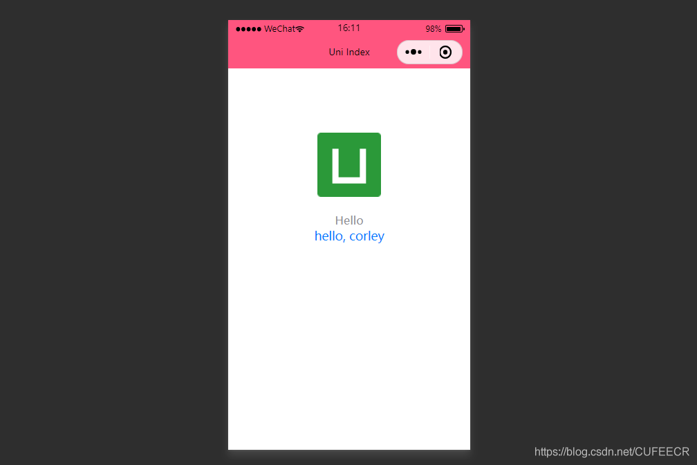
显示:
tabBar
如果应用是一个多 tab 应用,可以通过 tabBar 配置项指定 tab 栏的表现,以及 tab 切换时显示的对应页。
常见参数和含义如下:
| 属性 | 类型 | 必填与否 | 默认值 | 含义 |
|---|---|---|---|---|
| color | HexColor | 是 | 无 | tab上的文字默认颜色 |
| selectedColor | HexColor | 是 | 无 tab上的文字选中时的颜色 | |
| backgroundColor | HexColor | 是 | 无 | tab的背景色 |
| borderStyle | String | 否 | black | tabbar 上边框的颜色,仅支持 black/white |
| list | Array | 是 | 无 | tab 的列表,最少2个、最多5个 tab |
| position | String | 否 | bottom | 可选值 bottom、top |
说明: 当设置 position 为 top 时,将不会显示 icon; tabBar 中的 list 是一个数组,只能配置最少2个、最多5个 tab,tab 按数组的顺序排序,数组中的每个项都是一个对象,其属性值如下:
| 属性 | 类型 | 必填与否 | 说明 |
|---|---|---|---|
| pagePath | String | 是 | 页面路径,必须在 pages 中先定义 |
| text | String | 是 | tab |
| iconPath | String | 否 | 图片路径,icon 大小限制为40kb,建议尺寸为 81px * 81px,当 postion 为 top 时,此参数无效,不支持网络图片 |
| selectedIconPath | String | 否 | 选中时的图片路径,icon 大小限制为40kb,建议尺寸为 81px * 81px ,当 postion 为 top 时,此参数无效 |
在static目录下新建imgs目录专门用于保存图片资源,下面放4张图片,再在pages.json中定义tabBar如下:
1{
2	"pages": [ //pages数组中第一项表示应用启动页,参考:https://uniapp.dcloud.io/collocation/pages
3		{
4			"path": "pages/index/index",
5			"style": {
6				"navigationBarTitleText": "Uni Index",
7				"backgroundColor": "#F0AD4E",
8				"navigationBarTextStyle":"black"
9			}
10		},
11		{
12			"path": "pages/about/about",
13			"style": {
14				"navigationBarTitleText": "Uni About"
15			}
16		}
17	],
18	"globalStyle": {
19		"navigationBarTextStyle": "white",
20		"navigationBarTitleText": "hello uniapp",
21		"navigationBarBackgroundColor": "#ff557f",
22		"backgroundColor": "#fffae8"
23	},
24	"tabBar": {
25		"color":"#F0AD4E",
26		"selectedColor":"#007AFF",
27		"backgroundColor":"#FFFFFF",
28		"list": [
29			{
30				"pagePath":"pages/index/index",
31				"iconPath":"static/imgs/index_0.png",
32				"selectedIconPath":"static/imgs/index_1.png",
33				"text": "首页"
34			},
35			{
36				"pagePath":"pages/about/about",
37				"iconPath":"static/imgs/about_0.png",
38				"selectedIconPath":"static/imgs/about_1.png",
39				"text":"关于我们"
40			}
41		]
42	},
43	"condition" : { //模式配置,仅开发期间生效
44		"current": 0, //当前激活的模式(list 的索引项)
45		"list": [
46			{
47				"name": "", //模式名称
48				"path": "", //启动页面,必选
49				"query": "" //启动参数,在页面的onLoad函数里面得到
50			}
51		]
52	}
53}
54
此时显示:
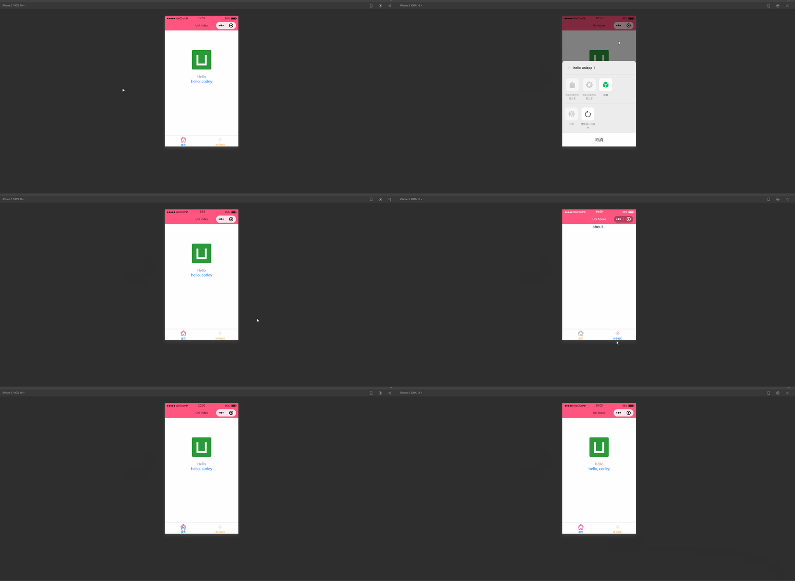
可以看到,此时已经可以显示不同的标签页,并且可以进行切换。
如需图标等静态资源,可以直接点击加QQ群 <a target="_blank" href="https://qm.qq.com/cgi-bin/qm/qr?k=rgE7cwG7OGHgfEucpRIQoSlYCTOEkmEr&jump_from=webapi"><img border="0" src="https://pub.idqqimg.com/wpa/images/group.png" alt="Python极客部落" title="Python极客部落">963624318</a> ,在群文件夹uni-app入门教程中下载即可。
condition
启动模式配置,仅开发期间生效,用于模拟直达页面的场景。 例如小程序转发后,用户点击所打开的页面。
属性和含义如下:
| 属性 | 类型 | 是否必填 | 描述 |
|---|---|---|---|
| current | Number | 是 | 当前激活的模式,list节点的索引值 |
| list | Array | 是 | 启动模式列表 |
其中,list属性如下:
| 属性 | 类型 | 是否必填 | 描述 |
|---|---|---|---|
| name | String | 是 | 启动模式名称 |
| path | String | 是 | 启动页面路径 |
| query | String | 否 | 启动参数,可在页面的 onLoad 函数里获得 |
说明: 在App里真机运行可直接打开配置的页面,微信开发者工具里需要手动改变编译模式。
例如,pages.json如下:
1{
2	"pages": [ //pages数组中第一项表示应用启动页
3		{
4			"path": "pages/index/index",
5			"style": {
6				"navigationBarTitleText": "Uni Index",
7				"backgroundColor": "#F0AD4E",
8				"navigationBarTextStyle":"black"
9			}
10		},
11		{
12			"path": "pages/about/about",
13			"style": {
14				"navigationBarTitleText": "Uni About"
15			}
16		}
17	],
18	"globalStyle": {
19		"navigationBarTextStyle": "white",
20		"navigationBarTitleText": "hello uniapp",
21		"navigationBarBackgroundColor": "#ff557f",
22		"backgroundColor": "#fffae8"
23	},
24	"tabBar": {
25		"color":"#F0AD4E",
26		"selectedColor":"#007AFF",
27		"backgroundColor":"#FFFFFF",
28		"list": [
29			{
30				"pagePath":"pages/index/index",
31				"iconPath":"static/imgs/index_0.png",
32				"selectedIconPath":"static/imgs/index_1.png",
33				"text": "首页"
34			},
35			{
36				"pagePath":"pages/about/about",
37				"iconPath":"static/imgs/about_0.png",
38				"selectedIconPath":"static/imgs/about_1.png",
39				"text":"关于我们"
40			}
41		]
42	},
43	"condition": { //模式配置,仅开发期间生效
44	    "current": 0, //当前激活的模式(list 的索引项)
45	    "list": [{
46	            "name": "index", //模式名称
47	            "path": "pages/index/index", //启动页面,必选
48	            "query": "interval=4000&autoplay=false" //启动参数,在页面的onLoad函数里面得到。
49	        },
50	        {
51	            "name": "about", //模式名称
52	            "path": "pages/about/about", //启动页面,必选
53	            "query": "interval=4000&autoplay=false" //启动参数,在页面的onLoad函数里面得到。
54	        }
55	    ]
56	}
57}
58
显示:
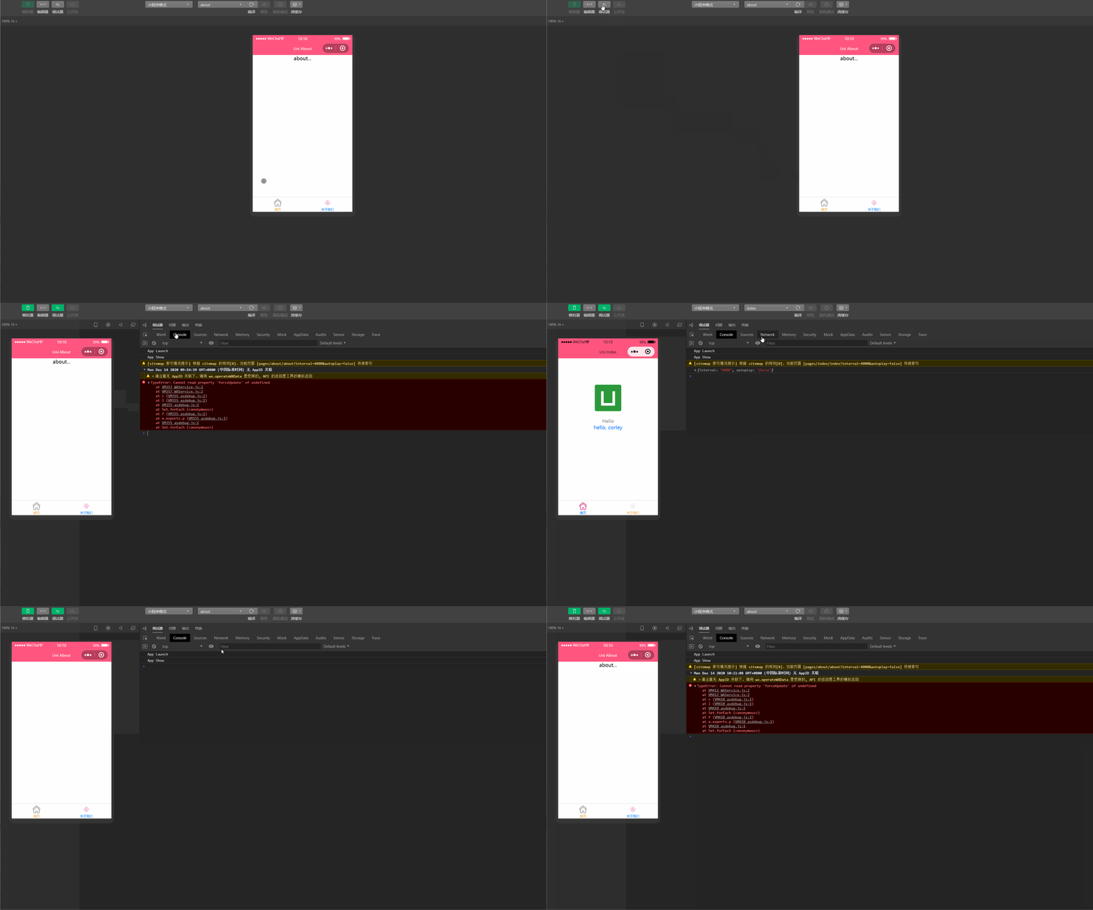
显然,此时可以在微信开发者工具根据定义的启动模式名称来选择页面,同时传递参数值。
2.显示配置manifest.json
manifest.json文件是应用的配置文件,用于指定应用的名称、图标、权限等,更偏向于Android、iOS等App配置。
常见配置项列表如下:
| 属性 | 类型 | 描述 |
|---|---|---|
| name | String | 应用名称 |
| appid | String | 应用标识,新建uni-app项目时DCloud云端分配 |
| description | String | 应用描述 |
| versionName | String | 版本名称,例如1.0.0 |
| versionCode | String | 版本号,例如36 |
| app-plus | Object | App特有配置 |
| quickapp | Object | 快应用特有配置,即将支持 |
| mp-weixin | Object | 微信小程序特有配置 |
| mp-baidu | Object | 百度小程序特有配置 |
| mp-alipay | Object | 支付宝小程序未提供可配置项 |
其中,app-plus常见属性和含义如下:
| 属性 | 类型 | 含义 |
|---|---|---|
| modules | Object | 权限模块 |
| distribute | Object | App发布信息 |
其中,modules属性常见的可配置的权限模块如下:
| 名称 | 描述 |
|---|---|
| Contacts | 系统通讯录 |
| Fingerprint | 指纹识别 |
| Maps | 地图 |
| Messaging | 短彩邮件消息 |
| OAuth | 登录授权 |
| Payment | 支付 |
| Push | 消息推送 |
| Share | 社交分享 |
| Speech | 语音识别 |
| Statistic | 统计 |
| VideoPlayer | 视频播放 |
| LivePusher | 直播推流 |
distribute属性常见的配置如下:
| 属性 | 类型 | 描述 |
|---|---|---|
| android | Object | Android应用配置 |
| ios | Object | iOS应用配置 |
| sdkConfigs | Object | SDK配置 |
说明: manifest.json文件的配置,推荐在 HBuilderX 提供的可视化操作界面完成; 部分配置在打包时的操作界面补全,例如证书等信息; Native.js权限部分会根据配置的模块权限,在打包后自动填充; 部分modules是默认的,不需要进行配置。
mp-weixin常见配置项和含义如下:
| 属性 | 类型 | 含义 |
|---|---|---|
| appid | String | 微信小程序的AppID,需要登录https://mp.weixin.qq.com/申请 |
| usingComponents | Boolean | 是否启用自定义组件模式,v1.8.0+,默认为false |
| setting | Object | 微信小程序项目设置 |
| functionalPages | Boolean | 微信小程序是否启用插件功能页,默认关闭 |
在BuilderX编辑器中查看manifest.json文件如下:
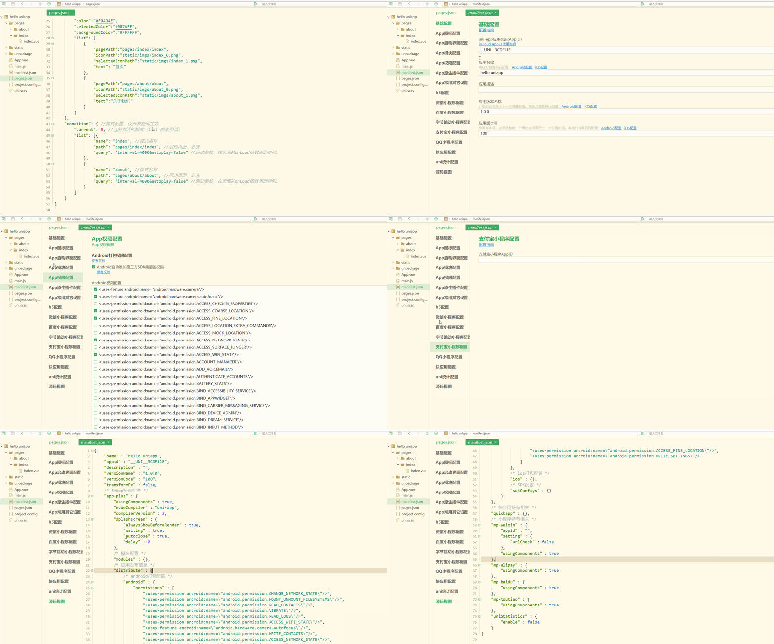
可以看到,除了通过源码视图定义manifest.json配置项,还可以使用可视化界面操作。
三、生命周期
不论是app还是小程序,生命周期是非常重要的特性,即对象从被创建到最后被销毁的整个过程。 uni-app支持如下页面生命周期函数:
| 函数 | 含义 |
|---|---|
| onLoad | 监听页面加载,其参数为上个页面传递的数据,参数类型为object(用于页面传参) |
| onShow | 监听页面显示 |
| onReady | 监听页面初次渲染完成 |
| onHide | 监听页面隐藏 |
| onUnload | 监听页面卸载 |
| onPullDownRefresh | 监听用户下拉动作 |
| onReachBottom | 页面上拉触底事件的处理函数 |
| onShareAppMessage | 用户点击右上角分享 微信小程序 |
| onPageScroll | 监听页面滚动 |
| onTabItemTap | 当前是 tab 页时,点击 tab 时触发 |
index.vue如下:
1<template>
2	<view class="content">
3		<image class="logo" src="/static/logo.png"></image>
4		<view class="text-area">
5			<text class="title">{{title}}</text>
6		</view>
7		<view class="red">
8			hello, corley
9		</view>
10	</view>
11</template>
12
13<script>
14	export default {
15		data() {
16			return {
17				title: 'Hello'
18			}
19		},
20		onLoad() {
21			console.log('index onload')
22		},
23		onShow() {
24			console.log('index onshow')
25		},
26		onHide() {
27			console.log('index onhide')
28		},
29		methods: {
30
31		}
32	}
33</script>
34
35<style>
36	.content {
37		display: flex;
38		flex-direction: column;
39		align-items: center;
40		justify-content: center;
41	}
42
43	.logo {
44		height: 200rpx;
45		width: 200rpx;
46		margin-top: 200rpx;
47		margin-left: auto;
48		margin-right: auto;
49		margin-bottom: 50rpx;
50	}
51
52	.text-area {
53		display: flex;
54		justify-content: center;
55	}
56
57	.title {
58		font-size: 36rpx;
59		color: #8f8f94;
60	}
61</style>
62
about.vue如下;
1<template>
2	<view class="content">
3		about...
4	</view>
5</template>
6
7<script>
8	export default {
9		data() {
10			return {
11				title: 'About'
12			}
13		},
14		onLoad() {
15			console.log('about onload')
16		},
17		onShow() {
18			console.log('about onshow')
19		},
20		methods: {
21
22		}
23	}
24</script>
25
26<style>
27	.content {
28		display: flex;
29		flex-direction: column;
30		align-items: center;
31		justify-content: center;
32	}
33
34	.logo {
35		height: 200rpx;
36		width: 200rpx;
37		margin-top: 200rpx;
38		margin-left: auto;
39		margin-right: auto;
40		margin-bottom: 50rpx;
41	}
42
43	.text-area {
44		display: flex;
45		justify-content: center;
46	}
47
48	.title {
49		font-size: 36rpx;
50		color: #8f8f94;
51	}
52</style>
53
运行测试如下:
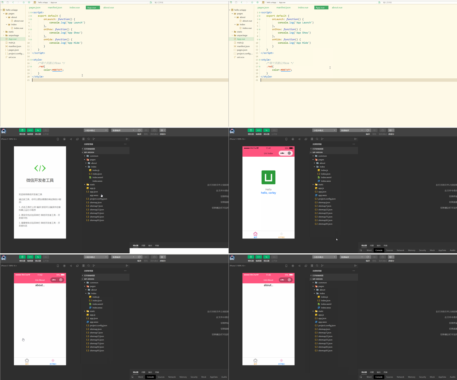 显然,在切换不同页面时,会调用相应的生命周期函数打印出不同的日志信息。
总结
uni-app对于样式有着自己的规定,比如尺寸单位,但是与HTML5也存在着很多共同点,体现在样式导入、选择器、全局样式与局部样式等方面。同时对于小程序和App有特定的配置文件进行配置。生命周期可用于定义页面在不同阶段、不同情境下的操作。
本文原文首发来自博客专栏移动应用开发,由本人转发至https://www.helloworld.net/p/z4kvtj0sG2hZz,其他平台均属侵权,可点击https://blog.csdn.net/CUFEECR/article/details/111240593查看原文,也可点击https://blog.csdn.net/CUFEECR浏览更多优质原创内容。