
代码地址如下:<br>http://www.demodashi.com/demo/12482.html
项目文件结构截图
只需要一个html文件既可:

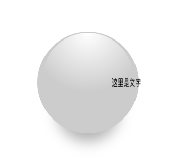
项目截图:
代码实现原理:
该示例的实现过程很简单,主要是使用了CSS3的透视、3D旋转、位移、渐变、阴影,可以说是一次比较全面的练习。
HTML部分:
1<div class="wrapper">
2    <div class="ball"></div>
3    <div class="stage">
4        <div class="text">
5            这里是文字
6        </div>
7    </div>
8</div>
CSS部分:
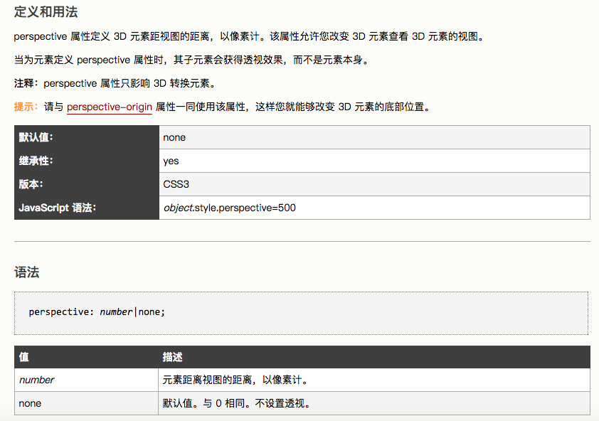
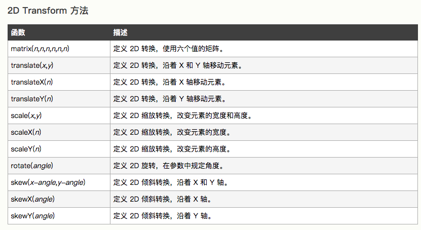
使用到的CSS属性用法:
舞台:
1* {
2    margin: 0;
3    padding: 0;
4}
5.wrapper {
6    width: 400px;
7    height: 400px;
8    margin: 200px;
9    perspective: 800px;
10    perspective-origin: 50% 50%;
11    position: relative;
12}
13.stage {
14    transform-style: preserve-3d;
15    position: absolute;
16    top: 50%;
17    left: 50%;
18    transform: translate3d(-50%, -50%, 0);
19}
球体:
1.ball {
2    width: 200px;
3    height: 200px;
4    border-radius: 50%;
5    background-color: #ccc;
6    position: absolute;
7    top: 50%;
8    left: 50%;
9    transform: translate3d(-50%, -50%, 0);
10    box-shadow: 0px 55px 45px -38px rgba(0, 0, 0, .3);
11}
12.ball::before {
13    content: "";
14    position: absolute;
15    top: 1%;
16    left: 5%;
17    width: 90%;
18    height: 90%;
19    border-radius: 50%;
20    background: -webkit-radial-gradient(50% 0px, circle, #ffffff, rgba(255, 255, 255, 0) 58%);
21    z-index: 2;
22}
文字:
1.text {
2    width: 100px;
3    height: 50px;
4    line-height: 50px;
5    text-align: center;
6    white-space: nowrap;
7    animation: rotate 5s linear infinite;
8    backface-visibility: hidden;
9}
文字动画:
1@keyframes rotate {
2    from {
3        transform: rotateY(0deg) translateZ(100px);
4    }
5    to {
6        transform: rotateY(360deg) translateZ(100px);
7    }
8}
效果预览
效果地址:rotate-text-around-the-ballCSS环绕球体的旋转文字-3D效果
代码地址如下:<br>http://www.demodashi.com/demo/12482.html
注:本文著作权归作者,由demo大师代发,拒绝转载,转载需要作者授权