

解密Flutter响应式布局
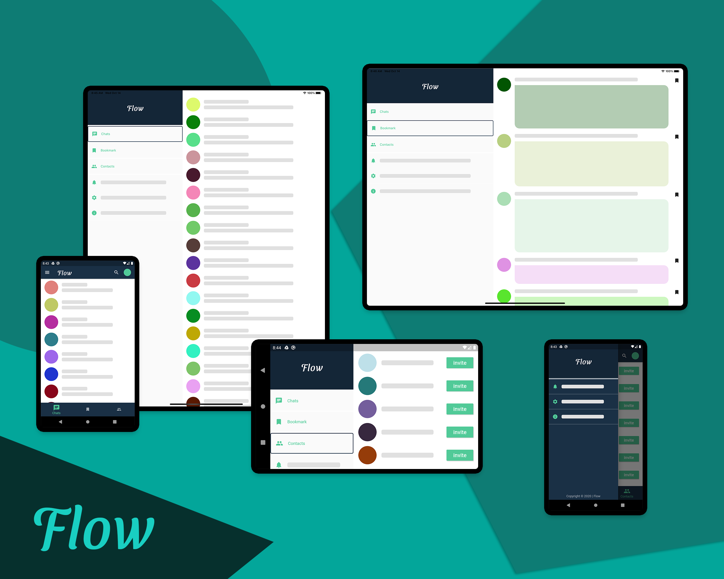
Flutter是一个跨平台的应用开发框架,支持各种屏幕大小的设备,它可以在智能手表这样的小设备上运行,也可以在电视这样的大设备上运行。使用相同的代码来适应不同的屏幕大小和像素密度是一个挑战。
Flutter响应式布局的设计没有硬性的规则。在本文中,我将向您展示在设计响应式布局时可以遵循的一些方法。
在使用Flutter构建响应式布局之前,我想说明一下Android和iOS是如何处理不同屏幕大小的布局的。
Android的方法
为了处理不同的屏幕尺寸和像素密度,在Android中使用了以下概念:
1. ConstraintLayout
Android UI设计中引入的一个革命性的东西是ConstraintLayout。它可以用于创建灵活的、响应性强的UI设计,以适应不同的屏幕大小和尺寸。它允许您根据与布局中其他视图的空间关系来指定每个视图的位置和大小。
但这并不能解决大型设备的问题,在大型设备中,拉伸或只是调整UI组件的大小并不是利用屏幕面积的最优雅的方式。在屏幕面积很小的智能手表,调整组件以适应屏幕大小可能会导致奇怪的UI。
2. Alternative layouts
要解决上述问题,您可以为不同大小的设备使用alternative layouts。例如,你可以在平板电脑等设备上使用分屏视图来提供良好的用户体验,并明智地使用大屏幕。
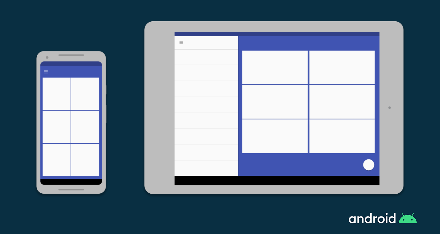
在Android中,你可以为不同的屏幕大小定义不同的布局文件,Android框架会根据设备的屏幕大小自动处理这些布局之间的切换。
3. Fragments
使用Fragment,你可以将你的UI逻辑提取到单独的组件中,这样当你为大屏幕尺寸设计多窗格布局时,你不必单独定义逻辑。您可以重用为每个片段定义的Fragment。
4. Vector graphics
Vector graphics使用XML创建图像来定义路径和颜色,而不是使用像素位图。它可以缩放到任何大小。在Android中,你可以使用VectorDrawable来绘制任何类型的插图,比如图标。
iOS的方法
iOS用于定义响应式布局的方式如下
1. Auto Layout
Auto Layout可用于构建自适应界面,您可以在其中定义用于控制应用程序内容的规则(称为约束)。 当检测到某些环境变化(称为特征)时,“Auto Layout”会根据指定的约束条件自动重新调整布局。
2. Size classes
Size类的特点是会根据其大小自动分配给内容区域。 iOS 会根据内容区域的Size类别动态地进行布局调整。在iPad上,size类也适用。
3. 一些UI 组件
还有一些其他的UI嘴贱你可以用来在iOS上构建响应式UI,像UIStackView, UIViewController,和UISplitViewController。
Flutter是如何自适应的
即使你不是Android或iOS的开发者,到目前为止,你应该已经了解了这些平台是如何处理响应式布局的。
在Android中,要在单个屏幕上显示多个UI视图,请使用Fragments,它们类似于可在应用程序的Activity中运行的可重用组件。
您可以在一个Activity中运行多个Fragment,但是不能在一个应用程序中同时运行多个Activity。
在iOS中,为了控制多个视图控制器,使用了UISplitViewController,它在分层界面中管理子视图控制器。
现在我们来到Flutter
Flutter引入了widget的概念。它们像积木一样拼凑在一起构建应用程序画面。
记住,在Flutter中,每个屏幕和整个应用程序也是一个widget!
widget本质上是可重用的,因此在Flutter中构建响应式布局时,您不需要学习任何其他概念。
Flutter的响应式概念
正如我前面所说的,我将讨论开发响应式布局所需的重要概念,然后你来选择使用什么样的方式在你的APP上实现响应式布局。
1. MediaQuery
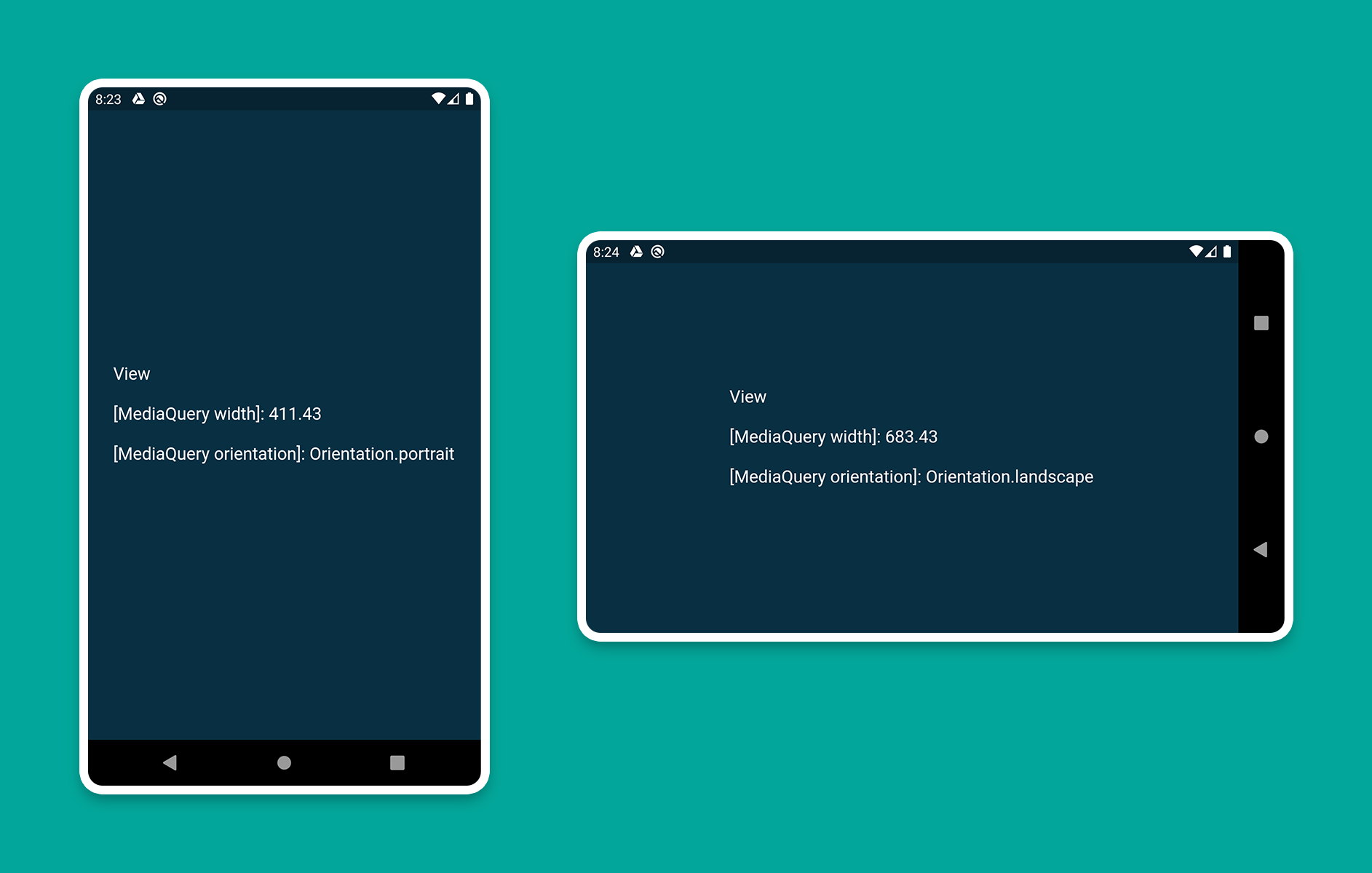
你可以使用MediaQuery来检索屏幕的大小(宽度/高度)和方向(纵向/横向)。
下面是例子
1class HomePage extends StatelessWidget {
2  @override
3  Widget build(BuildContext context) {
4    Size screenSize = MediaQuery.of(context).size;
5    Orientation orientation = MediaQuery.of(context).orientation;
6
7    return Scaffold(
8      body: Container(
9        color: CustomColors.android,
10        child: Center(
11          child: Text(
12            'View\n\n' +
13                '[MediaQuery width]: ${screenSize.width.toStringAsFixed(2)}\n\n' +
14                '[MediaQuery orientation]: $orientation',
15            style: TextStyle(color: Colors.white, fontSize: 18),
16          ),
17        ),
18      ),
19    );
20  }
21}
2. LayoutBuilder
使用LayoutBuilder类,您可以获得BoxConstraints对象,该对象可用于确定小部件的maxWidth和maxHeight。
请记住:MediaQuery和LayoutBuilder之间的主要区别在于,MediaQuery使用屏幕的完整上下文,而不仅仅是特定小部件的大小。而LayoutBuilder可以确定特定小部件的最大宽度和高度。
下面是例子
1class HomePage extends StatelessWidget {
2  @override
3  Widget build(BuildContext context) {
4    Size screenSize = MediaQuery.of(context).size;
5
6    return Scaffold(
7      body: Row(
8        children: [
9          Expanded(
10            flex: 2,
11            child: LayoutBuilder(
12              builder: (context, constraints) => Container(
13                color: CustomColors.android,
14                child: Center(
15                  child: Text(
16                    'View 1\n\n' +
17                        '[MediaQuery]:\n ${screenSize.width.toStringAsFixed(2)}\n\n' +
18                        '[LayoutBuilder]:\n${constraints.maxWidth.toStringAsFixed(2)}',
19                    style: TextStyle(color: Colors.white, fontSize: 18),
20                  ),
21                ),
22              ),
23            ),
24          ),
25          Expanded(
26            flex: 3,
27            child: LayoutBuilder(
28              builder: (context, constraints) => Container(
29                color: Colors.white,
30                child: Center(
31                  child: Text(
32                    'View 2\n\n' +
33                        '[MediaQuery]:\n ${screenSize.width.toStringAsFixed(2)}\n\n' +
34                        '[LayoutBuilder]:\n${constraints.maxWidth.toStringAsFixed(2)}',
35                    style: TextStyle(color: CustomColors.android, fontSize: 18),
36                  ),
37                ),
38              ),
39            ),
40          ),
41        ],
42      ),
43    );
44  }
45}
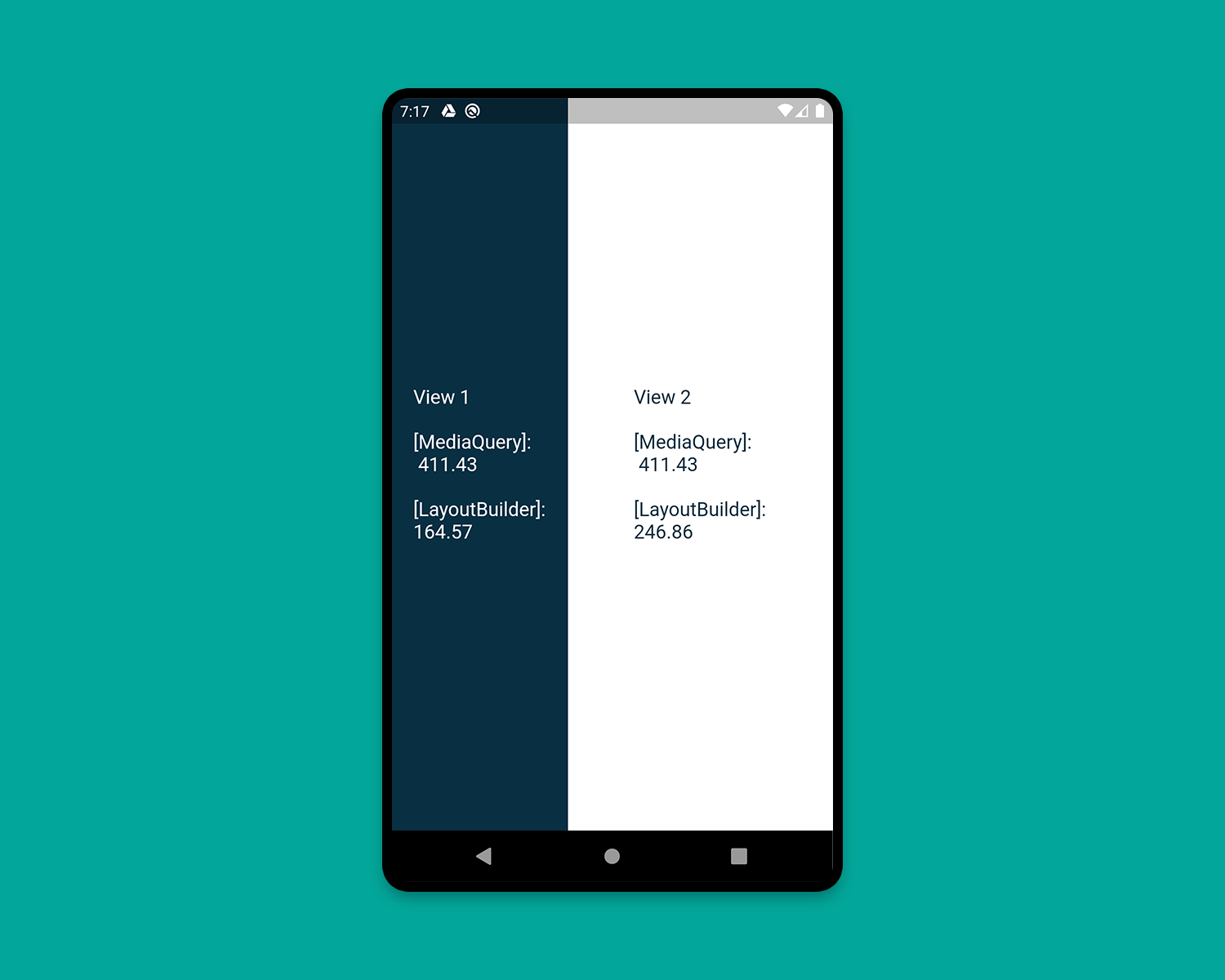 PS:当你在构建一个小部件,想知道他的宽度是多少时,使用这个组件,你可以根据子组件可用高/宽度来进行判断,构建不同的布局
3. OrientationBuilder
要确定widget的当前方向,可以使用OrientationBuilder类。
记住:这与你使用MediaQuery检索的设备方向不同。
下面是例子
1class HomePage extends StatelessWidget {
2  @override
3  Widget build(BuildContext context) {
4    Orientation deviceOrientation = MediaQuery.of(context).orientation;
5
6    return Scaffold(
7      body: Column(
8        children: [
9          Expanded(
10            flex: 2,
11            child: Container(
12              color: CustomColors.android,
13              child: OrientationBuilder(
14                builder: (context, orientation) => Center(
15                  child: Text(
16                    'View 1\n\n' +
17                        '[MediaQuery orientation]:\n$deviceOrientation\n\n' +
18                        '[OrientationBuilder]:\n$orientation',
19                    style: TextStyle(color: Colors.white, fontSize: 18),
20                  ),
21                ),
22              ),
23            ),
24          ),
25          Expanded(
26            flex: 3,
27            child: OrientationBuilder(
28              builder: (context, orientation) => Container(
29                color: Colors.white,
30                child: Center(
31                  child: Text(
32                    'View 2\n\n' +
33                        '[MediaQuery orientation]:\n$deviceOrientation\n\n' +
34                        '[OrientationBuilder]:\n$orientation',
35                    style: TextStyle(color: CustomColors.android, fontSize: 18),
36                  ),
37                ),
38              ),
39            ),
40          ),
41        ],
42      ),
43    );
44  }
45}
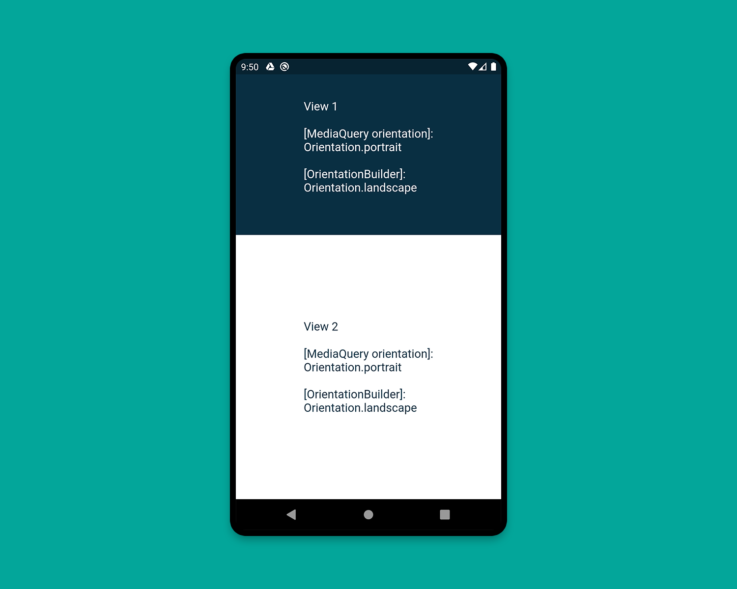
portrait (纵向) landscape(横向)
PS:看了下OrientationBuilder的源码注释
widget的方向仅仅是其宽度相对于高度的一个系数。如果一个[Column]部件的宽度超过了它的高度,它的方向是横向的,即使它以垂直的形式显示其子元素。
这是译者的代码
1import 'package:flutter/cupertino.dart';
2import 'package:flutter/material.dart';
3
4/// Copyright (C), 2020-2020, flutter_demo
5/// FileName: orientationBuilder_demo
6/// Author: Jack
7/// Date: 2020/12/6
8/// Description:
9
10class OrientationBuilderDemo extends StatelessWidget {
11  @override
12  Widget build(BuildContext context) {
13    Orientation deviceOrientation = MediaQuery.of(context).orientation;
14
15    return Scaffold(
16      body: Column(
17        children: [
18
19          Expanded(
20            flex: 1,
21            child: Container(
22              color: Colors.greenAccent,
23              child: OrientationBuilder(
24                builder: (context, orientation) => Center(
25                  child: Text(
26                    'View 1\n\n' +
27                        '[MediaQuery orientation]:\n$deviceOrientation\n\n' +
28                        '[OrientationBuilder]:\n$orientation',
29                    style: TextStyle(color: Colors.white, fontSize: 18),
30                  ),
31                ),
32              ),
33            ),
34          ),
35          Expanded(
36            flex: 2,
37            child: OrientationBuilder(
38              builder: (context, orientation) => Container(
39                color: Colors.white,
40                child: Center(
41                  child: Text(
42                    'View 2\n\n' +
43                        '[MediaQuery orientation]:\n$deviceOrientation\n\n' +
44                        '[OrientationBuilder]:\n$orientation',
45                    style: TextStyle(color: Colors.greenAccent, fontSize: 18),
46                  ),
47                ),
48              ),
49            ),
50          ),
51        ],
52      ),
53    );
54  }
55}
56
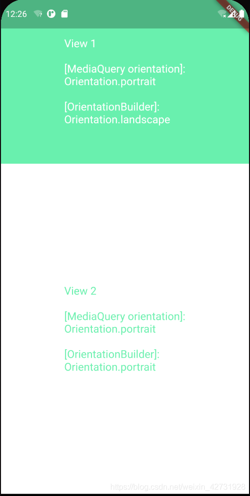
想必你已经理解了OrientationBuilder的方向定义,如果一个小部件的宽大于高,他就是横向的,如果高大于宽,他就是横向的,仅此而已。
4. Expanded and Flexible
在Row或Column中特别有用的小部件是 Expanded 和 Flexible。当Expanded 使用在一个Row、Column或Flex中,Expanded 可以使它的子Widget自动填充可用空间,与之相反,Flexible 的子widget不会填满整个可用空间。
例子如下。
1class HomePage extends StatelessWidget {
2  @override
3  Widget build(BuildContext context) {
4    return Scaffold(
5      backgroundColor: Colors.white,
6      body: SafeArea(
7        child: Column(
8          children: [
9            Row(
10              children: [
11                ExpandedWidget(),
12                FlexibleWidget(),
13              ],
14            ),
15            Row(
16              children: [
17                ExpandedWidget(),
18                ExpandedWidget(),
19              ],
20            ),
21            Row(
22              children: [
23                FlexibleWidget(),
24                FlexibleWidget(),
25              ],
26            ),
27            Row(
28              children: [
29                FlexibleWidget(),
30                ExpandedWidget(),
31              ],
32            ),
33          ],
34        ),
35      ),
36    );
37  }
38}
39
40class ExpandedWidget extends StatelessWidget {
41  @override
42  Widget build(BuildContext context) {
43    return Expanded(
44      child: Container(
45        decoration: BoxDecoration(
46          color: CustomColors.android,
47          border: Border.all(color: Colors.white),
48        ),
49        child: Padding(
50          padding: const EdgeInsets.all(16.0),
51          child: Text(
52            'Expanded',
53            style: TextStyle(color: Colors.white, fontSize: 24),
54          ),
55        ),
56      ),
57    );
58  }
59}
60
61class FlexibleWidget extends StatelessWidget {
62  @override
63  Widget build(BuildContext context) {
64    return Flexible(
65      child: Container(
66        decoration: BoxDecoration(
67          color: CustomColors.androidAccent,
68          border: Border.all(color: Colors.white),
69        ),
70        child: Padding(
71          padding: const EdgeInsets.all(16.0),
72          child: Text(
73            'Flexible',
74            style: TextStyle(color: CustomColors.android, fontSize: 24),
75          ),
76        ),
77      ),
78    );
79  }
80}
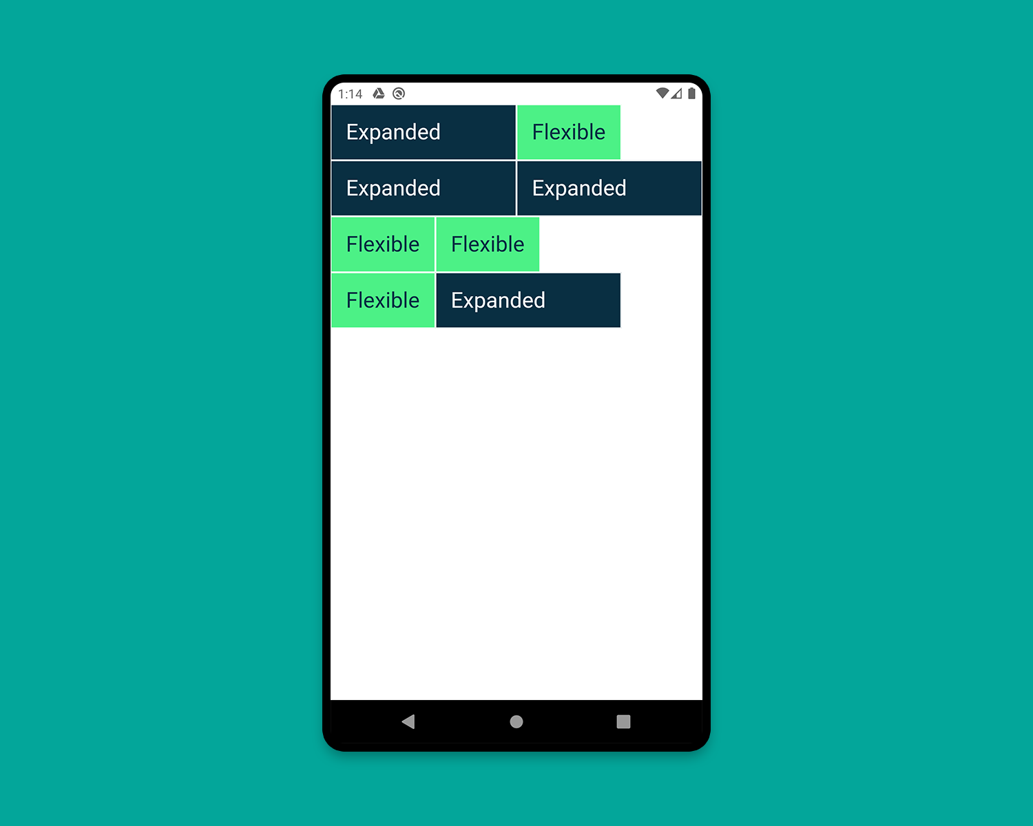
PS:与[expand]不同的是,[Flexible]不需要子widget填充剩余的空间,第一个例子,expanded虽然有填充空余空间的功能,不过expanded组件和flexible组件的flex都是1,相当于将纵轴分成两半,expanded所拥有的全部空间就是纵轴的一半,实际他已经填充了。
5. FractionallySizedBox
FractionallySizedBox widget将其子元素的大小调整为可用空间的一小部分。它在Expanded 或Flexible widget中特别有用。
1class HomePage extends StatelessWidget {
2  @override
3  Widget build(BuildContext context) {
4    return Scaffold(
5      backgroundColor: Colors.white,
6      body: SafeArea(
7        child: Column(
8          mainAxisAlignment: MainAxisAlignment.start,
9          children: [
10            Row(
11              crossAxisAlignment: CrossAxisAlignment.start,
12              children: [
13                FractionallySizedWidget(widthFactor: 0.4),
14              ],
15            ),
16            Row(
17              crossAxisAlignment: CrossAxisAlignment.start,
18              children: [
19                FractionallySizedWidget(widthFactor: 0.6),
20              ],
21            ),
22            Row(
23              crossAxisAlignment: CrossAxisAlignment.start,
24              children: [
25                FractionallySizedWidget(widthFactor: 0.8),
26              ],
27            ),
28            Row(
29              crossAxisAlignment: CrossAxisAlignment.start,
30              children: [
31                FractionallySizedWidget(widthFactor: 1.0),
32              ],
33            ),
34          ],
35        ),
36      ),
37    );
38  }
39}
40
41class FractionallySizedWidget extends StatelessWidget {
42  final double widthFactor;
43  FractionallySizedWidget({@required this.widthFactor});
44
45  @override
46  Widget build(BuildContext context) {
47    return Expanded(
48      child: FractionallySizedBox(
49        alignment: Alignment.centerLeft,
50        widthFactor: widthFactor,
51        child: Container(
52          decoration: BoxDecoration(
53            color: CustomColors.android,
54            border: Border.all(color: Colors.white),
55          ),
56          child: Padding(
57            padding: const EdgeInsets.all(16.0),
58            child: Text(
59              '${widthFactor * 100}%',
60              style: TextStyle(color: Colors.white, fontSize: 24),
61            ),
62          ),
63        ),
64      ),
65    );
66  }
67}
PS:当你想让你的widget,占据当前屏幕宽度和高度的百分之多少时,使用这个组件,想在Row和Column组件中使用百分比布局时,需要在FractionallySizedBox外包裹一个expanded或flexible
6. AspectRatio
可以使用AspectRatio小部件将子元素的大小调整为特定的长宽比。首先,它尝试布局约束允许的最大宽度,并通过将给定的高宽比应用于宽度来决定高度。
1class HomePage extends StatelessWidget {
2  @override
3  Widget build(BuildContext context) {
4    return Scaffold(
5      backgroundColor: Colors.white,
6      body: SafeArea(
7        child: Column(
8          children: [
9            AspectRatioWidget(ratio: '16 / 9'),
10            AspectRatioWidget(ratio: '3 / 2'),
11          ],
12        ),
13      ),
14    );
15  }
16}
17
18class AspectRatioWidget extends StatelessWidget {
19  final String ratio;
20
21  AspectRatioWidget({@required this.ratio});
22
23  @override
24  Widget build(BuildContext context) {
25    return AspectRatio(
26      aspectRatio: Fraction.fromString(ratio).toDouble(),
27      child: Container(
28        decoration: BoxDecoration(
29          color: CustomColors.android,
30          border: Border.all(color: Colors.white),
31        ),
32        child: Padding(
33          padding: const EdgeInsets.all(16.0),
34          child: Center(
35            child: Text(
36              'AspectRatio - $ratio',
37              style: TextStyle(color: Colors.white, fontSize: 24),
38            ),
39          ),
40        ),
41      ),
42    );
43  }
44}
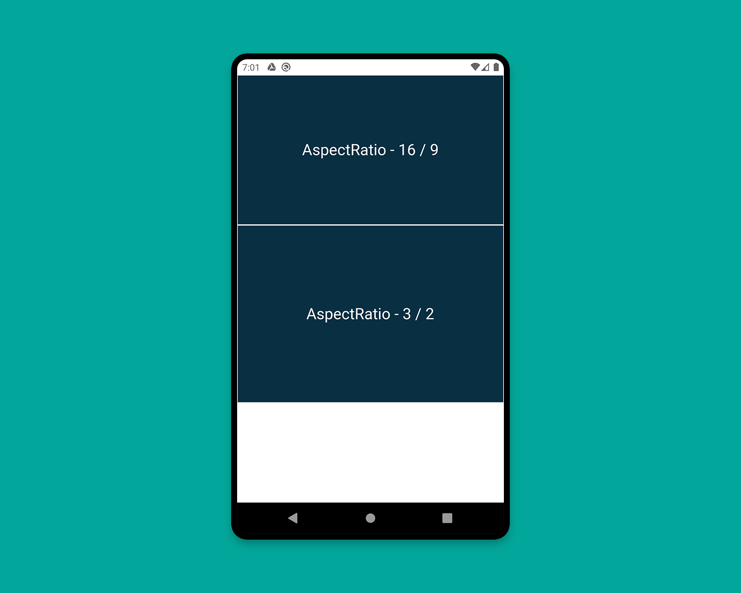
我们已经研究了大多数重要的概念,为建立一个响应式布局Flutter app,除了最后一个。
在构建一个示例响应式应用程序时,让我们学习最后一个概念。
创建一个响应式APP
现在,我们将应用上一节中描述的一些概念。与此同时,您还将学习为大屏幕构建布局的另一个重要概念,即分屏视图(一个屏幕上显示多个页面)。
响应式布局:在不同大小的屏幕上使用不同的布局。 我们将建立一个名叫Flow的聊天应用程序。
app主要由两个部分组成:
-
HomePage (
PeopleView,BookmarkView,ContactView) -
ChatPage (
PeopleView,ChatView)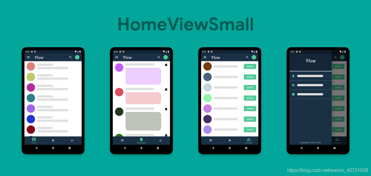
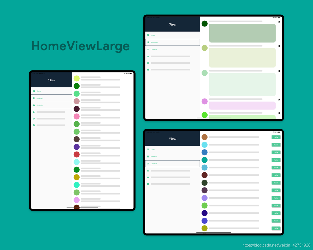
对于大屏幕,我们将显示包含MenuWidget和DestinationView的分屏视图。您可以看到,在Flutter中创建分屏视图是非常容易的,您只需使用一行将它们并排放置,然后为了填满整个空间,只需使用Expanded widget包装两个视图。您还可以定义扩展小部件的flex属性,这将允许您指定每个小部件应该覆盖屏幕的多少部分(默认flex设置为1)。
但是,如果您现在移动到一个特定的屏幕,然后在视图之间切换,那么您将丢失页面的上下文,也就是说您将始终返回到第一个页面,即“聊天”。为了解决这个问题,我使用了多个回调函数来返回所选页面到主页。实际上,您应该使用状态管理技术来处理此场景。由于本文的唯一目的是教您构建响应式布局,所以我不讨论任何状态管理的复杂性。
响应式APP Github地址感兴趣的小伙伴可以看一看
本文为medium翻译
原文地址
https://medium.com/flutter-community/demystifying-responsive-layout-in-flutter-f85d0014b94e
完整示例
上文所有的代码示例都在作者的GiuHub上,https://github.com/jack0-0wu/flutter_demo,里面还包含了一些常用flutter功能的展示。