
作者|Audhi Aprilliant 编译|VK 来源|Towards Datas Science

概述
对于这个项目,我们在2019年5月28-29日通过爬虫来使用Twitter的原始数据。此外,数据是CSV格式(逗号分隔),可以在这里下载。
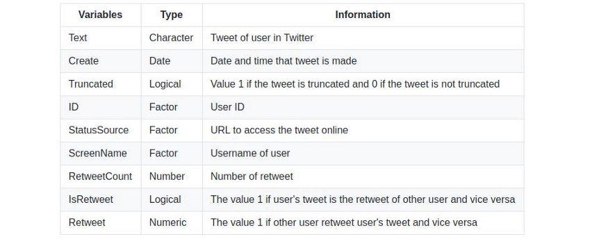
它涉及两个主题,一个是包含关键字“Joko Widodo”的Joko Widodo的数据,另一个是带有关键字“Prabowo Subianto”的Prabowo Subianto的数据。其中包括几个变量和信息,以确定用户情绪。实际上,数据有16个变量或属性和1000多个观察值。表1列出了一些变量。
1# 导入库
2library(ggplot2)
3library(lubridate)
4
5# 加载Joko Widodo的数据
6data.jokowi.df = read.csv(file = 'data-joko-widodo.csv',
7                          header = TRUE,
8                          sep = ',')
9senti.jokowi = read.csv(file = 'sentiment-joko-widodo.csv',
10                        header = TRUE,
11                        sep = ',')
12
13# 加载Prabowo Subianto的数据
14data.prabowo.df = read.csv(file = 'data-prabowo-subianto.csv',
15                           header = TRUE,
16                           sep = ',')
17senti.prabowo = read.csv(file = 'sentiment-prabowo-subianto.csv',
18                         header = TRUE,
19                         sep = ',')
数据可视化
数据探索旨在从Twitter数据中获取任何信息。应该指出的是,数据已经进行了文本预处理。我们对那些被认为是很有趣的变量进行探索。。
1# TWEETS的条形图-JOKO WIDODO
2data.jokowi.df$created = ymd_hms(data.jokowi.df$created,
3                                 tz = 'Asia/Jakarta')
4# 另一种制作“date”和“hour”变量的方法
5data.jokowi.df$date = date(data.jokowi.df$created)
6data.jokowi.df$hour = hour(data.jokowi.df$created)
7# 日期2019-05-29
8data.jokowi.date1 = subset(x = data.jokowi.df,
9                           date == '2019-05-29')
10data.hour.date1 = data.frame(table(data.jokowi.date1$hour))
11colnames(data.hour.date1) = c('Hour','Total.Tweets')
12# 创建数据可视化
13ggplot(data.hour.date1)+
14  geom_bar(aes(x = Hour,
15               y = Total.Tweets,
16               fill = I('blue')),
17           stat = 'identity',
18           alpha = 0.75,
19           show.legend = FALSE)+
20  geom_hline(yintercept = mean(data.hour.date1$Total.Tweets),
21             col = I('black'),
22             size = 1)+
23  geom_text(aes(fontface = 'italic',
24                label = paste('Average:',
25ceiling(mean(data.hour.date1$Total.Tweets)),
26                              'Tweets per hour'),
27                x = 8,
28                y = mean(data.hour.date1$Total.Tweets)+20),
29            hjust = 'left',
30            size = 4)+
31  labs(title = 'Total Tweets per Hours - Joko Widodo',
32       subtitle = '28 May 2019',
33       caption = 'Twitter Crawling 28 - 29 May 2019')+
34  xlab('Time of Day')+
35  ylab('Total Tweets')+
36  scale_fill_brewer(palette = 'Dark2')+
37  theme_bw()
38
39# TWEETS的条形图-PRABOWO SUBIANTO
40data.prabowo.df$created = ymd_hms(data.prabowo.df$created,
41                                  tz = 'Asia/Jakarta')
42
43# 另一种制作“date”和“hour”变量的方法
44data.prabowo.df$date = date(data.prabowo.df$created)
45data.prabowo.df$hour = hour(data.prabowo.df$created)
46
47# 日期2019-05-28
48data.prabowo.date1 = subset(x = data.prabowo.df,
49                            date == '2019-05-28')
50data.hour.date1 = data.frame(table(data.prabowo.date1$hour))
51colnames(data.hour.date1) = c('Hour','Total.Tweets')
52
53# 日期 2019-05-29
54data.prabowo.date2 = subset(x = data.prabowo.df,
55                            date == '2019-05-29')
56data.hour.date2 = data.frame(table(data.prabowo.date2$hour))
57colnames(data.hour.date2) = c('Hour','Total.Tweets')
58data.hour.date3 = rbind(data.hour.date1,data.hour.date2)
59data.hour.date3$Date = c(rep(x = '2019-05-28',
60                             len = nrow(data.hour.date1)),
61                         rep(x = '2019-05-29',
62                             len = nrow(data.hour.date2)))
63data.hour.date3$Labels = c(letters,'A','B')
64data.hour.date3$Hour = as.character(data.hour.date3$Hour)
65data.hour.date3$Hour = as.numeric(data.hour.date3$Hour)
66
67# 数据预处理
68for (i in 1:nrow(data.hour.date3)) {
69  if (i%%2 == 0) {
70    data.hour.date3[i,'Hour'] = ''
71  }
72  if (i%%2 == 1) {
73    data.hour.date3[i,'Hour'] = data.hour.date3[i,'Hour']
74  }
75}
76data.hour.date3$Hour = as.factor(data.hour.date3$Hour)
77
78# 数据可视化
79ggplot(data.hour.date3)+
80  geom_bar(aes(x = Labels,
81               y = Total.Tweets,
82               fill = Date),
83           stat = 'identity',
84           alpha = 0.75,
85           show.legend = TRUE)+
86  geom_hline(yintercept = mean(data.hour.date3$Total.Tweets),
87             col = I('black'),
88             size = 1)+
89  geom_text(aes(fontface = 'italic',
90                label = paste('Average:',
91ceiling(mean(data.hour.date3$Total.Tweets)),
92                              'Tweets per hour'),
93                x = 5,
94                y = mean(data.hour.date3$Total.Tweets)+6),
95            hjust = 'left',
96            size = 3.8)+
97  scale_x_discrete(limits = data.hour.date3$Labels,
98                   labels = data.hour.date3$Hour)+
99  labs(title = 'Total Tweets per Hours - Prabowo Subianto',
100       subtitle = '28 - 29 May 2019',
101       caption = 'Twitter Crawling 28 - 29 May 2019')+
102  xlab('Time of Day')+
103  ylab('Total Tweets')+
104  ylim(c(0,100))+
105  theme_bw()+
106  theme(legend.position = 'bottom',
107        legend.title = element_blank())+
108  scale_fill_brewer(palette = 'Dark2')
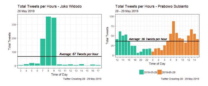
根据图1,我们可以得出结论,通过数据抓取(关键字“Jokow Widodo”和“Prabowo Subianto”)得到的tweet数量并不相似,即使在同一日期。
例如,在图1(左)中,从视觉上看,对于关键字为“Joko Widodo”的推文,仅在2019年5月28日03:00–17:00 WIB期间获得。而在图1(右图)中,我们得出的结论是,在2019年5月28日至29日12:00-23:59 WIB(2019年5月28日)和00:00-15:00 WIB(2019年5月29日)期间获得的关键词为“Prabowo Subianto”的推文。
1# 2019-05-28的推特
2ggplot(data.hour.date1)+
3  geom_bar(aes(x = Hour,
4               y = Total.Tweets,
5               fill = I('red')),
6           stat = 'identity',
7           alpha = 0.75,
8           show.legend = FALSE)+
9  geom_hline(yintercept = mean(data.hour.date1$Total.Tweets),
10             col = I('black'),
11             size = 1)+
12  geom_text(aes(fontface = 'italic',
13                label = paste('Average:',
14ceiling(mean(data.hour.date1$Total.Tweets)),
15                              'Tweets per hour'),
16                x = 6.5,
17                y = mean(data.hour.date1$Total.Tweets)+5),
18            hjust = 'left',
19            size = 4)+
20  labs(title = 'Total Tweets per Hours - Prabowo Subianto',
21       subtitle = '28 May 2019',
22       caption = 'Twitter Crawling 28 - 29 May 2019')+
23  xlab('Time of Day')+
24  ylab('Total Tweets')+
25  ylim(c(0,100))+
26  theme_bw()+
27  scale_fill_brewer(palette = 'Dark2')
28
29# 2019-05-29的推特
30ggplot(data.hour.date2)+
31  geom_bar(aes(x = Hour,
32               y = Total.Tweets,
33               fill = I('red')),
34           stat = 'identity',
35           alpha = 0.75,
36           show.legend = FALSE)+
37  geom_hline(yintercept = mean(data.hour.date2$Total.Tweets),
38             col = I('black'),
39             size = 1)+
40  geom_text(aes(fontface = 'italic',
41                label = paste('Average:',
42ceiling(mean(data.hour.date2$Total.Tweets)),
43                              'Tweets per hour'),
44                x = 1,
45                y = mean(data.hour.date2$Total.Tweets)+6),
46            hjust = 'left',
47            size = 4)+
48  labs(title = 'Total Tweets per Hours - Prabowo Subianto',
49       subtitle = '29 May 2019',
50       caption = 'Twitter Crawling 28 - 29 May 2019')+
51  xlab('Time of Day')+
52  ylab('Total Tweets')+
53  ylim(c(0,100))+
54  theme_bw()+
55  scale_fill_brewer(palette = 'Dark2')
根据图2,我们得到了使用关键字“Joko Widodo”和“Prabowo Subianto”的用户之间的显著差异。关键词为“Joko Widodo”的tweet在某个特定时间(07:00–09:00 WIB)谈论Joko Widodo往往非常激烈,08:00 WIB的tweet数量最多。它有348条推文。然而,在2019年5月28日至29日期间,关键词为“Prabowo Subianto”的推文往往会不断地谈论Prabowo Subianto。2019年5月28日至29日,每小时上传关键词为“Prabowo Subianto”的推文平均为36条。
1# JOKO WIDODO
2df.score.1 = subset(senti.jokowi,class == c('Negative','Positive'))
3colnames(df.score.1) = c('Score','Text','Sentiment')
4# Data viz
5ggplot(df.score.1)+
6  geom_density(aes(x = Score,
7                   fill = Sentiment),
8               alpha = 0.75)+
9  xlim(c(-11,11))+
10  labs(title = 'Density Plot of Sentiment Scores',
11       subtitle = 'Joko Widodo',
12       caption = 'Twitter Crawling 28 - 29 May 2019')+
13  xlab('Score')+
14  ylab('Density')+
15  theme_bw()+
16  scale_fill_brewer(palette = 'Dark2')+
17  theme(legend.position = 'bottom',
18        legend.title = element_blank())
19
20# PRABOWO SUBIANTO
21df.score.2 = subset(senti.prabowo,class == c('Negative','Positive'))
22colnames(df.score.2) = c('Score','Text','Sentiment')
23ggplot(df.score.2)+
24  geom_density(aes(x = Score,
25                   fill = Sentiment),
26               alpha = 0.75)+
27  xlim(c(-11,11))+
28  labs(title = 'Density Plot of Sentiment Scores',
29       subtitle = 'Prabowo Subianto',
30       caption = 'Twitter Crawling 28 - 29 May 2019')+
31  xlab('Density')+
32  ylab('Score')+
33  theme_bw()+
34  scale_fill_brewer(palette = 'Dark2')+
35  theme(legend.position = 'bottom',
36        legend.title = element_blank())

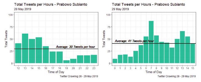
图3是2019年5月28日至29日以“Joko Widodo”和“Prabowo Subianto”为关键词的多条推文的条形图。由图3(左)可以得出,Twitter用户在19:00-23:59 WIB上谈论Prabowo Subianto的频率较低。这是由于印尼人的休息时间造成的。然而,这些带有主题的推文总是在午夜更新,因为有的用户居住在国外,有的用户仍然活跃。然后,用户在04:00 WIB开始活动,在07:00 WIB达到高峰,然后下降,直到12:00 WIB再次上升。
1# JOKO WIDODO
2df.senti.score.1 = data.frame(table(senti.jokowi$score))
3colnames(df.senti.score.1) = c('Score','Freq')
4# 数据预处理
5df.senti.score.1$Score = as.character(df.senti.score.1$Score)
6df.senti.score.1$Score = as.numeric(df.senti.score.1$Score)
7Score1 = df.senti.score.1$Score
8sign(df.senti.score.1[1,1])
9for (i in 1:nrow(df.senti.score.1)) {
10  sign.row = sign(df.senti.score.1[i,'Score'])
11  for (j in 1:ncol(df.senti.score.1)) {
12    df.senti.score.1[i,j] = df.senti.score.1[i,j] * sign.row
13  }
14}
15df.senti.score.1$Label = c(letters[1:nrow(df.senti.score.1)])
16df.senti.score.1$Sentiment = ifelse(df.senti.score.1$Freq < 0,
17                                    'Negative','Positive')
18df.senti.score.1$Score1 = Score1
19# 数据可视化
20ggplot(df.senti.score.1)+
21  geom_bar(aes(x = Label,
22               y = Freq,
23               fill = Sentiment),
24           stat = 'identity',
25           show.legend = FALSE)+
26  # 积极情感
27  geom_hline(yintercept = mean(abs(df.senti.score.1[which(df.senti.score.1$Sentiment == 'Positive'),'Freq'])),
28             col = I('black'),
29             size = 1)+
30  geom_text(aes(fontface = 'italic',
31                label = paste('Average Freq:',
32ceiling(mean(abs(df.senti.score.1[which(df.senti.score.1$Sentiment == 'Positive'),'Freq'])))),
33                x = 10,
34                y = mean(abs(df.senti.score.1[which(df.senti.score.1$Sentiment == 'Positive'),'Freq']))+30),
35            hjust = 'right',
36            size = 4)+
37  # 消极情感
38  geom_hline(yintercept = mean(df.senti.score.1[which(df.senti.score.1$Sentiment == 'Negative'),'Freq']),
39             col = I('black'),
40             size = 1)+
41  geom_text(aes(fontface = 'italic',
42                label = paste('Average Freq:',
43ceiling(mean(abs(df.senti.score.1[which(df.senti.score.1$Sentiment == 'Negative'),'Freq'])))),
44                x = 5,
45                y = mean(df.senti.score.1[which(df.senti.score.1$Sentiment == 'Negative'),'Freq'])-15),
46            hjust = 'left',
47            size = 4)+
48  labs(title = 'Barplot of Sentiments',
49       subtitle = 'Joko Widodo',
50       caption = 'Twitter Crawling 28 - 29 May 2019')+
51  xlab('Score')+
52  scale_x_discrete(limits = df.senti.score.1$Label,
53                   labels = df.senti.score.1$Score1)+
54  theme_bw()+
55  scale_fill_brewer(palette = 'Dark2')
56
57# PRABOWO SUBIANTO
58df.senti.score.2 = data.frame(table(senti.prabowo$score))
59colnames(df.senti.score.2) = c('Score','Freq')
60# 数据预处理
61df.senti.score.2$Score = as.character(df.senti.score.2$Score)
62df.senti.score.2$Score = as.numeric(df.senti.score.2$Score)
63Score2 = df.senti.score.2$Score
64sign(df.senti.score.2[1,1])
65for (i in 1:nrow(df.senti.score.2)) {
66  sign.row = sign(df.senti.score.2[i,'Score'])
67  for (j in 1:ncol(df.senti.score.2)) {
68    df.senti.score.2[i,j] = df.senti.score.2[i,j] * sign.row
69  }
70}
71df.senti.score.2$Label = c(letters[1:nrow(df.senti.score.2)])
72df.senti.score.2$Sentiment = ifelse(df.senti.score.2$Freq < 0,
73                                    'Negative','Positive')
74df.senti.score.2$Score1 = Score2
75# 数据可视化
76ggplot(df.senti.score.2)+
77  geom_bar(aes(x = Label,
78               y = Freq,
79               fill = Sentiment),
80           stat = 'identity',
81           show.legend = FALSE)+
82  # 积极情感
83  geom_hline(yintercept = mean(abs(df.senti.score.2[which(df.senti.score.2$Sentiment == 'Positive'),'Freq'])),
84             col = I('black'),
85             size = 1)+
86  geom_text(aes(fontface = 'italic',
87                label = paste('Average Freq:',
88ceiling(mean(abs(df.senti.score.2[which(df.senti.score.2$Sentiment == 'Positive'),'Freq'])))),
89                x = 11,
90                y = mean(abs(df.senti.score.2[which(df.senti.score.2$Sentiment == 'Positive'),'Freq']))+20),
91            hjust = 'right',
92            size = 4)+
93  # 消极情感
94  geom_hline(yintercept = mean(df.senti.score.2[which(df.senti.score.2$Sentiment == 'Negative'),'Freq']),
95             col = I('black'),
96             size = 1)+
97  geom_text(aes(fontface = 'italic',
98                label = paste('Average Freq:',
99ceiling(mean(abs(df.senti.score.2[which(df.senti.score.2$Sentiment == 'Negative'),'Freq'])))),
100                x = 9,
101                y = mean(df.senti.score.2[which(df.senti.score.2$Sentiment == 'Negative'),'Freq'])-10),
102            hjust = 'left',
103            size = 4)+
104  labs(title = 'Barplot of Sentiments',
105       subtitle = 'Prabowo Subianto',
106       caption = 'Twitter Crawling 28 - 29 May 2019')+
107  xlab('Score')+
108  scale_x_discrete(limits = df.senti.score.2$Label,
109                   labels = df.senti.score.2$Score1)+
110  theme_bw()+
111  scale_fill_brewer(palette = 'Dark2')
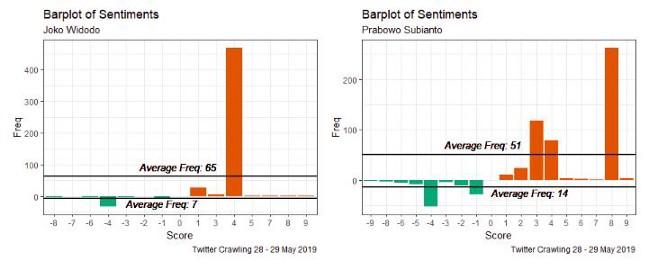
图4是包含关键字“Joko Widodo”和“Prabowo Subianto”的情感得分密度图。tweets的得分是由组成tweets的词根的平均得分得到的。因此,它的分数是针对每个词根给出的,其值介于-10到10之间。如果分数越小,那么微博中的负面情绪就越多,反之亦然。根据图4(左),可以得出结论,包含关键字“Joko Widodo”的推文的负面情绪在-10到-1之间,中间得分为-4。它也适用于积极的情绪(当然,有一个积极的分数)。根据图4(左)中的密度图,我们发现积极情绪的得分具有相当小的方差。因此,我们得出结论,对包含关键词“Joko Widodo”的微博的积极情绪并不是太多样化。
图4(右)显示了包含关键字“Prabowo Subianto”的情感得分密度图。它与图4(左)不同,因为图4(右)上的负面情绪在-8到-1之间。这意味着tweets没有太多负面情绪(tweets有负面情绪,但不够高)。此外,负面情绪得分的分布在4和1之间有两个峰值。然而,积极情绪从1到10不等。与图4(左)相比,图4(右)的积极情绪具有较高的方差,在3和10范围内有两个峰值。这表明,包含关键词“Prabowo Subianto”的微博具有很高的积极情绪。
1# JOKO WIDODO
2df.senti.3 = as.data.frame(table(senti.jokowi$class))
3colnames(df.senti.3) = c('Sentiment','Freq')
4# 数据预处理
5df.pie.1 = df.senti.3
6df.pie.1$Prop = df.pie.1$Freq/sum(df.pie.1$Freq)
7df.pie.1 = df.pie.1 %>%
8  arrange(desc(Sentiment)) %>%
9  mutate(lab.ypos = cumsum(Prop) - 0.5*Prop)
10# 数据可视化
11ggplot(df.pie.1,
12       aes(x = 2,
13           y = Prop,
14           fill = Sentiment))+
15  geom_bar(stat = 'identity',
16           col = 'white',
17           alpha = 0.75,
18           show.legend = TRUE)+
19  coord_polar(theta = 'y',
20              start = 0)+
21  geom_text(aes(y = lab.ypos,
22                label = Prop),
23            color = 'white',
24            fontface = 'italic',
25            size = 4)+
26  labs(title = 'Piechart of Sentiments',
27       subtitle = 'Joko Widodo',
28       caption = 'Twitter Crawling 28 - 29 May 2019')+
29  xlim(c(0.5,2.5))+
30  theme_void()+
31  scale_fill_brewer(palette = 'Dark2')+
32  theme(legend.title = element_blank(),
33        legend.position = 'right')
34
35# PRABOWO SUBIANTO
36df.senti.4 = as.data.frame(table(senti.prabowo$class))
37colnames(df.senti.4) = c('Sentiment','Freq')
38# 数据预处理
39df.pie.2 = df.senti.4
40df.pie.2$Prop = df.pie.2$Freq/sum(df.pie.2$Freq)
41df.pie.2 = df.pie.2 %>%
42  arrange(desc(Sentiment)) %>%
43  mutate(lab.ypos = cumsum(Prop) - 0.5*Prop)
44# 数据可视化
45ggplot(df.pie.2,
46       aes(x = 2,
47           y = Prop,
48           fill = Sentiment))+
49  geom_bar(stat = 'identity',
50           col = 'white',
51           alpha = 0.75,
52           show.legend = TRUE)+
53  coord_polar(theta = 'y',
54              start = 0)+
55  geom_text(aes(y = lab.ypos,
56                label = Prop),
57            color = 'white',
58            fontface = 'italic',
59            size = 4)+
60  labs(title = 'Piechart of Sentiments',
61       subtitle = 'Prabowo Subianto',
62       caption = 'Twitter Crawling 28 - 29 May 2019')+
63  xlim(c(0.5,2.5))+
64  theme_void()+
65  scale_fill_brewer(palette = 'Dark2')+
66  theme(legend.title = element_blank(),
67        legend.position = 'right')
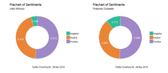
图5是推特的情绪得分汇总,这些微博被分为负面情绪、中性情绪和积极情绪。消极情绪是指得分低于零的情绪,中性是指分数等于零的情绪,积极情绪得分大于零。从图5可以看出,关键字为“Joko Widodo”的微博的负面情绪百分比低于关键字为“Prabowo Subianto”的tweet。有6.3%的差异。研究还发现,与关键词为Prabowo Subianto的微博相比,包含关键词“Joko Widodo”的微博具有更高的中性情绪和积极情绪。通过piechart的研究发现,与关键字为“Prabowo Subianto”的tweet相比,带有关键字“Joko Widodo”的tweet倾向于拥有更高比例的积极情绪。但是通过密度图发现,积极和消极情绪得分的分布表明,与“Joko Widodo”相比,包含关键字“Prabowo Subianto”的微博往往具有更高的情绪得分。它必须进行进一步的分析。

图6显示了用户在2019年5月28-29日经常上传的tweet(关键词“Joko Widodo”和“Prabowo Subianto”)中的术语或单词。通过这个WordCloud可视化,可以找到热门话题,这些话题都是针对关键词进行讨论的。对于包含关键词“Joko Widodo”的tweet,我们发现术语“tuang”、“petisi”、“negara”、“aman”和“nusantara”是前五名,每个tweet出现的次数最多。然而,包含关键词“Joko Widodo”的tweet发现,“Prabowo”、“Subianto”、“kriminalisasi”、“selamat”和“dubai”是每个tweet中出现次数最多的前五个词。这间接地显示了以关键字“Prabowo Subianto”上传的tweet的模式,即:几乎可以肯定的是,每个上传的tweet都直接包含“Prabowo Subianto”的名称,而不是通过提及(@)。这是因为,在文本预处理中,提到(@)已被删除。
可以前往我的GitHub repo查找代码:https://github.com/audhiaprilliant/Indonesia-Public-Election-Twitter-Sentiment-Analysis
参考引用
[1] K. Borau, C. Ullrich, J. Feng, R. Shen. Microblogging for Language Learning: Using Twitter to Train Communicative and Cultural Competence (2009), Advances in Web-Based Learning — ICWL 2009, 8th International Conference, Aachen, Germany, August 19–21, 2009.
原文链接:https://towardsdatascience.com/twitter-data-visualization-fb4f45b63728
欢迎关注磐创AI博客站: http://panchuang.net/
sklearn机器学习中文官方文档: http://sklearn123.com/
欢迎关注磐创博客资源汇总站: http://docs.panchuang.net/