
作为一个Web的前端攻城师,在制作页面效果时肯定有碰到下面这种现象:当一个HTML页面中含有较少的内容时,Web页面的“footer”部分随着飘上来,处在页面的半腰中间,给视觉效果带来极大的影响,让你的页面看上去很不好看,特别是现在宽屏越来越多,这种现象更是常见。那么如何将Web页面的“footer”部分永远固定在页面的底部呢?注意了这里所说的是页脚footer永远固定在页面的底部,而不是永远固定在显示器屏幕的底部,换句话说,就是当内容只有一点点时,Web页面显示在浏览器底部,当内容高度超过浏览器高度时,Web页面的footer部分在页面的底部,总而言之Web页面的footer部分永远在页面的底部,换句说,Footer部分永远沉底。如下图所示:
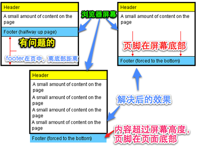

那么今天主要和大家一起学习如何将页脚固定在页面的底部?
方法一
首先我们来看第一种方法,这种方法是来自于Matthew James Taylor的《How to keep footers at the bottom of the page》。下面我们就一起来看看Matthew James Taylor介绍的方法。
HTML Markup
1<div id="container">
2<div id="header">Header Section</div>
3<div id="page" class="clearfix">
4页面容容部分
5</div>
6<div id="footer">Footer Section</div>
7</div>
其实我们可以在div#page增加所需的内容结构,如下所示:
1<div id="container">
2<div id="header">Header Section</div>
3<div id="page" class="clearfix">
4<div id="left">Left Sidebar</div>
5<div id="content">Main content</div>
6<div id="right">Right sidebar</div>
7</div>
8<div id="footer">Footer Section</div>
9</div>
真正来说,实现这页脚永远固定在页面的底部,我们只需要四个div,其中div#container是一个容器,在这个容器之中,我们包含了div#header(头部),div#page(页面主体部分,我们可以在这个div中增加更多的div结构,如上面的代码所示),div#footer(页脚部分)
CSS Code
1html,body {
2margin: 0;
3padding:0;
4height: 100%;
5}
6#container {
7min-height:100%;
8height: auto !important;
9height: 100%; /*IE6不识别min-height*/
10position: relative;
11}
12#header {
13background: #ff0;
14padding: 10px;
15}
16
17#page {
18width: 960px;
19margin: 0 auto;
20padding-bottom: 60px;/*等于footer的高度*/
21}
22
23#footer {
24position: absolute;
25bottom: 0;
26width: 100%;
27height: 60px;/*脚部的高度*/
28background: #6cf;
29clear:both;
30}
31/*=======主体内容部分=======*/
32#left {
33width: 220px;
34float: left;
35margin-right: 20px;
36background: lime;
37}
38
39#content {
40background: orange;
41float: left;
42width: 480px;
43margin-right: 20px;
44}
45
46#right{
47background: green;
48float: right;
49width: 220px;
50}
下面我们一起来看看这种方法的实现原理:
- **<html>和<body>标签:**html和body标签中必须将高度(height)设置为“100%”,这样我们就可以在容器上设置百分比高度,同时需要将html,body的margin和padding都移除,也就是html,body的margin和padding都为0;
- **div#container容器:**div#container容器必须设置一个最小高度(min-height)为100%;这主要使他在内容很少(或没有内容)情况下,能保持100%的高度,不过在IE6是不支持min-height的,所以为了兼容IE6,我们需要对min-height做一定的兼容处理,具体可以看前面的代码,或者阅读Min-Height Fast Hack了解如何解决min-height在Ie6下的bug问题。另外我们还需要在div#container容器中设置一个"position:relative"以便于里面的元素进行绝对定位后不会跑了div#container容器;
- div#page容器:div#page这个容器有一个很关键的设置,需要在这个容器上设置一个padding-bottom值,而且这个值要等于(或略大于)页脚div#footer的高度(height)值,当然你在div#page中可以使用border-bottom人水-width来替代padding-bottom,但有一点需要注意,此处你千万不能使用margin-bottom来代替padding-bottom,不然会无法实现效果;
- **div#footer容器:**div#footer容器必须设置一个固定高度,单位可以是px(或em)。div#footer还需要进行绝对定位,并且设置bottom:0;让div#footer固定在容器div#container的底部,这样就可以实现我们前面所说的效果,**当内容只有一点时,div#footer固定在屏幕的底部(因为div#container设置了一个min-height:100%),当内容高度超过屏幕的高度,div#footer也固定在div#container底部,也就是固定在页面的底部。**你也可以给div#footer加设一个"width:100%",让他在整个页面上得到延伸;
- **其他div:**至于其他容器可以根据自己需求进行设置,比如说前面的div#header,div#left,div#content,div#right等。
优点:
结构简单清晰,无需js和任何hack能实现各浏览器下的兼容,并且也适应iphone。
缺点:
不足之处就是需要给div#footer容器设置一个固定高度,这个高度可以根据你的需求进行设置,其单位可以是px也可以是em,而且还需要将div#page容器的padding-bottom(或border-bottom-width)设置大小等于(或略大于)div#footer的高度,才能正常运行。
上面就是Matthew James Taylor介绍的如何实现页脚永远固定在页面的底部,如果大家感兴趣可以阅读原文,也可以直接点击这里查看Demo。
方法二:
这种方法是利用footer的margin-top负值来实现footer永远固定在页面的底部效果,下面我们具体看是如何实现的。
HTML Markup
1<div id="container">
2<div id="page">Main Content</div>
3</div>
4<div id="footer">footer</div>
上面的代码是最基本的HTML Code,同时你也发现了div#footer和div#container是同辈关系,不像方法一,div#footer在div#container容器内部。当然你也可以根据你的需要把内容增加在div#container容器中,如:一个三列布局,而且还带有header部分,请看下面的代码:
1<div id="container">
2<div id="header">Header Section</div>
3<div id="page" class="clearfix">
4<div id="left">Left sidebar</div>
5<div id="content">Main content</div>
6<div id="right">Right sidebar</div>
7</div>
8</div>
9<div id="footer">Footer section</div>
CSS Code
1html,
2body {
3height: 100%;
4margin: 0;
5padding: 0;
6}
7
8#container {
9min-height: 100%;
10height: auto !important;
11height: 100%;
12}
13#page {
14padding-bottom: 60px;/*高度等于footer的高度*/
15}
16#footer {
17position: relative;
18margin-top: -60px;/*等于footer的高度*/
19height: 60px;
20clear:both;
21background: #c6f;
22}
23/*==========其他div==========*/
24#header {
25padding: 10px;
26background: lime;
27}
28#left {
29width: 18%;
30float: left;
31margin-right: 2%;
32background: orange;
33}
34#content{
35width: 60%;
36float: left;
37margin-right: 2%;
38background: green;
39}
40#right {
41width: 18%;
42float: left;
43background: yellow;
44}
方法一和方法二有几点是完全相同的,比如说方法一中的1-3三点,在方法二中都一样,换句话说,方法二中也需要把**html,body高度设置为100%,并重置margin,padding为0;其二div#container也需要设置min-height:100%,并处理好IE6下的min-height兼容问题;其三也需要在div#page容器上设置一个padding-bottom或border-bottom-width值等于div#footer高度值(或略大于)。**那么两种方法不同之处是:
- div#footer放在div#container容器外面,也就是说两者是同级关系,如果你有新元素需要放置在与div#container容器同级,那你需要将此元素进行绝对定位,不然将会破坏div#container容器的min-height值;
- div#footer进行margin-top的负值设置,并且此值等于div#footer的高度值,而且也要和div#page容器的padding-bottom(或border-bottom-width)值相等。
优点:
结构简单清晰,无需js和任何hack能实现各浏览器下的兼容。
缺点:
要给footer设置固定值,因此无法让footer部分自适应高度。
大家要是对这种方法感兴趣,你也可以浏览一下《CSS Sticky Footer》和《Pure Css Sticky Footer》,或者直接点击Demo查看其源代码。
方法三:
实现在页脚永远固定在页面底部的方法有很多,但是有很多方法是需要使用一些hack或借助javaScrip来实现,那么接下来要说的方法三,仅仅使用了15行的样式代码和一个简单明了的HTML结构实现了效果,并且兼容性强,别的不多说,先看代码。
HTML Code
1<div id="container">
2<div id="page">Your Website content here.</div>
3<div class="push"><!-- not have any content --></div>
4</div>
5<div id="footer">Footer Section</div>
上面是最基本的HTML Markup,当然你也可以加上新的内容,不过有一点需要注意如果你在div#container和div#footer容器外增加内容的话,新加进徕的元素需要进行绝对定位。如如说你可以在div#container容器中加上你页面所需的元素
HTML Code
1<div id="contaner">
2<div id="header">Header Section</div>
3<div id="page" class="clearfix">
4<div id="left">Left sidebar</div>
5<div id="content">Main Content</div>
6<div id="right">Right Content</div>
7</div>
8<div class="push"><!-- not put anything here --></div>
9</div>
10<div id="footer">Footer Section</div>
CSS Code
1html,
2body{
3height: 100%;
4margin:0;
5padding:0;
6}
7#container {
8min-height: 100%;
9height: auto !important;
10height: 100%;
11margin: 0 auto -60px;/*margin-bottom的负值等于footer高度*/
12}
13.push,
14#footer {
15height: 60px;
16clear:both;
17}
18/*==========其他div效果==========*/
19#header {
20padding: 10px;
21background: lime;
22}
23#left {
24width: 18%;
25float: left;
26margin-right: 2%;
27background: orange;
28}
29#content{
30width: 60%;
31float: left;
32margin-right: 2%;
33background: green;
34}
35#right {
36width: 18%;
37float: left;
38background: yellow;
39}
40#footer {
41background: #f6c;
42}
跟前面两种方法相比较,方法三更类似于方法二,他们都将div#footer放在div#container容器之外,而且这个方法在div#container容器中还增加了一个div.push用来把div#footer推下去,下面我们就一起看看这种方法是怎么实现页脚永远固定在页面底部的。
- **<html>和<body>标签:**html,body标签和前两种方法一样,需要设置“height:100%”并重置“margin”和“padding”为0;
- div#container:方法三关键部分就在于div#container的设置,首先需要设置其最小高度(min-height)为100%,为了能兼容好IE6,需要对min-height进行兼容处理(具体处理方法看前面或代码)另外这里还有一个关键点在div#container容器上需要设置一个margin-bottom,并且给其取负值,而且值的大小等于div#footer和div.push的高度,如果div#footer和div.push设置了padding和border值,那么div#container的margin-bottom负值需要加上div#footer和div.push的padding和border值。也就是说“div#container{margin-bottom:-[div#footer的height+padding+border]或者-[div.push的height+padding+border]}”。一句话来说:div#container的margin-bottom负值需要和div#footer以及div.push的高度一致(如果有padding或border时,高度值需要加上他们);
- **div.push:**在div.push中我们不应该放置任何内容,而且这个div必须放置在div#container容器中,而且是最底部,并且需要设置其高度值等于div#footer的值,最好加上clear:both来清除浮动。div.push容器在此处所起的作用就是将footer往下推。
- **div#footer容器:**div#footer容器和方法二一样,不能放到div#container内部,而和div#container容器同级,如果需要设置元素和footer之间的间距,最好使用padding来代替margin值。
优点:
简单明了,易于理解,兼容所有浏览器。
缺点:
较之前面的两种方法,多使用了一个div.push容器,同样此方法限制了footer部分高度,无法达到自适应高度效果。
如果大家对方法三想了解更多可以点击这里或者直接从DEMO中下载代码自己研究一下。
方法四:
前面三种方法我们都不需要任何javaScript或jQuery的帮助,让我们实现了页脚永远固定在页面底部的效果,前面三种方法虽然没有使用jQuery等帮助,但我们都额外增加了HTML标签来实现效果。如果你省略了这些HTML标签,再要实现效果就比较困难了,那么此时使用jQuery或javaScript方法来帮助实现是一种很好的办法,下面我们就一起来看第四种方法,通过jQuery来实现页脚永远固定在页面底部的效果。
HTML Markup
1<div id="header">Header Section</div>
2<div id="page" class="clearfix">
3<div id="left">Left sidebar</div>
4<div id="content">Main Content</div>
5<div id="right">Right Content</div>
6</div>
7<div id="footer">Footer Section</div>
这里我们没有增加没用的HTML标签,此时你也可以随时在body中增加内容,只要确保div#footer是在body最后面。
1.
2.
3.
4<div id="footer">Footer Section</div>
CSS Code
1*{margin: 0;padding:0;}
2.clearfix:before,
3.clearfix:after {
4content:"";
5display:table;
6}
7.clearfix:after {
8clear:both;
9}
10.clearfix {
11zoom:1; /* IE <8 */
12}
13
14#footer{
15height: 60px;
16background: #fc6;
17width: 100%;
18}
19/*==========其他div==========*/
20#header {
21padding: 10px;
22background: lime;
23}
24#left {
25width: 18%;
26float: left;
27margin-right: 2%;
28background: orange;
29}
30#content{
31width: 60%;
32float: left;
33margin-right: 2%;
34background: green;
35}
36#right {
37width: 18%;
38float: left;
39background: yellow;
40}
这个方法不像前面三种方法靠CSS来实现效果,这里只需要按正常的样式需求写样式,不过有一点需要特别注意在html,body中不可以设置高度height为100%,否则此方法无法正常运行,如果你在div#footer中设置了一个高度并把宽度设置为100%将更是万无一失了。
jQuery Code
1<script type="text/javascript">
2// Window load event used just in case window height is dependant upon images
3$(window).bind("load", function() {
4var footerHeight = 0,
5footerTop = 0,
6$footer = $("#footer");
7positionFooter();
8//定义positionFooter function
9function positionFooter() {
10//取到div#footer高度
11footerHeight = $footer.height();
12//div#footer离屏幕顶部的距离
13footerTop = ($(window).scrollTop()+$(window).height()-footerHeight)+"px";
14/* DEBUGGING STUFF
15console.log("Document height: ", $(document.body).height());
16console.log("Window height: ", $(window).height());
17console.log("Window scroll: ", $(window).scrollTop());
18console.log("Footer height: ", footerHeight);
19console.log("Footer top: ", footerTop);
20console.log("-----------")
21*/
22//如果页面内容高度小于屏幕高度,div#footer将绝对定位到屏幕底部,否则div#footer保留它的正常静态定位
23if ( ($(document.body).height()+footerHeight) < $(window).height()) {
24$footer.css({
25position: "absolute"
26}).stop().animate({
27top: footerTop
28});
29} else {
30$footer.css({
31position: "static"
32});
33}
34}
35$(window).scroll(positionFooter).resize(positionFooter);
36});
37</script>
使用上面的jQuery代码,可以轻松的帮我们实现页脚永远固定在页面底部,使用这种方法有几个地方需要注意
- 确保正常引入了jQuery版本库,并正常调入了上面那段jQuery代码;
- 确保<div id="footer">是在body中最后;
- 确保在html,body中没有设置高度为100%。
优点:
结构简单,无需外加无用标签,兼容所有浏览器,不用另外写特别样式。页脚可以不固定高度。
缺点:
在不支持js的浏览器中无法正常显示,另外每次改变浏览器大小会闪动一下。
今天主要和大家一起探讨和学习了四种方法,用来实现Web页面脚部永远固定在页面的底,这里在着得说清楚一下,是页脚永远固定在页面的底部,而不是永远固定在浏览器窗口的底部,换句话说,就说当页面主内容没有显示屏幕高时,页脚固定在显示器屏幕的底部,但当页面内容超过显示器屏幕高度时,页脚又会跟随内容往下沉,但页脚都永远固定在页的底部。前面三种都是纯CSS实现,最后一种采用的是jQuery方法实现,四种方法各有各的利弊,大家使用时可以根据自己的需求来定夺,希望这篇文章能给大家带来一定的帮助。如果大家有更好的方法,希望能和我一起分享,如果您愿意,可以直接给我留言,我会一直和您在一起,一起学习和讨论这方面的知识。