
有时候我们做数据可视化并不需要特别复杂的功能,仅仅是想把简单的数据用图形展示出来
今天就给大家介绍一种非常适合新手的python可视化库--pygal
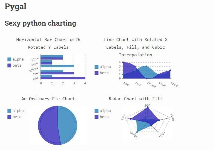
pygal比较小众,专注于SVG图,擅长交互,最主要的是它能用非常少的代码就可画出非常漂亮的图形
pygal能绘制Line(折线图)、Bar(柱状图)、Histogram(直方图)、Pie(饼图)、Radar(雷达图)、Funnel(漏斗图)、Gauge(仪表盘图)等14种常见可视化图
而且自带16种漂亮的主题,色调相当柔和,感觉很适合我这样细腻温柔的人
pygal的安装比较简单,直接在命令行输入以下代码即可:
1pip install pygal
2
下面,我们依托某宿舍2020年各月生活费花销情况为例,对pygal绘制方法进行介绍
首先pandas读取数据:
1import pandas as pd
2data=pd.read_excel('生活费开销.xlsx')
3
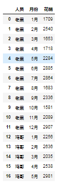
我想在jupyter上直接显示pygal的图形,需要创建html的基础模板,你们可以拿去直接用:
1import pygal
2#设置pygal与jupyter notebook交互
3from IPython.display import display, HTML
4base_html = """
5<!DOCTYPE html>
6<html>
7  <head>
8  <script type="text/javascript" src="http://kozea.github.com/pygal.js/javascripts/svg.jquery.js"></script>
9  <script type="text/javascript" src="https://kozea.github.io/pygal.js/2.0.x/pygal-tooltips.min.js""></script>
10  </head>
11  <body>
12    <figure>
13      {rendered_chart}
14    </figure>
15  </body>
16</html>
17"""
18
下面进入主题:
1.pygal绘制折线图(主题:DefaultStyle)
1from pygal.style import *
2people=data['人员'].unique()
3label=data['月份'].unique()
4line_chart = pygal.Line(style=DefaultStyle)
5line_chart.title = '520寝室2020年生活费花销情况'
6line_chart.x_labels = label
7for i in people:
8    line_chart.add(i, data[data.人员==i]['花销'].values.tolist())
9HTML(base_html.format(rendered_chart=line_chart.render(is_unicode=True)))#图片渲染
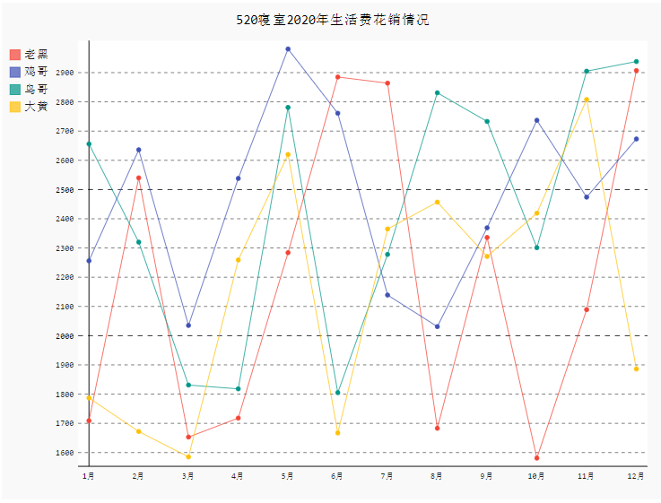
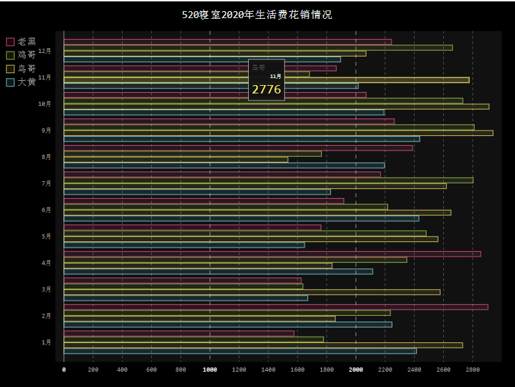
2.pygal绘制柱状图(主题:DarkStyle、NeonStyle)
绘制竖状柱状图
1from pygal.style import *
2people=data['人员'].unique()
3label=data['月份'].unique()
4line_chart = pygal.Bar(style=DarkStyle)
5line_chart.title = '520寝室2020年生活费花销情况'
6line_chart.x_labels = label
7for i in people:
8    line_chart.add(i, data[data.人员==i]['花销'].values.tolist())
9HTML(base_html.format(rendered_chart=line_chart.render(is_unicode=True)))#图片渲染
10
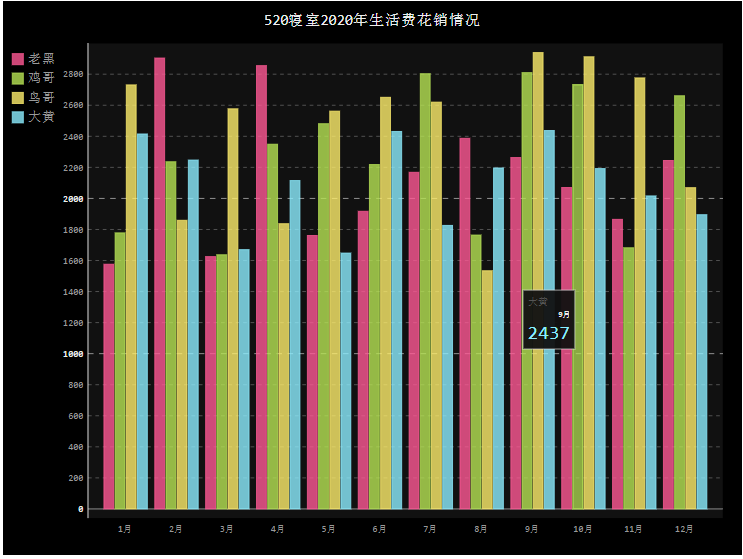
绘制横状柱状图
1from pygal.style import *
2people=data['人员'].unique()
3label=data['月份'].unique()
4line_chart = pygal.HorizontalBar(style=NeonStyle)
5line_chart.title = '520寝室2020年生活费花销情况'
6line_chart.x_labels = label
7for i in people:
8    line_chart.add(i, data[data.人员==i]['花销'].values.tolist())
9HTML(base_html.format(rendered_chart=line_chart.render(is_unicode=True)))#图片渲染
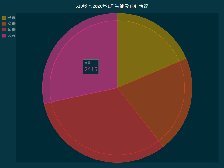
3.pygal绘制饼图(主题:DarkSolarizedStyle)
普通饼状图
1from pygal.style import *
2people=data['人员'].unique()
3label=data['月份'].unique()
4line_chart = pygal.Pie(style=DarkSolarizedStyle)
5line_chart.title = '520寝室2020年1月生活费花销情况'
6line_chart.x_labels = label
7for i in people:
8    line_chart.add(i, data[(data.人员==i)&(data.月份=='1月')]['花销'].values.tolist())
9HTML(base_html.format(rendered_chart=line_chart.render(is_unicode=True)))#图片渲染
10
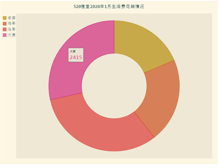
圆环图
1from pygal.style import *
2people=data['人员'].unique()
3label=data['月份'].unique()
4pie_chart = pygal.Pie(inner_radius=0.45,style=LightSolarizedStyle)
5pie_chart.title = '520寝室2020年1月生活费花销情况'
6for i in people:
7    pie_chart.add(i, data[(data.人员==i)&(data.月份=='1月')]['花销'].values.tolist()[0])
8HTML(base_html.format(rendered_chart=pie_chart.render(is_unicode=True)))#图片渲染
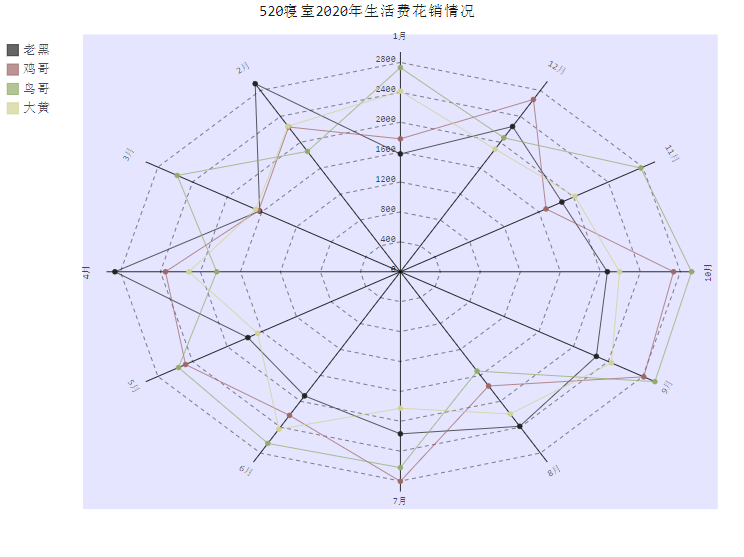
4.pygal绘制雷达图(主题:LightStyle)
1from pygal.style import *
2people=data['人员'].unique()
3label=data['月份'].unique()
4radar_chart = pygal.Radar(style=LightStyle)
5radar_chart.title = '520寝室2020年生活费花销情况'
6radar_chart.x_labels = label
7for i in people:
8    radar_chart.add(i, data[data.人员==i]['花销'].values.tolist())
9HTML(base_html.format(rendered_chart=radar_chart.render(is_unicode=True)))#图片渲染
10
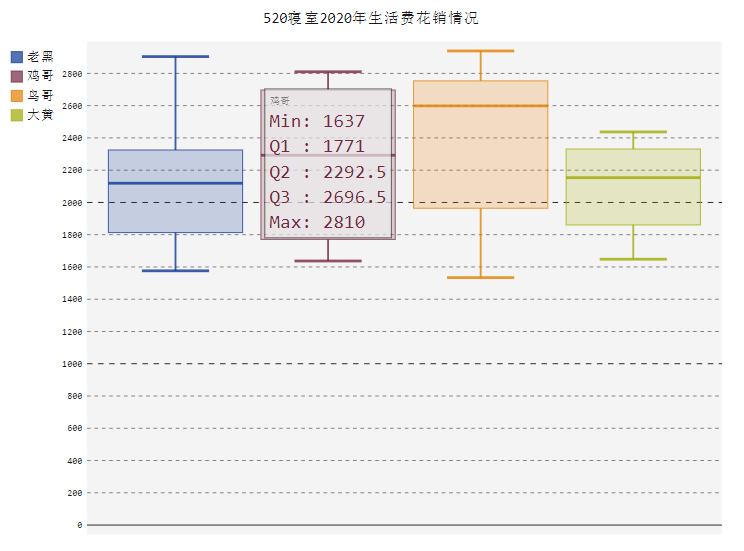
5.pygal绘制箱形图(主题:CleanStyle)
1from pygal.style import *
2people=data['人员'].unique()
3label=data['月份'].unique()
4box_plot = pygal.Box(style=CleanStyle)
5box_plot.title = '520寝室2020年生活费花销情况'
6for i in people:
7    box_plot.add(i, data[data.人员==i]['花销'].values.tolist())
8HTML(base_html.format(rendered_chart=box_plot.render(is_unicode=True)))#图片渲染
9
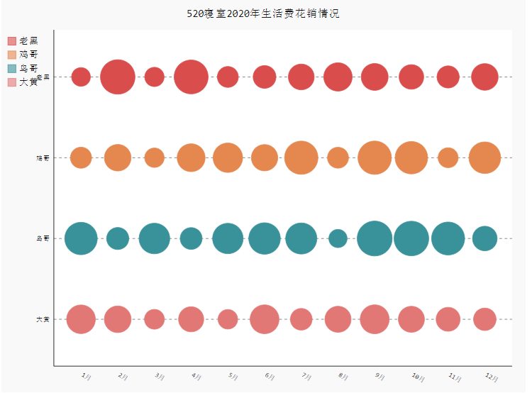
6.pygal绘制散点图(主题:RedBlueStyle)
1from pygal.style import *
2people=data['人员'].unique()
3label=data['月份'].unique()
4dot_chart = pygal.Dot(x_label_rotation=30,style=RedBlueStyle)
5dot_chart.title = '520寝室2020年生活费花销情况'
6dot_chart.x_labels=label
7for i in people:
8    dot_chart.add(i, data[data.人员==i]['花销'].values.tolist())
9HTML(base_html.format(rendered_chart=dot_chart.render(is_unicode=True)))#图片渲染
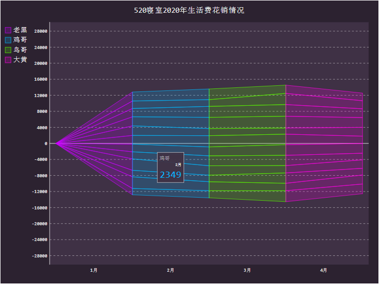
7.pygal绘制漏斗图(主题:DarkColorizedStyle)
1from pygal.style import *
2people=data['人员'].unique()
3label=data['月份'].unique()
4funnel_chart = pygal.Funnel(style=DarkColorizedStyle)
5funnel_chart.title = '520寝室2020年生活费花销情况'
6funnel_chart.x_labels=label
7for i in people:
8    funnel_chart.add(i, data[data.人员==i]['花销'].values.tolist())
9HTML(base_html.format(rendered_chart=funnel_chart.render(is_unicode=True)))#图片渲染
10
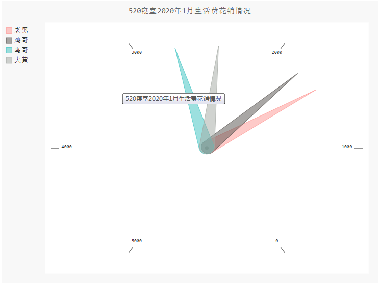
8.pygal绘制仪表盘图(主题:LightColorizedStyle)
1from pygal.style import *
2people=data['人员'].unique()
3label=data['月份'].unique()
4gauge_chart = pygal.Gauge(human_readable=True,style=LightColorizedStyle)
5gauge_chart.title = '520寝室2020年1月生活费花销情况'
6gauge_chart.range = [0, 5000]
7for i in people:
8    gauge_chart.add(i, data[(data.人员==i)&(data.月份=='1月')]['花销'].values.tolist())
9HTML(base_html.format(rendered_chart=gauge_chart.render(is_unicode=True)))#图片渲染
10
细心的读者可以发现,pygal绘制图形的套路基本都一样,其核心的代码也就5行代码,可以说是一招打遍天下无敌手。
-------------------********************************** End **********-------------**-----********-**********************************
往期精彩文章推荐:

欢迎各位大佬点击链接加入群聊【helloworld开发者社区】:https://jq.qq.com/?_wv=1027&k=mBlk6nzX进群交流IT技术热点。
本文转自 https://mp.weixin.qq.com/s/VKCE5ly5p-Xjt5167KKcyg,如有侵权,请联系删除。