
我们传统的前端更多的是用javascript实现各种复杂动画,自从有了Css3 transition和animation以来,前端开发在动画这一块有了更高的自由度和格局,对动画的开发也越来越容易。这篇文章就让我们汇总一下使用Css3实现的各种特效。这篇文章参考《css揭秘》这本书,并作出了自己的总结,希望能让大家更有收获,也强烈推荐大家看看这本书,你值得拥有。
我们将学到
- Css3
- outline
- radial-gradient
- linear-gradient
- box-shadow
程序员必读
1.实现内部虚线边框
知识点:outline
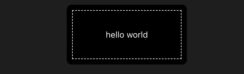 核心代码
核心代码
1.dash-border{
2  width: 200px;
3  height: 100px;
4  line-height: 100px;
5  outline: 1px dashed #fff;
6  outline-offset: -10px;
7}
2.边框内圆角的实现
知识点:box-shadow
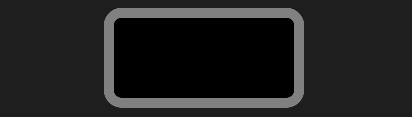 核心代码
核心代码
1.radius-border{
2  margin-top: 20px;
3  width: 180px;
4  height: 80px;
5  box-shadow: 0 0 0 10px gray;
6}
3.实现条纹背景与进度条
知识点:linear-gradient,repeating-linear-gradient
 核心代码
核心代码
1/* 上 */
2background: linear-gradient(to right,#fb3 50%,#58a 0);
3background-size: 40px 100%;
4box-shadow: inset 0 0 3px #555;
5
6/* 中 */
7background: linear-gradient(45deg,#fb3 25%,#58a 0,#58a 50%,#fb3 0,#fb3 75%,#58a 0);
8background-size: 40px 40px;
9
10/* 下 (可以实现任意角度的渐变,45°时显示效果最好) */
11background: repeating-linear-gradient(60deg,#fb3,#fb3 15px,#58a 0,#58a 30px);
4.复杂的背景图案
知识点:linear-gradient,repeating-linear-gradient,radial-gradient
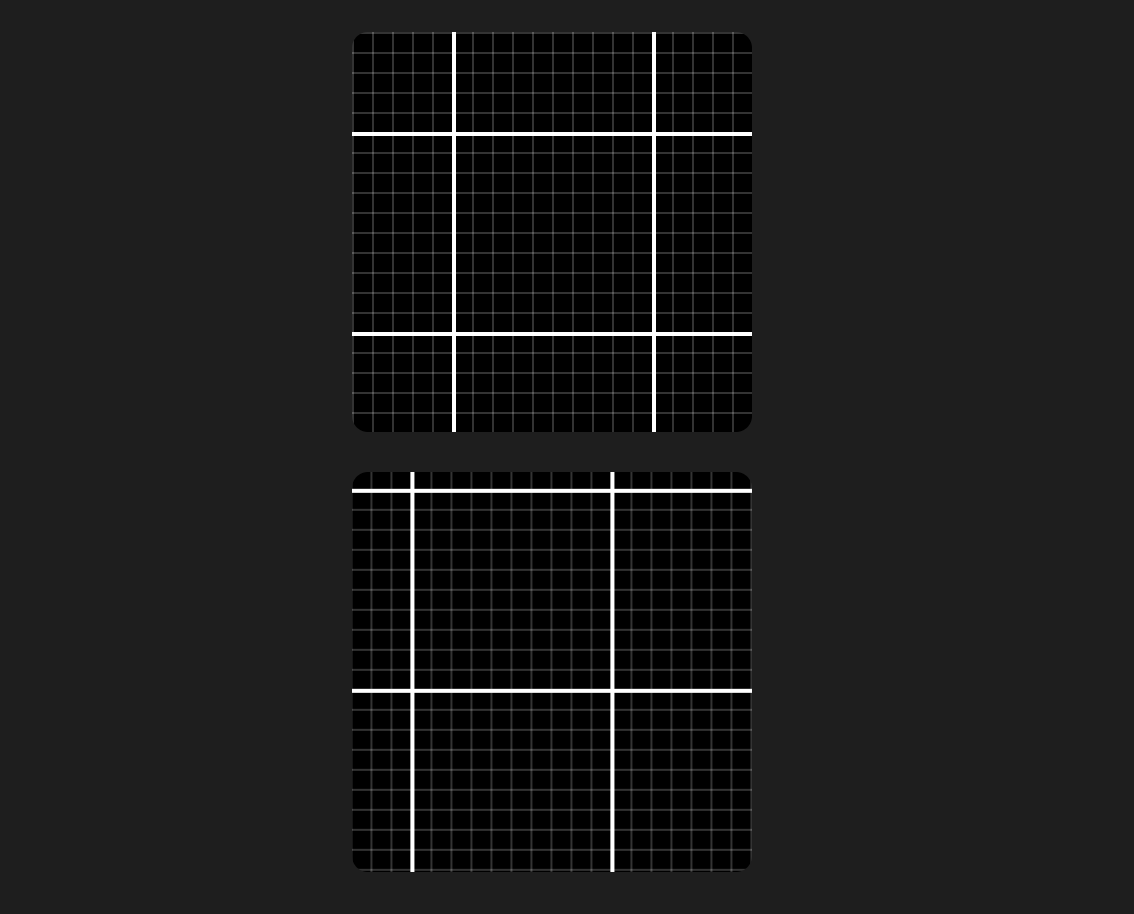
由于第二个图会有复杂的随机动画,建议大家可以亲自尝试看看效果,核心代码
1<style>
2.bg-grid{
3  margin-top: 20px;
4  width: 200px;
5  height: 200px;
6  background-image: linear-gradient(rgba(255,255,255,1) 2px,transparent 0),
7  linear-gradient(to right,rgba(255,255,255,1) 2px,transparent 0),
8  linear-gradient(rgba(255,255,255,.2) 1px,transparent 0),
9  linear-gradient(to right,rgba(255,255,255,.2) 1px,transparent 0);
10  background-position: -50px -50px;
11  background-size: 100px 100px,100px 100px, 100% 10px, 10px 100%;
12}
13.animate-grid{
14  animation: move-grid 6s linear infinite;
15}
16@keyframes move-grid{
17  0%{
18    background-position: -50px -50px;
19  }
20  30%{
21    background-position: -100px -100px;
22  }
23  60%{
24    background-position: -100px -150px;
25  }
26  100%{
27    background-position: -50px -50px;
28  }
29}
30</style>
31<div class="bg-grid black-theme"></div>
32<div class="bg-grid black-theme animate-grid"></div>
红绿灯以及红路灯随机运动动画
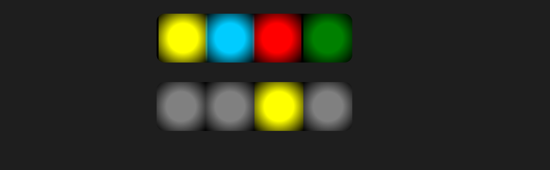 利用css3多背景和position实现红绿灯和背景色块移动
核心代码
1<style>
2.bg-dot{
3  margin-top: 20px;
4  width: 200px;
5  height: 50px;
6  background-image: radial-gradient(circle,#0cf 15px,transparent),
7                    radial-gradient(circle,red 15px,transparent),
8                    radial-gradient(circle,yellow 15px,transparent),
9                    radial-gradient(circle,green 15px,transparent);
10  background-repeat: no-repeat;
11  background-position: 0 0, 50px 0, 100px 0, 150px 0, 200px 0;
12  background-size: 50px 50px;
13}
14.animate-dot{
15  animation: move-dot 8s linear infinite;
16}
17.animate-dot2{
18  animation: move-dot2 6s linear infinite;
19}
20@keyframes move-dot{
21  0%{
22    background-position: 0 0, 50px 0, 100px 0, 150px 0;
23  }
24  30%{
25    background-position: 50px 0, 0 0, 100px 0, 150px 0;
26  }
27  60%{
28    background-position: 50px 0, 100px 0, 0 0, 150px 0;
29  }
30  100%{
31    background-position: 50px 0, 100px 0, 150px 0, 0 0;
32  }
33}
34@keyframes move-dot2{
35  0%{
36    background-image: radial-gradient(circle,#0cf 15px,transparent),
37                    radial-gradient(circle,gray 15px,transparent),
38                    radial-gradient(circle,gray 15px,transparent),
39                    radial-gradient(circle,gray 15px,transparent);
40  }
41  30%{
42    background-image: radial-gradient(circle,gray 15px,transparent),
43                    radial-gradient(circle,red 15px,transparent),
44                    radial-gradient(circle,gray 15px,transparent),
45                    radial-gradient(circle,gray 15px,transparent);
46  }
47  60%{
48    background-image: radial-gradient(circle,gray 15px,transparent),
49                    radial-gradient(circle,gray 15px,transparent),
50                    radial-gradient(circle,yellow 15px,transparent),
51                    radial-gradient(circle,gray 15px,transparent);
52  }
53  100%{
54    background-image: radial-gradient(circle,gray 15px,transparent),
55                    radial-gradient(circle,gray 15px,transparent),
56                    radial-gradient(circle,gray 15px,transparent),
57                    radial-gradient(circle,green 15px,transparent);
58  }
59}
60</style>
61<div class="bg-dot black-theme animate-dot"></div>
62<div class="bg-dot black-theme animate-dot2"></div>
棋盘背景以及棋盘背景随机动画
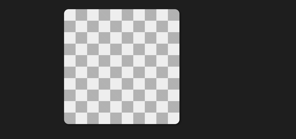 利用背景渐变实现棋盘图案
核心代码
1<style>
2.bg-qi{
3  margin-top: 20px;
4  width: 200px;
5  height: 200px;
6  background-color: #eee;
7  background-image: linear-gradient(45deg,rgba(0,0,0,.25) 25%,transparent 0,transparent 75%,rgba(0,0,0,.25) 0),
8  linear-gradient(45deg,rgba(0,0,0,.25) 25%,transparent 0,transparent 75%,rgba(0,0,0,.25) 0);
9  background-position: 0 0, 20px 20px;
10  background-size: 40px 40px;
11  box-shadow: 2px 2px 4px rgba(0,0,0,.4);
12}
13
14</style>
15<div class="bg-qi black-theme"></div>
伪随机背景
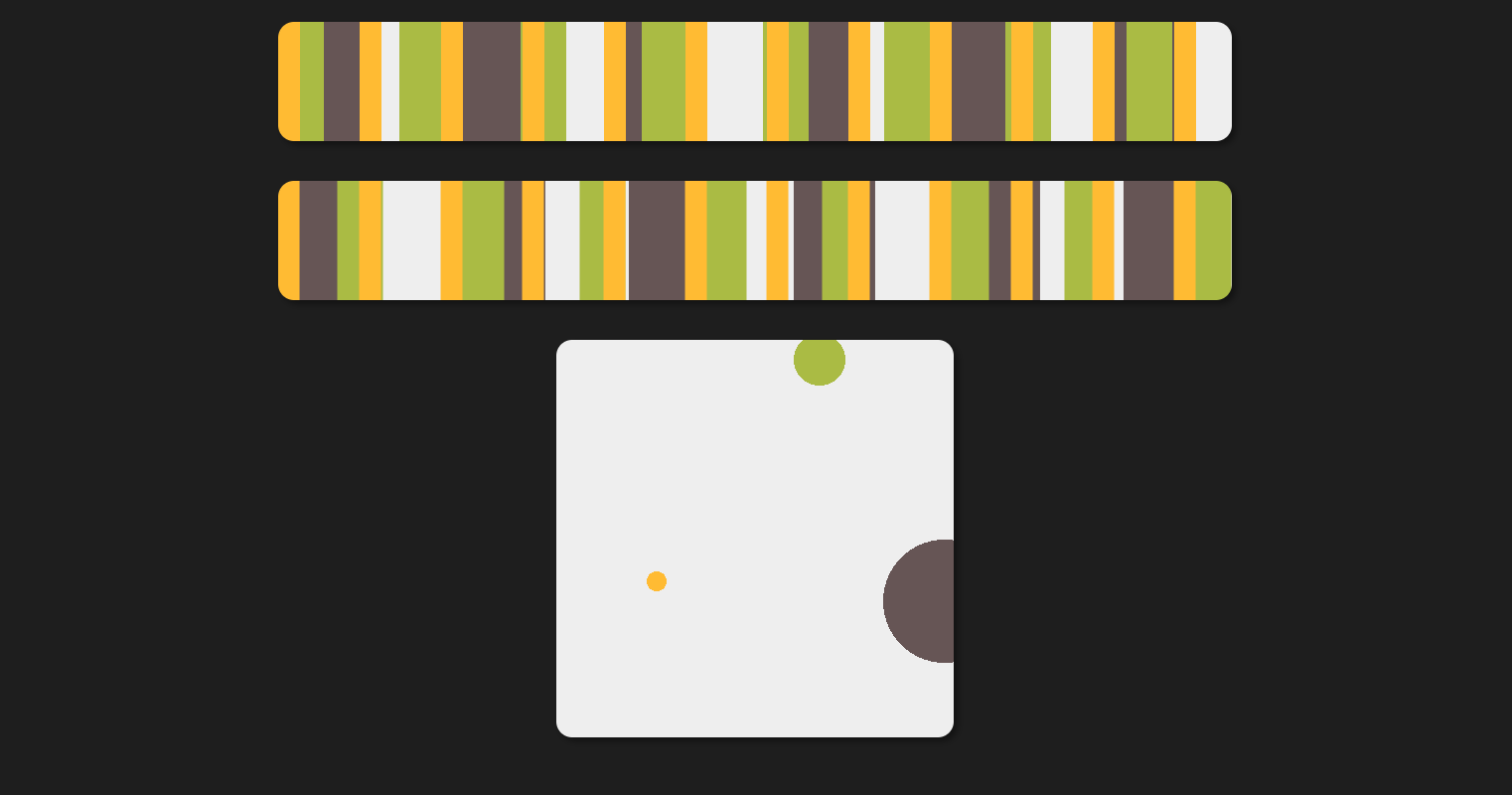 利用背景渐变,keyframe动画,实现复杂的伪随机动画
核心代码
1<style>
2.bg-line-rand{
3  margin-top: 20px;
4  width: 480px;
5  height: 60px;
6  background-color: #eee;
7  background-image: linear-gradient(90deg,#fb3 11px, transparent 0),
8                    linear-gradient(90deg,#ab4 23px, transparent 0),
9                    linear-gradient(90deg,#655 41px, transparent 0);
10  background-size: 41px 100%, 61px 100%, 83px 100%;
11  box-shadow: 2px 2px 4px rgba(0,0,0,.4);
12}
13.bg-dot-rand{
14  margin-top: 20px;
15  width: 200px;
16  height: 200px;
17  background-color: #eee;
18  background-image: radial-gradient(circle,#fb3 5px, transparent 0),
19                    radial-gradient(circle,#ab4 13px, transparent 0),
20                    radial-gradient(circle,#655 31px, transparent 0);
21  background-repeat: no-repeat;
22  background-size: 101px 203px, 147px 60px, 373px 201px;
23  box-shadow: 2px 2px 4px rgba(0,0,0,.4);
24}
25.animate1{
26  animation: move 4s linear infinite;
27}
28.animate2{
29  animation: move2 4s linear infinite;
30}
31@keyframes move{
32  0%{
33    background-position: 0 0, 0 0, 0 0;
34  }
35  50%{
36    background-position: -10px 0, 20px 0, 30px 0;
37  }
38  100%{
39    background-position: 0 0, 30px 0, 10px 0;
40  }
41}
42@keyframes move2{
43  0%{
44    background-position: 0 0, 0 0, 0 0;
45  }
46  50%{
47    background-position: -10px 30px, 20px 0, -40px 80px;
48  }
49  100%{
50    background-position: 0 20px, 60px -20px, 10px 30px;
51  }
52}
53</style>
54<div class="bg-line-rand black-theme"></div>
55<div class="bg-line-rand black-theme animate1"></div>
56<div class="bg-dot-rand black-theme animate2"></div>
5.折角效果
知识点:linear-gradient
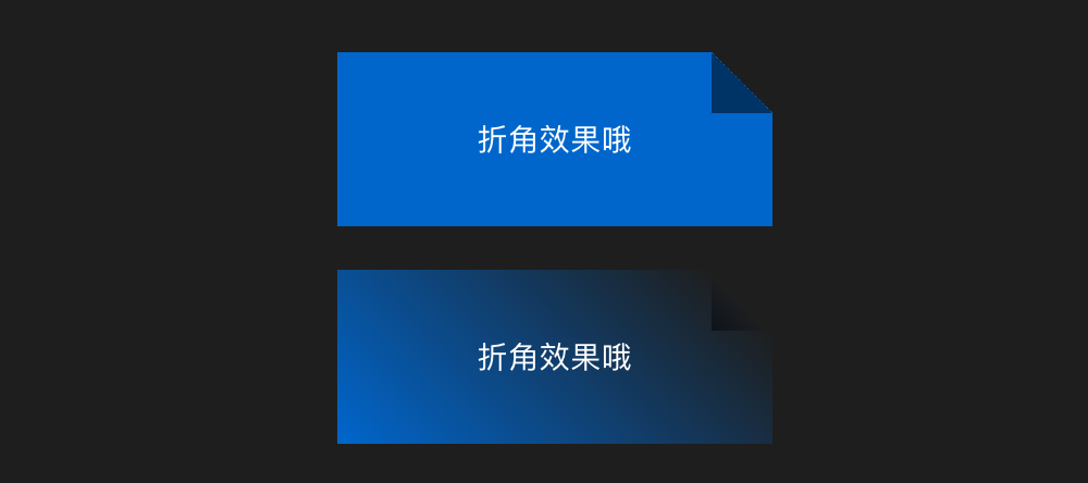
核心代码
1<style>
2.fold{
3  margin-left: auto;
4  margin-right: auto;
5  margin-bottom: 20px;
6  width: 200px;
7  height: 80px;
8  color: #fff;
9  line-height: 80px;
10  text-align: center;
11  background: linear-gradient(to left bottom,transparent 50%,rgba(0,0,0,.5) 0) no-repeat 100% 0 / 2em 2em,
12              linear-gradient(-135deg,transparent 1.4em,#06c 0);
13}
14.linear{
15  background: linear-gradient(to left bottom,transparent 50%,rgba(0,0,0,.5)) no-repeat 100% 0 / 2em 2em,
16              linear-gradient(-135deg,transparent 1.4em,#06c);
17}
18</style>
19<div class="fold">折角效果哦</div>
20<div class="fold linear">折角效果哦</div>
21
2.内阴影圆折角效果

核心代码
1<style>
2.fold-1{
3  margin-left: auto;
4  margin-right: auto;
5  margin-bottom: 20px;
6  position: relative;
7  width: 200px;
8  height: 80px;
9  border-radius: .5em;
10  color: #fff;
11  line-height: 80px;
12  text-align: center;
13  background: linear-gradient(-150deg,transparent 1.5em, #58a 0);
14}
15.fold-1::before{
16  content: "";
17  position: absolute;
18  top: 0;
19  right: 0;
20  background: linear-gradient(to left bottom,transparent 50%,rgba(0,0,0,.2) 0,rgba(0,0,0,.4)) 100% 0 no-repeat;
21  width: 1.73em;
22  height: 3em;
23  transform: translateY(-1.3em) rotate(-30deg);
24  transform-origin: bottom right;
25  border-bottom-left-radius: inherit;
26  box-shadow: -.2em .2em .3em -.1em rgba(0,0,0,.15);
27}
28
29</style>
30<div class="fold-1">折角效果哦</div>
6.自适应文本的条纹背景
知识点:linear-gradient,line-height,background-origin

核心代码
1<style>
2.stripe-bg{
3  padding: .5em;
4  line-height: 1.5em;
5  background: beige;
6  background-size: auto 3em;
7  background-origin: content-box;
8  background-image: linear-gradient(rgba(0,0,0,.2) 50%, transparent 0);
9}
10.stripe-bg > p{
11  margin: 0;
12}
13</style>
14<div class="stripe-bg">
15  <p>hello you</p>
16  <p>hello you</p>
17  <p>hello you</p>
18  <p>hello you</p>
19  <p>hello you</p>
20</div>
7.自定义的下划线实现
知识点linear-gridient

小伙伴们注意到了吗?默认的下划线会将文字穿过,而上面的不会呦!
核心代码
1<style>
2.my-line{
3  line-height: 1.4em;
4  background: linear-gradient(gray,gray) no-repeat;
5  background-size: 100% 1px;
6  background-position: 0 1.15em;
7  text-shadow: .05em 0 #fff, -.05em 0 #fff;
8}
9</style>
10<div class=""><span class="my-line">i have your big apple.you have a too? hi hi hi.</span></div>
最后
笔者3天后将推出开源的CMS系统,技术架构:
- 后台Node+Koa+redis+JsonSchema
- 管理后台界面 vue-cli3 + vue + ts + vuex + antd-vue + axios
- 客户端前台 react + antd + react-hooks + axios
后面将推出该系统的设计思想,架构和实现过程,欢迎在公众号《趣谈前端》里查看更详细的介绍。
欢迎大家相互学习交流,一起探索前端的边界。
更多推荐
- 2年vue项目实战经验汇总
- 15分钟带你了解前端工程师必知的javascript设计模式(附详细思维导图和源码)
- 记一次老项目中的跨页面通信问题和前端实现文件下载功能
- 如何优雅的使用javascript递归画一棵结构树
- 5分钟教你用nodeJS手写一个mock数据服务器
- 笛卡尔乘积的javascript版实现和应用
- JavaScript 中的二叉树以及二叉搜索树的实现及应用
- 用 JavaScript 和 C3 实现一个转盘小游戏
- 教你用200行代码写一个爱豆拼拼乐H5小游戏(附源码)
- 基于react/vue生态的前端集成解决方案探索与总结
- 9012教你如何使用gulp4开发项目脚手架
- 如何用不到200行代码写一款属于自己的js类库)
- 让你瞬间提高工作效率的常用js函数汇总(持续更新)
- 一张图教你快速玩转vue-cli3
- 3分钟教你用原生js实现具有进度监听的文件上传预览组件
- 3分钟教你用原生js实现具有进度监听的文件上传预览组件
- 使用Angular8和百度地图api开发《旅游清单》
- js基本搜索算法实现与170万条数据下的性能测试
- 《前端算法系列》如何让前端代码速度提高60倍
- 《前端算法系列》数组去重
- vue高级进阶系列——用typescript玩转vue和vuex
- 前端三年,谈谈最值得读的5本书籍