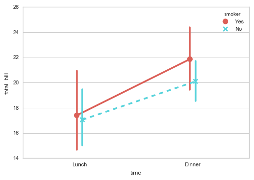
1. 分类数据可视化 - 分类散点图
stripplot( ) / swarmplot( )
1sns.stripplot(x="day",y="total_bill",data=tips,jitter = True, size = 5, edgecolor = 'w',linewidth=1,marker = 'o')
2
3import numpy as np
4import pandas as pd
5import matplotlib.pyplot as plt
6import seaborn as sns
7% matplotlib inline
8
9sns.set_style("whitegrid")
10sns.set_context("paper")
11# 设置风格、尺度
12
13import warnings
14warnings.filterwarnings('ignore')
15# 不发出警告
16
17# 1、stripplot()
18# 按照不同类别对样本数据进行分布散点图绘制
19
20tips = sns.load_dataset("tips")
21print(tips.head())
22# 加载数据print(tips['day'].value_counts())
23sns.stripplot(x="day",          # x → 设置分组统计字段
24              y="total_bill",   # y → 数据分布统计字段
25              # 这里xy数据对调,将会使得散点图横向分布
26              data=tips,        # data → 对应数据
27              jitter = True,    # jitter → 当点数据重合较多时,用该参数做一些调整,也可以设置间距如:jitter = 0.1
28              size = 5, edgecolor = 'w',linewidth=1,marker = 'o'  # 设置点的大小、描边颜色或宽度、点样式
29              )

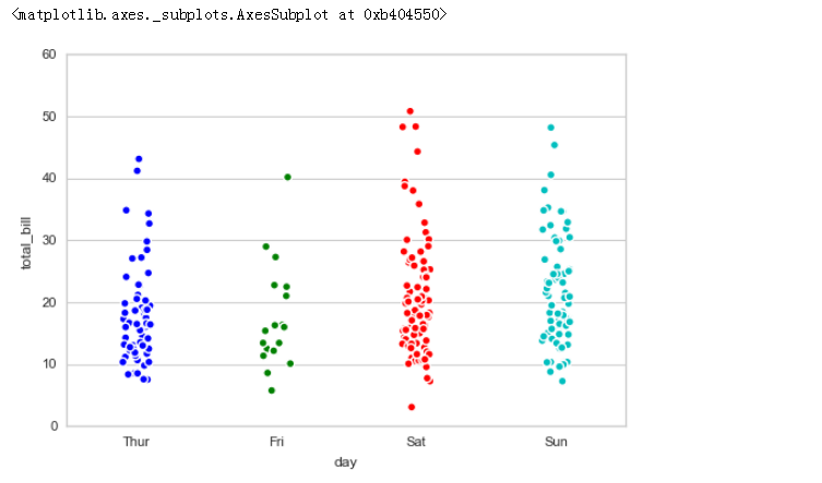
1.1 stripplot()
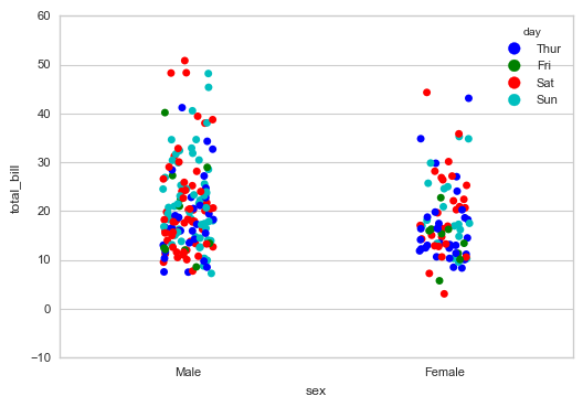
hue参数可再分类
1# 1、stripplot() 通过hue参数再分类
2
3sns.stripplot(x="sex", y="total_bill", hue="day",
4              data=tips, jitter=True)
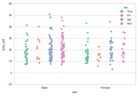
1# 1、stripplot() 设置调色盘
2
3sns.stripplot(x="sex", y="total_bill", hue="day",
4              data=tips, jitter=True,
5              palette="Set2",  # 设置调色盘
6              dodge=True,  # 是否拆分
7             )
1# 1、stripplot() 筛选分类类别
2
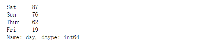
3print(tips['day'].value_counts())
4# 查看day字段的唯一值
5
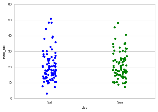
6sns.stripplot(x="day", y="total_bill", data=tips,jitter = True,
7              order = ['Sat','Sun'])
8# order → 筛选类别
1.2 swarmplot()分簇散点图
1# 2、swarmplot()
2# 分簇散点图
3
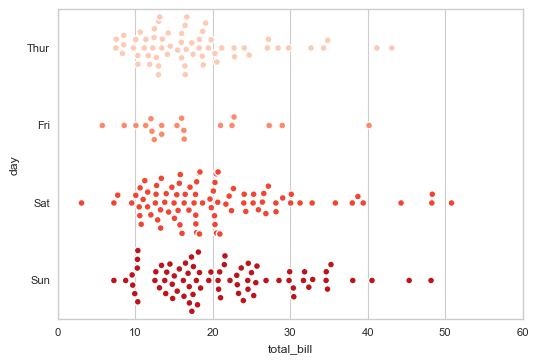
4sns.swarmplot(x="total_bill", y="day", data=tips,
5              size = 5, edgecolor = 'w',linewidth=1,marker = 'o',
6              palette = 'Reds')
7# 用法和stripplot类似
2. 分类数据可视化 - 分布图
boxplot( ) / violinplot( ) / lvplot( )
2.1 boxplot()箱型图
1sns.boxplot(x="day", y="total_bill", data=tips,
2            linewidth = 2,   # 线宽
3            width = 0.8,     # 箱之间的间隔比例
4            fliersize = 3,   # 异常点大小
5            palette = 'hls', # 设置调色板
6            whis = 1.5,      # 设置IQR
7            notch = True,    # 设置是否以中值做凹槽
8            order = ['Thur','Fri','Sat','Sun'],  # 筛选类别
9
10# 1、boxplot()
11# 箱型图
12
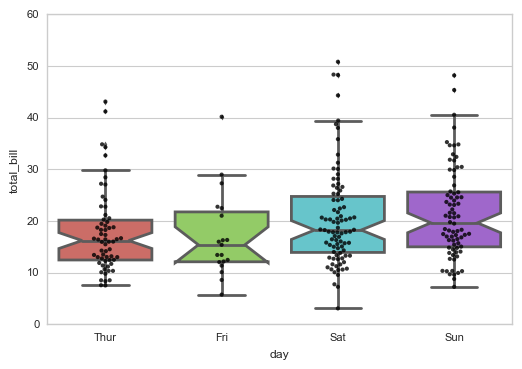
13sns.boxplot(x="day", y="total_bill", data=tips,
14            linewidth = 2,   # 线宽
15            width = 0.8,     # 箱之间的间隔比例
16            fliersize = 3,   # 异常点大小
17            palette = 'hls', # 设置调色板
18            whis = 1.5,      # 设置IQR
19            notch = True,    # 设置是否以中值做凹槽
20            order = ['Thur','Fri','Sat','Sun'],  # 筛选类别
21           )
22# 绘制箱型图
23
24sns.swarmplot(x="day", y="total_bill", data=tips,color ='k',size = 3,alpha = 0.8)
25# 可以添加散点图
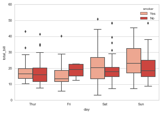
1# 1、boxplot() 通过hue参数再分类
2
3sns.boxplot(x="day", y="total_bill", data=tips,
4            hue = 'smoker', palette = 'Reds')
5# 绘制箱型图
6
7#sns.swarmplot(x="day", y="total_bill", data=tips,color ='k',size = 3,alpha = 0.8)
8# 可以添加散点图
2.2 violinplot()小提琴图
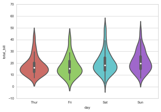
1sns.violinplot(x="day", y="total_bill", data=tips,
2            linewidth = 2,   # 线宽
3            width = 0.8,     # 箱之间的间隔比例
4            palette = 'hls', # 设置调色板
5            order = ['Thur','Fri','Sat','Sun'],  # 筛选类别
6            scale = 'area',  # 测度小提琴图的宽度:area-面积相同,count-按照样本数量决定宽度,width-宽度一样
7            gridsize = 50,   # 设置小提琴图边线的平滑度,越高越平滑
8            inner = 'box',   # 设置内部显示类型 → “box”, “quartile”, “point”, “stick”, None
9            #bw = 0.8        # 控制拟合程度,一般可以不设置
10           )
11
12# 2、violinplot()  小提琴图
13
14sns.violinplot(x="day", y="total_bill", data=tips,
15            linewidth = 2,   # 线宽
16            width = 0.8,     # 箱之间的间隔比例
17            palette = 'hls', # 设置调色板
18            order = ['Thur','Fri','Sat','Sun'],  # 筛选类别
19            scale = 'area',  # 测度小提琴图的宽度:area-面积相同,count-按照样本数量决定宽度,width-宽度一样
20            gridsize = 50,   # 设置小提琴图边线的平滑度,越高越平滑
21            inner = 'box',   # 设置内部显示类型 → “box”, “quartile”, “point”, “stick”, None
22            #bw = 0.8        # 控制拟合程度,一般可以不设置
23           )
24# 用法和boxplot类似
1# 2、violinplot() 通过hue参数再分类
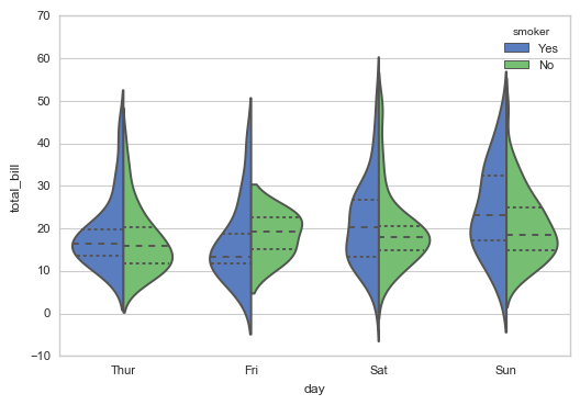
2
3sns.violinplot(x="day", y="total_bill", data=tips,
4               hue = 'smoker', palette="muted",
5               split=True,  # 设置是否拆分小提琴图
6               inner="quartile")
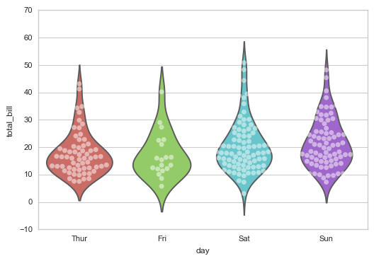
1sns.violinplot()+ sns.swarmplot()小提琴图结合散点图
2
3# 2、violinplot()  结合散点图
4
5sns.violinplot(x="day", y="total_bill", data=tips, palette = 'hls', inner = None)
6sns.swarmplot(x="day", y="total_bill", data=tips, color="w", alpha=.5)
7# 插入散点图
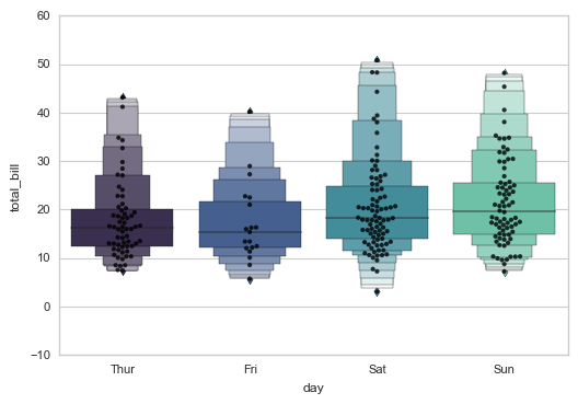
2.3 lvplot() LV图表
1sns.lvplot(x="day", y="total_bill", data=tips, palette="mako",
2           #hue = 'smoker',
3           width = 0.8,           # 箱之间间隔比例
4           linewidth = 12,
5           scale = 'area',        # 设置框的大小 → “linear”、“exonential”、“area”
6           k_depth = 'proportion',  # 设置框的数量 → “proportion”、“tukey”、“trustworthy”
7          )
8
9# 3、lvplot()  LV图表
10
11sns.lvplot(x="day", y="total_bill", data=tips, palette="mako",
12           #hue = 'smoker',
13           width = 0.8,           # 箱之间间隔比例
14           linewidth = 12,
15           scale = 'area',        # 设置框的大小 → “linear”、“exonential”、“area”
16           k_depth = 'proportion',  # 设置框的数量 → “proportion”、“tukey”、“trustworthy”
17          )
18# 绘制LV图
19
20sns.swarmplot(x="day", y="total_bill", data=tips,color ='k',size = 3,alpha = 0.8)
21# 可以添加散点图
3. 分类数据可视化 - 统计图
barplot( ) / countplot( ) / pointplot( )
3.1 barplot()柱状图
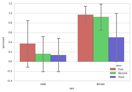
1sns.barplot(x="sex", y="survived", hue="class", data=titanic,
2            palette = 'hls',
3            order = ['male','female'],  # 筛选类别
4            capsize = 0.05,  # 误差线横向延伸宽度
5            saturation=.8,   # 颜色饱和度
6            errcolor = 'gray',errwidth = 2,  # 误差线颜色,宽度
7            ci = 'sd'    # 置信区间误差 → 0-100内值、'sd'、None
8            )
9
10# 1、barplot()
11# 柱状图 - 置信区间估计
12# 置信区间:样本均值 + 抽样误差
13
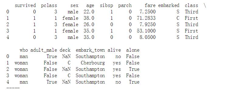
14titanic = sns.load_dataset("titanic")
15print(titanic.head())
16print('-----')
17# 加载数据
1sns.barplot(x="sex", y="survived", hue="class", data=titanic,
2            palette = 'hls',
3            order = ['male','female'],  # 筛选类别
4            capsize = 0.05,  # 误差线横向延伸宽度
5            saturation=.8,   # 颜色饱和度
6            errcolor = 'gray',errwidth = 2,  # 误差线颜色,宽度
7            ci = 'sd'    # 置信区间误差 → 0-100内值、'sd'、None
8            )
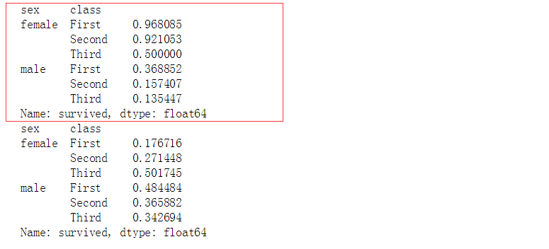
1print(titanic.groupby(['sex','class']).mean()['survived'])
2print(titanic.groupby(['sex','class']).std()['survived'])
3# 计算数据
1# 1、barplot()
2# 柱状图 - 置信区间估计
3
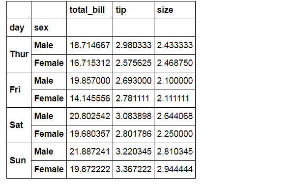
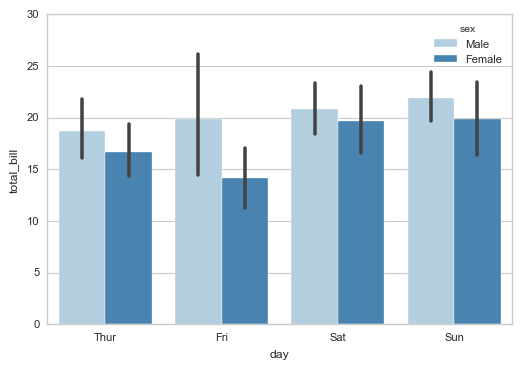
4sns.barplot(x="day", y="total_bill", hue="sex", data=tips,
5            palette = 'Blues',edgecolor = 'w')
6tips.groupby(['day','sex']).mean()
7# 计算数据
1# 1、barplot()
2# 柱状图 - 置信区间估计
3
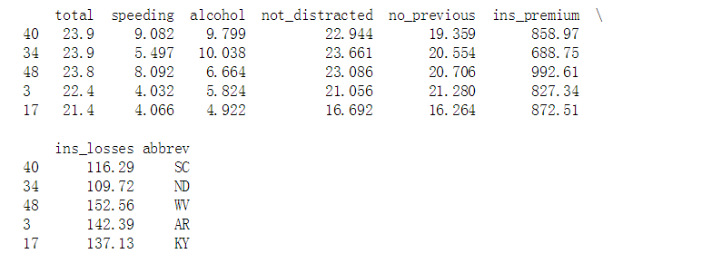
4crashes = sns.load_dataset("car_crashes").sort_values("total", ascending=False)
5print(crashes.head())
6# 加载数据
7
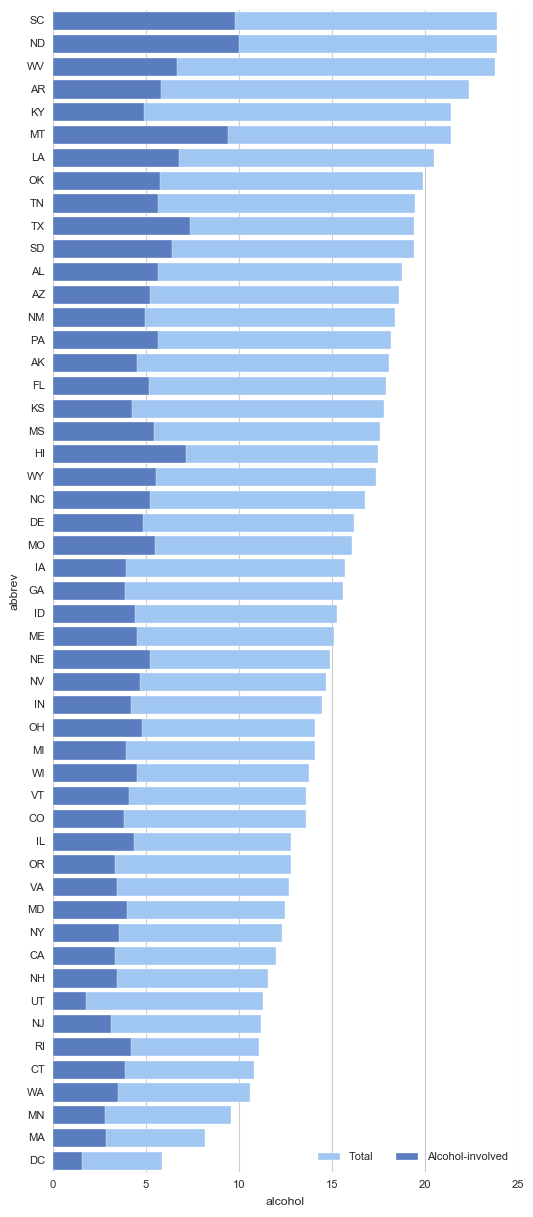
8f, ax = plt.subplots(figsize=(6, 15))
9# 创建图表
10
11sns.set_color_codes("pastel")
12sns.barplot(x="total", y="abbrev", data=crashes,
13            label="Total", color="b",edgecolor = 'w')
14# 设置第一个柱状图
15
16sns.set_color_codes("muted")
17sns.barplot(x="alcohol", y="abbrev", data=crashes,
18            label="Alcohol-involved", color="b",edgecolor = 'w')
19# 设置第二个柱状图
20
21ax.legend(ncol=2, loc="lower right")
22sns.despine(left=True, bottom=True)
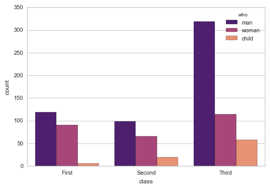
3.2 countplot()计数柱状图
1sns.countplot(x="class", hue="who", data=titanic,palette = 'magma')
2
3# 2、countplot()  计数柱状图
4
5sns.countplot(x="class", hue="who", data=titanic,palette = 'magma')
6#sns.countplot(y="class", hue="who", data=titanic,palette = 'magma')
7# x/y → 以x或者y轴绘图(横向,竖向)
8# 用法和barplot相似
3.3 pointplot()折线图
1# 3、pointplot()
2# 折线图 - 置信区间估计
3
4sns.pointplot(x="time", y="total_bill", hue = 'smoker',data=tips,
5              palette = 'hls',
6              dodge = True,   # 设置点是否分开
7              join = True,    # 是否连线
8              markers=["o", "x"], linestyles=["-", "--"],  # 设置点样式、线型
9              )
10tips.groupby(['time','smoker']).mean()['total_bill']
11# 计算数据
12# # 用法和barplot相似