
大家好,我是明哥。
今天给大家推荐一个可视化神器 - Plotly_express ,上手非常的简单,基本所有的图都只要一行代码就能绘出一张非常酷炫的可视化图。
以下是这个神器的详细使用方法,文中附含大量的 GIF 动图示例图。
注:源代码( .ipypnb 文件)的获取方式,我放在文末了。记得下载
1. 环境准备
本文的是在如下环境下测试完成的。
-
Python3.7
-
Jupyter notebook
-
Pandas1.1.3
-
Plotly_express0.4.1
其中 Plotly_express0.4.1 是本文的主角,安装它非常简单,只需要使用 pip install 就可以
1$ python3 -m pip install plotly_express
2
2. 工具概述
在说 plotly_express之前,我们先了解下plotly。Plotly是新一代的可视化神器,由TopQ量化团队开源。虽然Ploltly功能非常之强大,但是一直没有得到重视,主要原因还是其设置过于繁琐。因此,Plotly推出了其简化接口:Plotly_express,下文中统一简称为px。
px是对Plotly.py的一种高级封装,其内置了很多实用且现代的绘图模板,用户只需要调用简单的API函数即可实用,从而快速绘制出漂亮且动态的可视化图表。
px是完全免费的,用户可以任意使用它。最重要的是,px和plotly生态系统的其他部分是完全兼容的。用户不仅可以在Dash中使用,还能通过Orca将数据导出为几乎任意文件格式。
官网的学习资料:https://plotly.com/
px的安装是非常简单的,只需要通过pip install plotly_express来安装即可。安装之后的使用:
import plotly_express as px
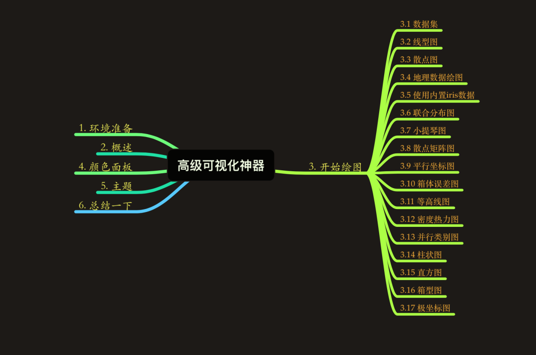
3. 开始绘图
接下来我们通过px中自带的数据集来绘制各种精美的图形。
-
gapminder
-
tips
-
wind
3.1 数据集
首先我们看下px中自带的数据集:
1import pandas as pd
2import numpy as np
3import plotly_express as px  # 现在这种方式也可行:import plotly.express as px
4
5# 数据集
6gapminder = px.data.gapminder()
7gapminder.head()  # 取出前5条数据
8
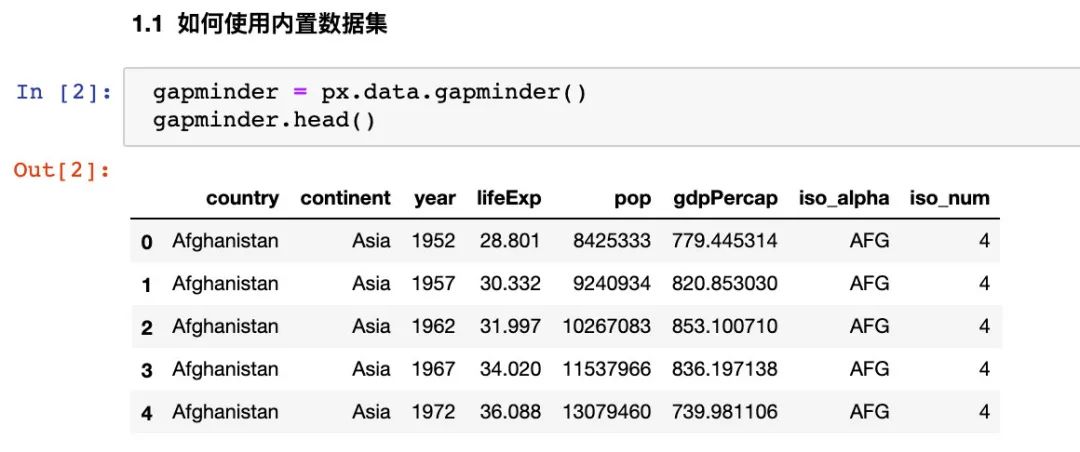
我们看看全部属性值:

3.2 线型图
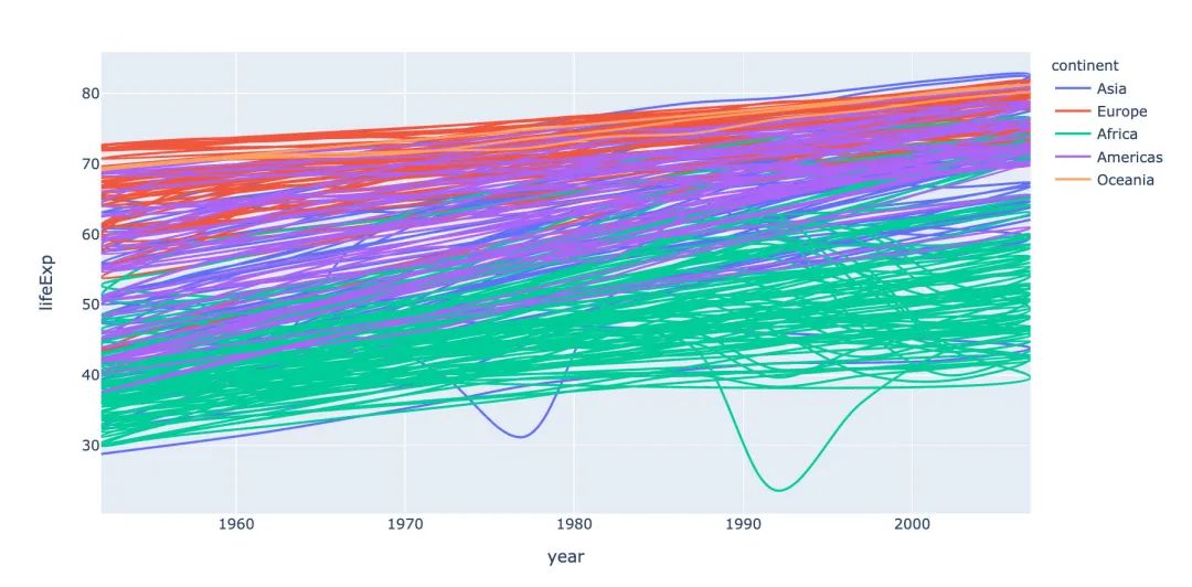
线型图line在可视化制图中是很常见的。利用px能够快速地制作线型图:
1# line 图
2fig = px.line(
3  gapminder,  # 数据集
4  x="year",  # 横坐标
5  y="lifeExp",  # 纵坐标
6  color="continent",  # 颜色的数据
7  line_group="continent",  # 线性分组
8  hover_name="country",   # 悬停hover的数据
9  line_shape="spline",  # 线的形状
10  render_mode="svg"  # 生成的图片模式
11)
12fig.show()
13
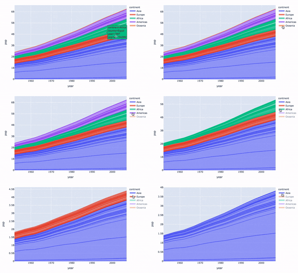
再来制作面积图:
1# area 图
2fig = px.area(
3  gapminder,  # 数据集
4  x="year",  # 横坐标
5  y="pop",  # 纵坐标
6  color="continent",   # 颜色
7  line_group="country"  # 线性组别
8)
9fig.show()
10
3.3 散点图
散点图的制作调用scatter方法:
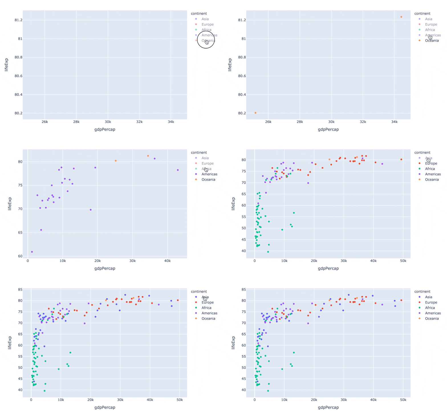
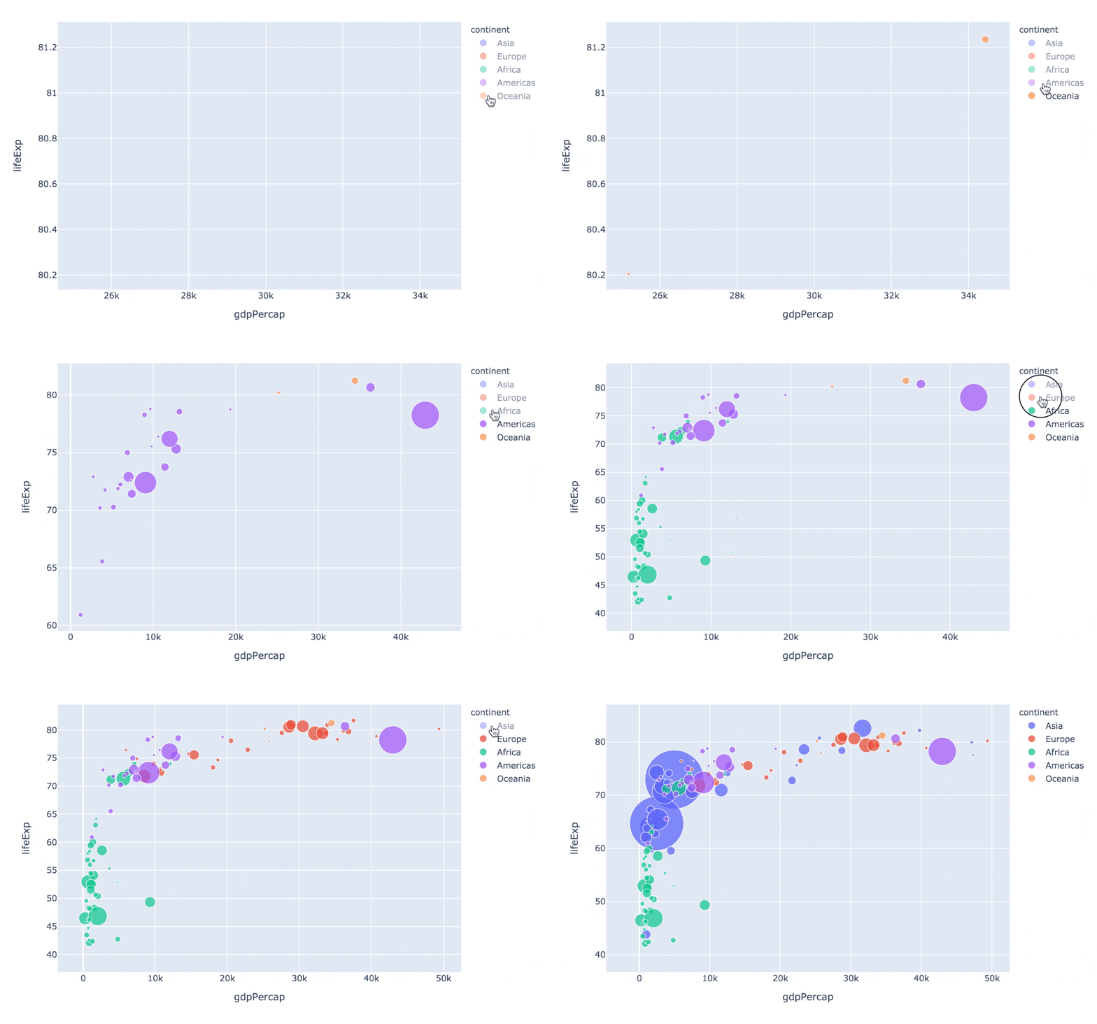
指定size参数还能改变每个点的大小:
1px.scatter(
2  gapminder2007   # 绘图DataFrame数据集
3  ,x="gdpPercap"  # 横坐标
4  ,y="lifeExp"  # 纵坐标
5  ,color="continent"  # 区分颜色
6  ,size="pop"   # 区分圆的大小
7  ,size_max=60  # 散点大小
8)
9
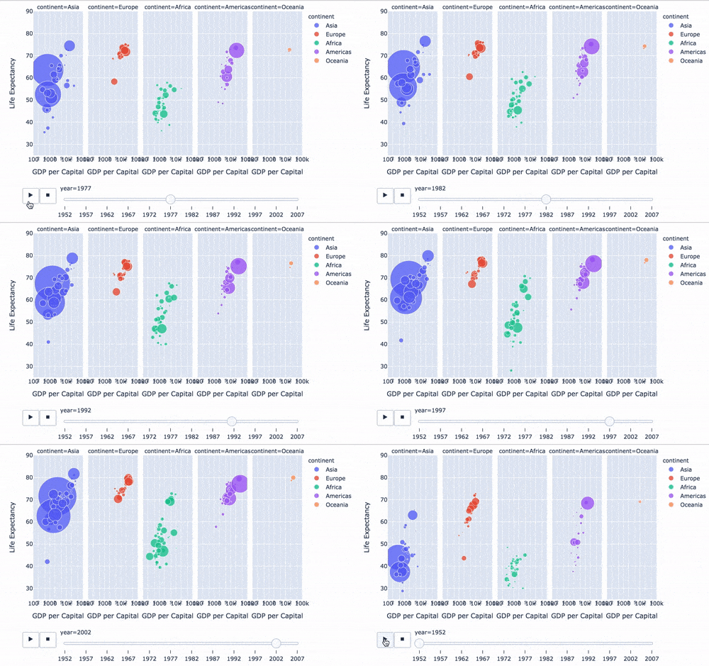
通过指定facet_col、animation_frame参数还能将散点进行分块显示:
1px.scatter(
2  gapminder   # 绘图使用的数据
3  ,x="gdpPercap" # 横纵坐标使用的数据
4  ,y="lifeExp"  # 纵坐标数据
5  ,color="continent"  # 区分颜色的属性
6  ,size="pop"   # 区分圆的大小
7  ,size_max=60  # 圆的最大值
8  ,hover_name="country"  # 图中可视化最上面的名字
9  ,animation_frame="year"  # 横轴滚动栏的属性year
10  ,animation_group="country"  # 标注的分组
11  ,facet_col="continent"   # 按照国家country属性进行分格显示
12  ,log_x=True  # 横坐标表取对数
13  ,range_x=[100,100000]  # 横轴取值范围
14  ,range_y=[25,90]  # 纵轴范围
15  ,labels=dict(pop="Populations",  # 属性名字的变化,更直观
16               gdpPercap="GDP per Capital",
17               lifeExp="Life Expectancy")
18)
19
3.4 地理数据绘图
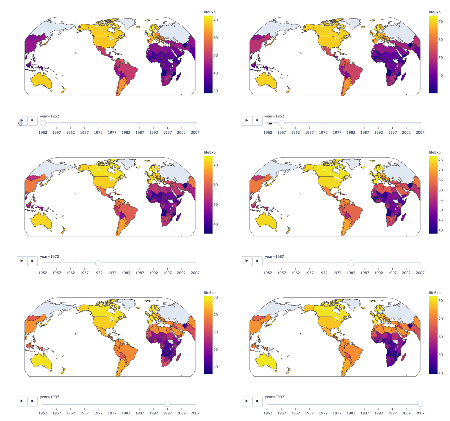
在实际的工作中,我们可能会接触到中国地图甚至是全球地图,使用px也能制作:
1px.choropleth(
2  gapminder,  # 数据集
3  locations="iso_alpha",  # 配合颜色color显示
4  color="lifeExp", # 颜色的字段选择
5  hover_name="country",  # 悬停字段名字
6  animation_frame="year",  # 注释
7  color_continuous_scale=px.colors.sequential.Plasma,  # 颜色变化
8  projection="natural earth"  # 全球地图
9             )
10
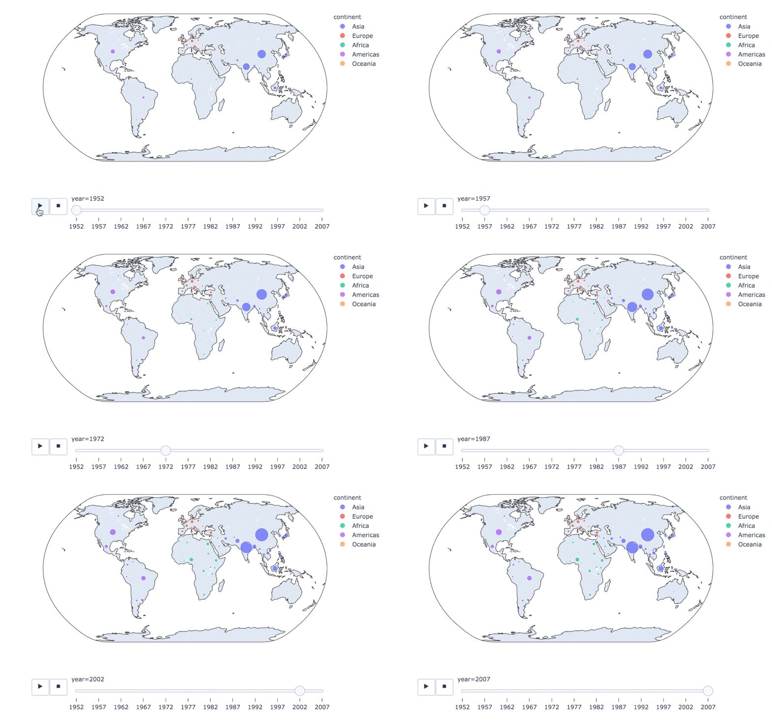
1fig = px.scatter_geo(
2  gapminder,   # 数据
3  locations="iso_alpha",  # 配合颜色color显示
4  color="continent", # 颜色
5  hover_name="country", # 悬停数据
6  size="pop",  # 大小
7  animation_frame="year",  # 数据帧的选择
8  projection="natural earth"  # 全球地图
9                    )
10
11fig.show()
12
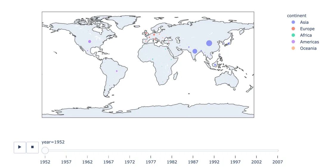
1 px.scatter_geo(gapminder, # 数据集
2  locations="iso_alpha",  # 配和color显示颜色
3  color="continent",  # 颜色的字段显示
4  hover_name="country",  # 悬停数据
5  size="pop",  # 大小
6  animation_frame="year"  # 数据联动变化的选择
7  #,projection="natural earth"   # 去掉projection参数
8)
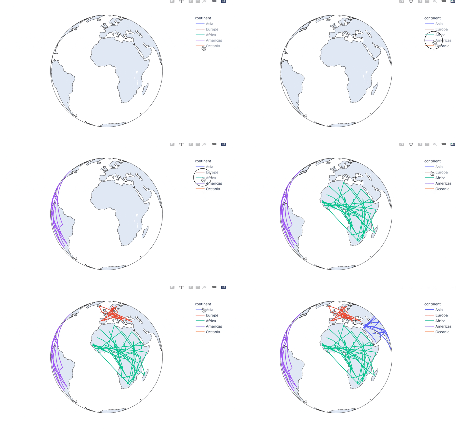
使用line_geo来制图:
1fig = px.line_geo(
2  gapminder2007,  # 数据集
3  locations="iso_alpha",  # 配合和color显示数据
4  color="continent",  # 颜色
5  projection="orthographic")   # 球形的地图
6fig.show()
7
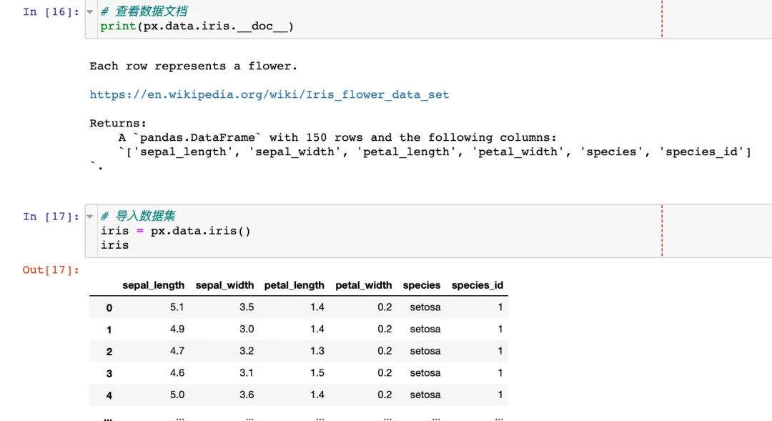
3.5 使用内置iris数据
我们先看看怎么使用px来查看内置数据的文档:
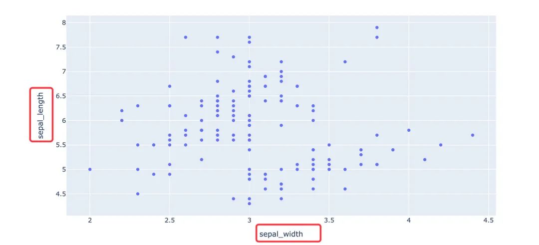
选择两个属性制图
选择两个属性作为横纵坐标来绘制散点图
1fig = px.scatter(
2  iris,  # 数据集
3  x="sepal_width",  # 横坐标
4  y="sepal_length"  # 纵坐标
5                )
6fig.show()
7
通过color参数来显示不同的颜色:
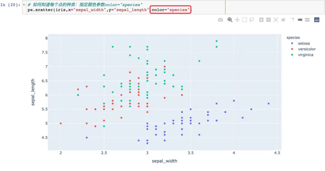
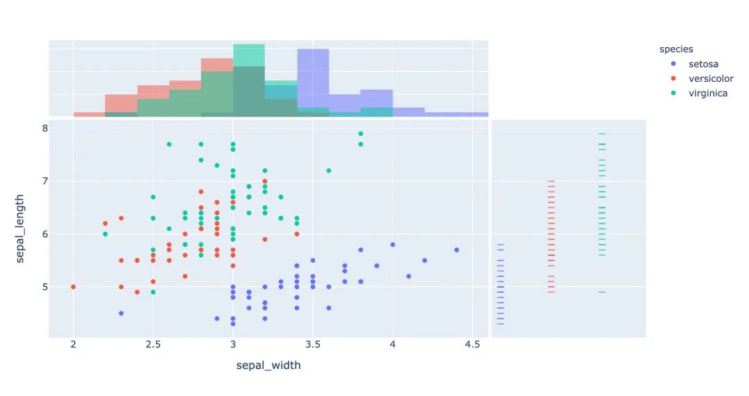
3.6 联合分布图
我们一个图形中能够将散点图和直方图组合在一起显示:
1px.scatter(
2  iris,  # 数据集
3  x="sepal_width", # 横坐标
4  y="sepal_length",  # 纵坐标
5  color="species",  # 颜色
6  marginal_x="histogram",  # 横坐标直方图
7  marginal_y="rug"   # 细条图
8)
9
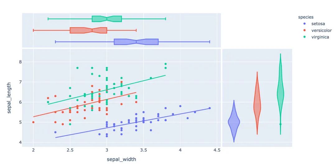
3.7 小提琴图
小提琴图能够很好的显示数据的分布和误差情况,一行代码利用也能显示小提琴图:
1px.scatter(
2  iris,  # 数据集
3  x="sepal_width",  # 横坐标
4  y="sepal_length",  # 纵坐标
5  color="species",  # 颜色
6  marginal_y="violin",  # 纵坐标小提琴图
7  marginal_x="box",  # 横坐标箱型图
8  trendline="ols"  # 趋势线
9)
10
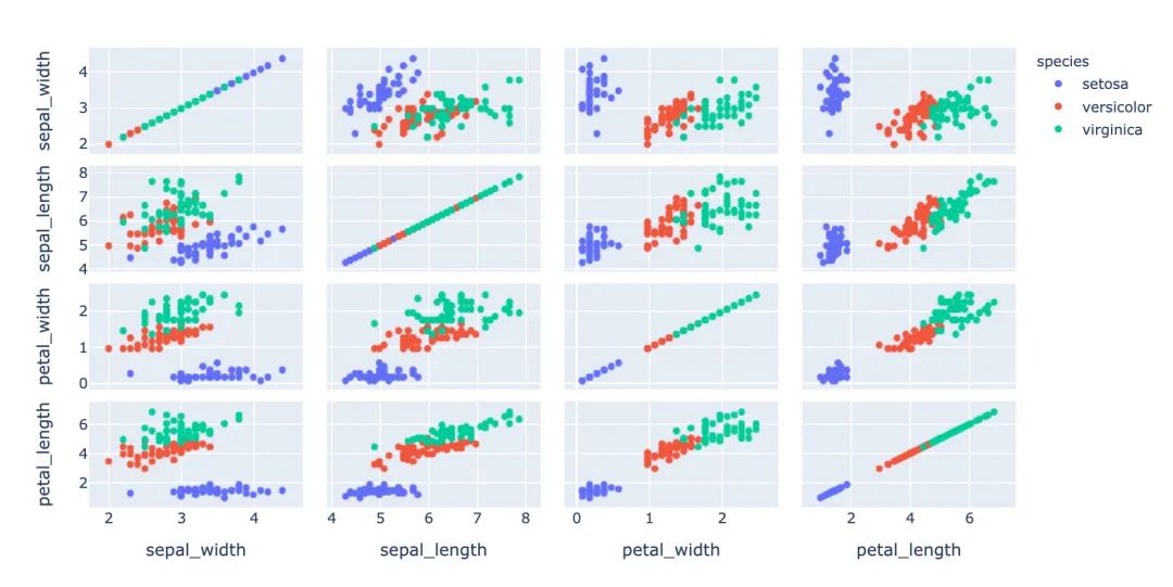
3.8 散点矩阵图
1px.scatter_matrix(
2  iris,  # 数据
3  dimensions=["sepal_width","sepal_length","petal_width","petal_length"],  # 维度选择
4  color="species")  # 颜色
5
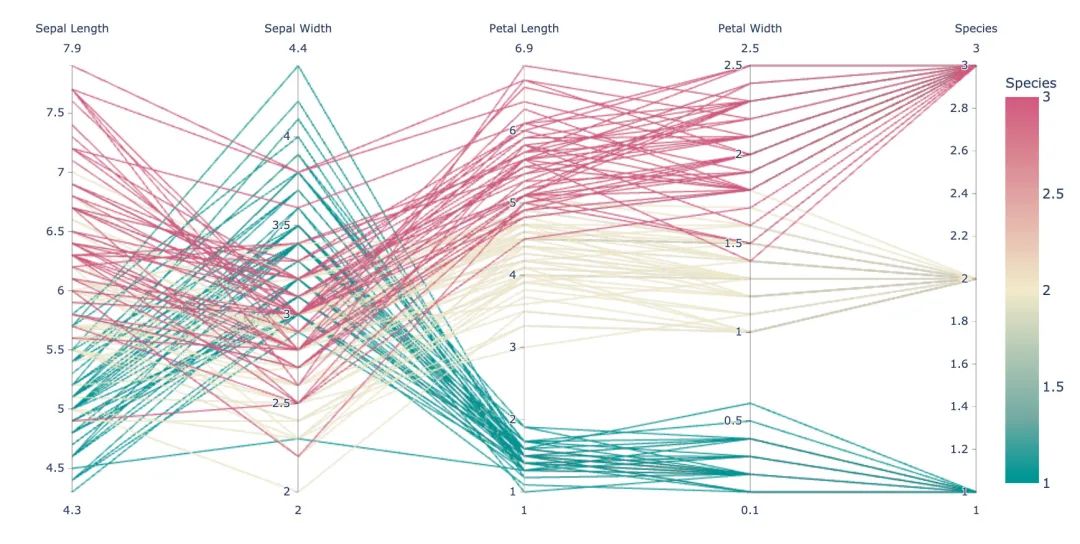
3.9 平行坐标图
1px.parallel_coordinates(
2  iris,   # 数据集
3  color="species_id",  # 颜色
4  labels={"species_id":"Species",  # 各种标签值
5          "sepal_width":"Sepal Width",
6          "sepal_length":"Sepal Length",
7          "petal_length":"Petal Length",
8          "petal_width":"Petal Width"},
9  color_continuous_scale=px.colors.diverging.Tealrose,
10  color_continuous_midpoint=2)
11
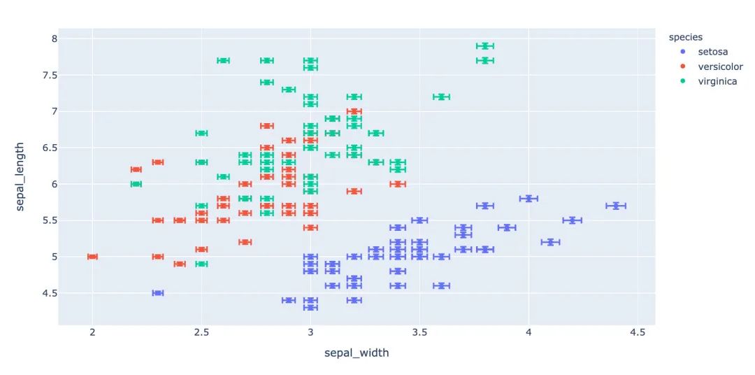
3.10 箱体误差图
1# 对当前值加上下两个误差值
2iris["e"] = iris["sepal_width"] / 100
3px.scatter(
4  iris,  # 绘图数据集
5  x="sepal_width",  # 横坐标
6  y="sepal_length",  # 纵坐标
7  color="species",  # 颜色值
8  error_x="e",  # 横轴误差
9  error_y="e"  # 纵轴误差
10          )
11
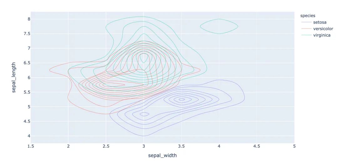
3.11 等高线图
等高线图反映数据的密度情况:
1px.density_contour(
2  iris,  # 绘图数据集
3  x="sepal_width",  # 横坐标
4  y="sepal_length",  # 纵坐标值
5  color="species"  # 颜色
6)
7
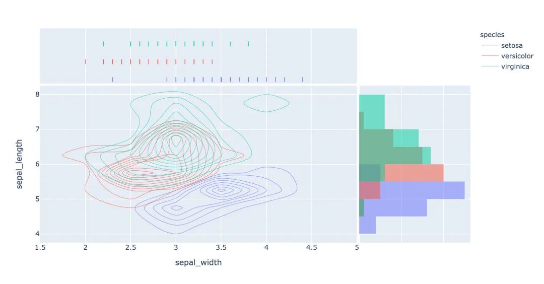
等高线图和直方图的俩和使用:
1px.density_contour(
2  iris, # 数据集
3  x="sepal_width",  # 横坐标值
4  y="sepal_length",  # 纵坐标值
5  color="species",  # 颜色
6  marginal_x="rug",  # 横轴为线条图
7  marginal_y="histogram"   # 纵轴为直方图
8                  )
9
3.12 密度热力图
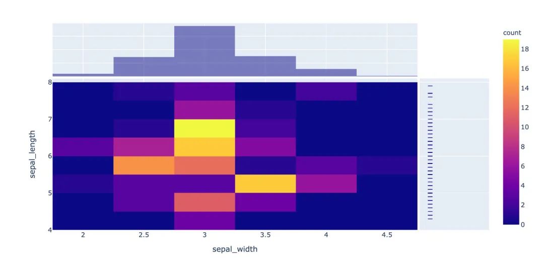
1px.density_heatmap(
2  iris,  # 数据集
3  x="sepal_width",   # 横坐标值
4  y="sepal_length",  # 纵坐标值
5  marginal_y="rug",  # 纵坐标值为线型图
6  marginal_x="histogram"  # 直方图
7                  )
8
3.13 并行类别图
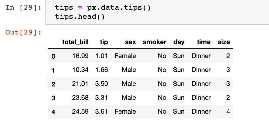
在接下来的图形中我们使用的小费tips实例,首先是导入数据:
1fig = px.parallel_categories(
2  tips,  # 数据集
3  color="size",  # 颜色
4  color_continuous_scale=px.colors.sequential.Inferno)  # 颜色变化取值
5fig.show()
6
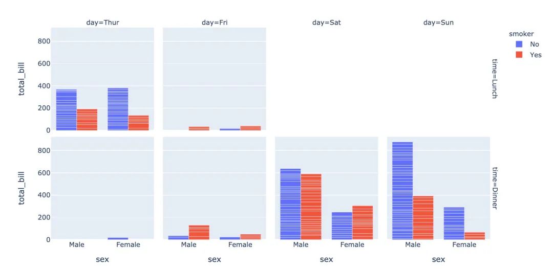
3.14 柱状图
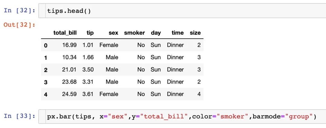
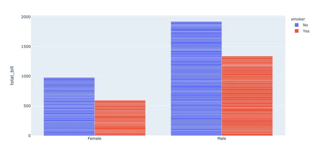
1fig = px.bar(
2  tips,  # 数据集
3  x="sex",  # 横轴
4  y="total_bill",  # 纵轴
5  color="smoker",  # 颜色参数取值
6  barmode="group",  # 柱状图模式取值
7  facet_row="time",  # 行取值
8  facet_col="day",  # 列元素取值
9  category_orders={
10    "day": ["Thur","Fri","Sat","Sun"],  # 分类顺序
11    "time":["Lunch", "Dinner"]})
12fig.show()
13
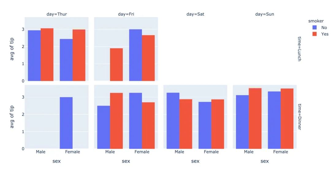
3.15 直方图
1fig = px.histogram(
2  tips,  # 绘图数据集
3  x="sex",  # 横轴为性别
4  y="tip",  # 纵轴为费用
5  histfunc="avg",  # 直方图显示的函数
6  color="smoker",  # 颜色
7  barmode="group",  # 柱状图模式
8  facet_row="time",  # 行取值
9  facet_col="day",   # 列取值
10  category_orders={  # 分类顺序
11    "day":["Thur","Fri","Sat","Sun"],
12    "time":["Lunch","Dinner"]}
13)
14
15fig.show()
16
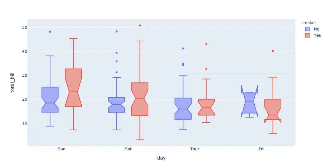
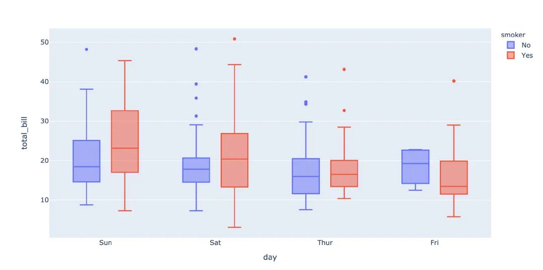
3.16 箱型图
箱型图也是现实数据的误差和分布情况:
1# notched=True显示连接处的锥形部分
2px.box(tips,  # 数据集
3       x="day",  # 横轴数据
4       y="total_bill",  # 纵轴数据
5       color="smoker",  # 颜色
6       notched=True)  # 连接处的锥形部分显示出来
7
1px.box(
2  tips,  # 数据集
3  x="day",  # 横轴
4 y="total_bill",  # 纵轴
5 color="smoker",  # 颜色
6#         notched=True   # 隐藏参数
7      )
8
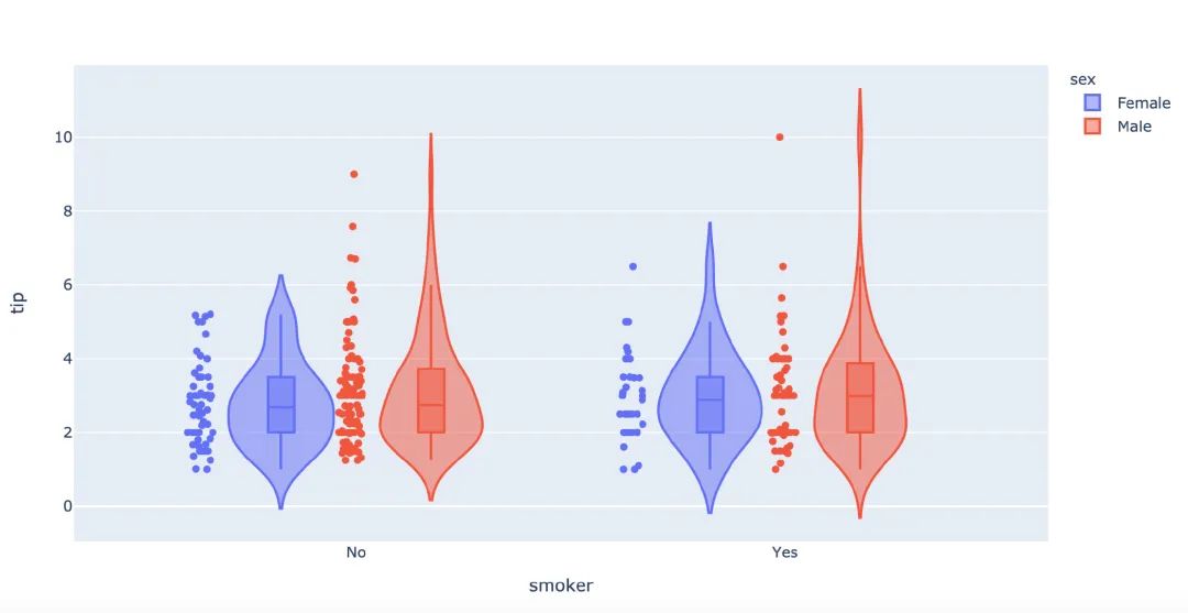
再来画一次小提琴图:
1px.violin(
2    tips,   # 数据集
3    x="smoker",  # 横轴坐标
4    y="tip",  # 纵轴坐标
5    color="sex",   # 颜色参数取值
6    box=True,   # box是显示内部的箱体
7    points="all",  # 同时显示数值点
8    hover_data=tips.columns)  # 结果中显示全部数据
9
3.17 极坐标图
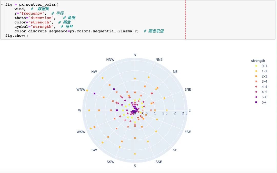
在这里我们使用的是内置的wind数据:
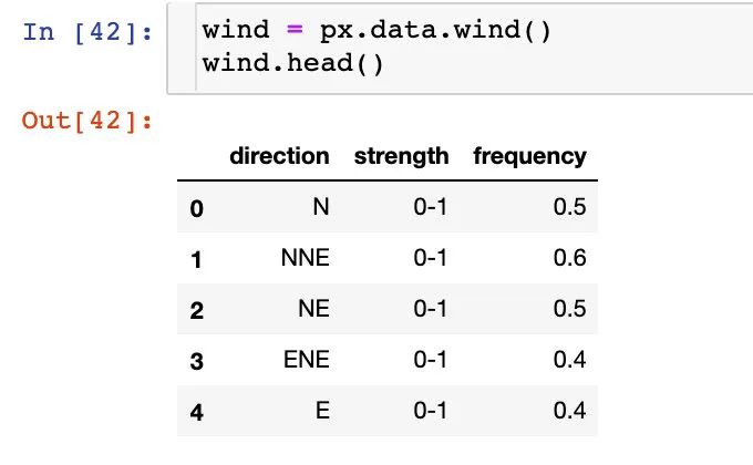
散点极坐标图
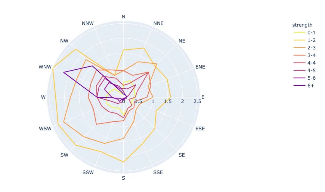
线性极坐标图
1fig = px.line_polar(
2    wind,  # 数据集
3    r="frequency",  # 半径
4    theta="direction",  # 角度
5    color="strength",  # 颜色
6    line_close=True,  # 线性闭合
7    color_discrete_sequence=px.colors.sequential.Plasma_r)  # 颜色变化
8fig.show()
9
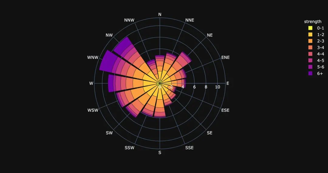
柱状极坐标图
1fig = px.bar_polar(
2    wind,   # 数据集
3    r="frequency",   # 半径
4    theta="direction",  # 角度
5    color="strength",  # 颜色
6    template="plotly_dark",  # 主题
7    color_discrete_sequence=px.colors.sequential.Plasma_r)  # 颜色变化
8fig.show()
9
4. 颜色面板
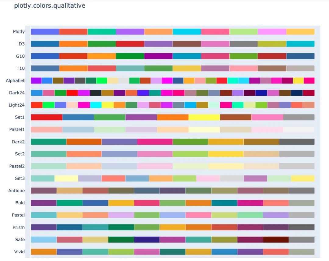
在px中有很多的颜色可以供选择,提供了一个颜色面板:
1px.colors.qualitative.swatches()
2
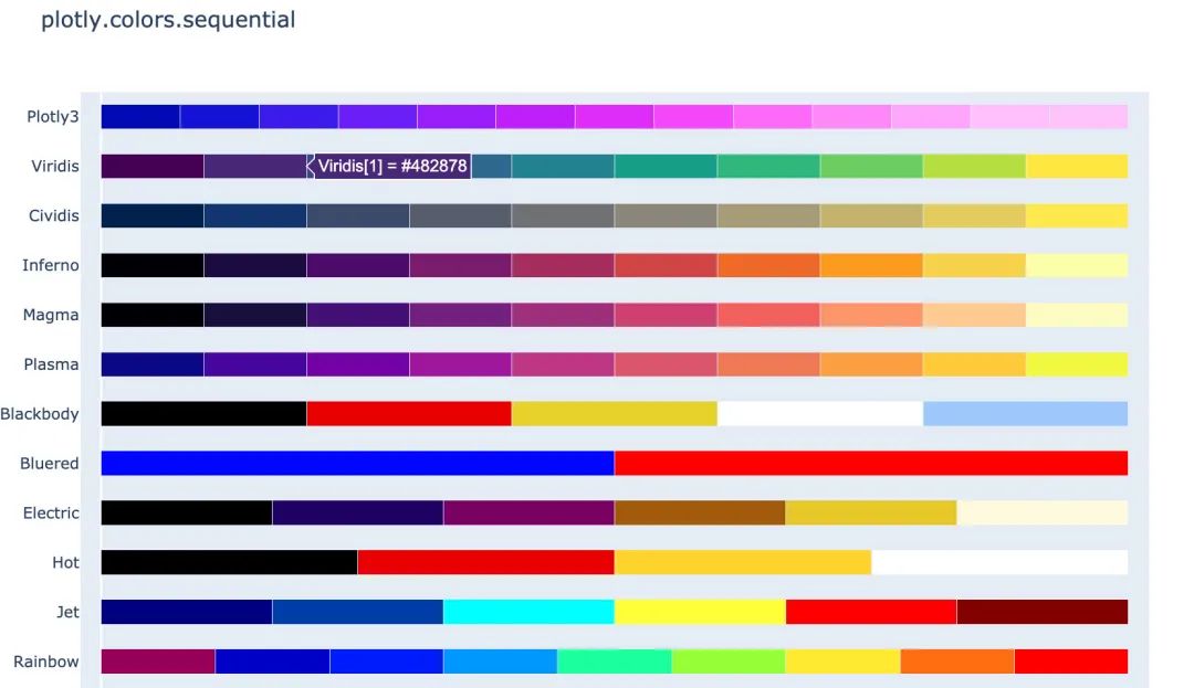
1px.colors.sequential.swatches()
2
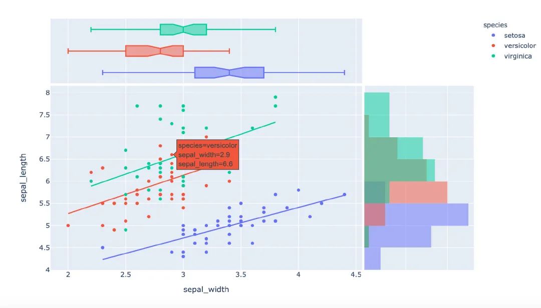
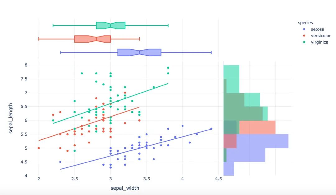
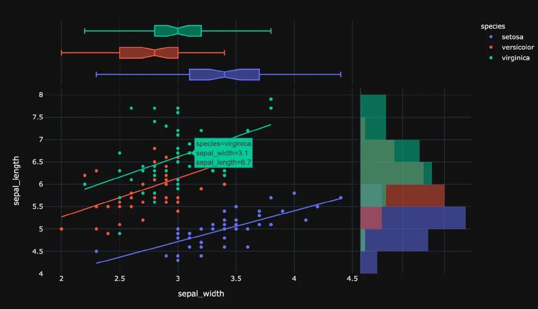
5. 主题
px中存在3种主题:
-
plotly
-
plotly_white
-
plotly_dark
1px.scatter(
2    iris,  # 数据集
3    x="sepal_width",  # 横坐标值
4    y="sepal_length",  # 纵坐标取值
5    color="species",  # 颜色
6    marginal_x="box",  # 横坐标为箱型图
7    marginal_y="histogram",  # 纵坐标为直方图
8    height=600,  # 高度
9    trendline="ols",  # 显示趋势线
10    template="plotly")  # 主题
11
1px.scatter(
2    iris,  # 数据集
3    x="sepal_width",  # 横坐标值
4    y="sepal_length",  # 纵坐标取值
5    color="species",  # 颜色
6    marginal_x="box",  # 横坐标为箱型图
7    marginal_y="histogram",  # 纵坐标为直方图
8    height=600,  # 高度
9    trendline="ols",  # 显示趋势线
10    template="plotly_white")  # 主题
1px.scatter(
2    iris,  # 数据集
3    x="sepal_width",  # 横坐标值
4    y="sepal_length",  # 纵坐标取值
5    color="species",  # 颜色
6    marginal_x="box",  # 横坐标为箱型图
7    marginal_y="histogram",  # 纵坐标为直方图
8    height=600,  # 高度
9    trendline="ols",  # 显示趋势线
10    template="plotly_dark")  # 主题
6. 总结一下
本文中利用大量的篇幅讲解了如何通过plotly_express来绘制:柱状图、线型图、散点图、小提琴图、极坐标图等各种常见的图形。通过观察上面Plotly_express绘制图形过程,我们不难发现它有三个主要的优点:
-
快速出图,少量的代码就能满足多数的制图要求。基本上都是几个参数的设置我们就能快速出图
-
图形漂亮,绘制出来的可视化图形颜色亮丽,也有很多的颜色供选择。
-
图形是动态可视化的。文章中图形都是截图,如果是在
Jupyter notebook中都是动态图形
希望通过本文的讲解能够帮助堵住快速入门plotly_express可视化神器。
-------------------********************************** End **********-------------**-----********-**********************************
往期精彩文章推荐:
 欢迎各位大佬点击链接加入群聊【helloworld开发者社区】:https://jq.qq.com/?_wv=1027&k=mBlk6nzX进群交流IT技术热点。
本文转自 https://mp.weixin.qq.com/s/S6DuP-zp7YmF4Tt1hzz3TQ,如有侵权,请联系删除。