
今天我们来复盘一下前端中css伪元素的知识以及如何用css伪元素来减轻javascript的压力,做出一些脑洞大开的图形。

预备知识
伪元素
伪元素是一个附加至选择器末的关键词,允许你对被选择元素的特定部分修改样式。伪元素主要有:
- ::first-letter 第一个字母的样式
- ::first-line 首行文字的样式
- ::before 元素头部添加的修饰
- ::after 元素尾部添加的修饰
- ::placeholder input的占位符样式
- ::selection 被选中元素的样式
我个人觉得伪元素可以解释为元素的修饰,可以为元素带来额外的附加样式,属于额外的文档结构。
伪类
用来表示无法在CSS中轻松或者可靠检测到的某个元素的状态或属性,比如a标签的hover表示鼠标经过的样式,visited表示访问过的链接的样式,更多的用来描述元素状态变化时的样式,伪类主要有:
- :link
- :visited
- :hover
- :active
- :focus
- :lang(fr)
- :not(s)
- :root
- :first-child
- :last-child
- :only-child
- :nth-child(n)
- :nth-last-child(n)
- :first-of-type
- :last-of-type
- :only-of-type
- :nth-of-type(n)
- :nth-last-of-type(n)
- :empty
- :checked
- :enabled
- :disabled
- :target
我们利用css伪类和伪元素可以实现很多强大的视觉效果,这里我主要介绍伪元素,如果对伪类或其他css特性感兴趣,可以看看我之前的css文章,写的很全面:
正文
先看看我们用纯css实现的图标库:


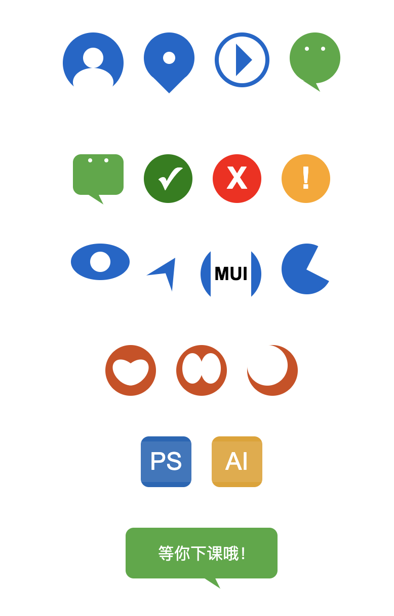 当然,如果我们知道了做出如上图标的css原理,那么我们就可以实现更加丰富复杂的图形,甚至可以打造自己的图标库。
接下来我会介绍实现如上图标的方式和方法,并给出部分源码,方便大家学习。
原理
我们实现如上css图标是基于伪元素的,可以利用伪元素的::before和::after和content属性来为元素添加额外视觉效果,我们在上文中也介绍了伪元素的概念和类型,接下来让我们来实现它吧~
实现箭头
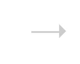 思路其实就是利用元素的::before伪元素画一个三角形,用css设置span样式为一条线并进行布局定位:
1// less
2.arrow {
3    position: relative;
4    display: inline-block;
5    line-height: 0;
6    background-color: #ccc;
7    &.arrow-hor {
8        width: 16px;
9        height: 1px;
10    }
11    &.arrow-hor.right::before {
12        content: '';
13        position: absolute;
14        top: -4px;
15        right: -8px;
16        border: 4px solid transparent;
17        border-left: 4px solid #ccc;
18    }
19}
20
21// html
22<span class="arrow arrow-hor right"></span>
这样就实现了一个指向右的箭头,我们用类似的方法也可以实现左箭头,上下箭头,实现双向箭头只需要加一个::after伪类并做适当定位就好了。
实现搜索图标
 实现搜索图标实际上只需要一个圆和一根线,然后我们会用transform:ratate来实现角度倾斜,具体实现如下:
1// less
2.search {
3    position: relative;
4    display: inline-block;
5    width: 12px;
6    height: 12px;
7    border-radius: 50%;
8    border: 1px solid #ccc;
9    text-align: center;
10    transform: rotate(-45deg);
11    &::after {
12        content: '';
13        display: inline-block;
14        width: 1px;
15        height: 4px;
16        background-color: #ccc;
17    }
18}
19// html
20<span class="search"></span>
实现头像
 实现头像我们要利用before和after伪元素,分别做人物头部和身体,身体我们会用css画一个椭圆来做:
1// less
2.dot-pan {
3    position: relative;
4    display: inline-flex;
5    width: 60px;
6    height: 60px;
7    line-height: 0;
8    align-items: center;
9    border-radius: 50%;
10    background-color: #06c;
11    transform: rotate(-90deg);
12    &::before {
13        content: '';
14        display: inline-block;
15        width: 28px;
16        height: 40px;
17        margin-left: -3px;
18        border-radius: 50% 50%;
19        flex-shrink: 0;
20        background-color: #fff;
21    }
22
23    &::after {
24        content: '';
25        display: inline-block;
26        width: 20px;
27        height: 20px;
28        flex-shrink: 0;
29        border-radius: 50%;
30        background-color: #fff;
31    }
32}
33// html
34<span class="search"></span>
实现地点图标
 地点图标由一个圆和一个三角形组成,如果要做的精致一点,我们可以再用一个伪元素来做一个定点:
1// less
2.locate-icon {
3    position: relative;
4    display: inline-block;
5    width: 50px;
6    height: 50px;
7    border-radius: 50%;
8    background-color: #06c;
9    &::before {
10        content: '';
11        position: absolute;
12        display: inline-block;
13        width: 12px;
14        height: 12px;
15        border-radius: 50%;
16        left: 50%;
17        top: 50%;
18        transform: translate(-50%, -50%);
19        background-color: #fff;
20    }
21    &::after {
22        content: '';
23        margin-top: 45px;
24        display: inline-block;
25        border: 15px solid transparent;
26        border-top-color: #06c;
27    }
28}
29// html
30<span class="locate-icon mr-20"></span>
实现微信图标
 图中2个眼睛主要是用到一个伪元素加上box-shadow来实现,这样可以节约一个伪元素用来做小尾巴,至于如何实现不同形状的三角形,如果有不懂的可以和我交流,具体实现如下:
1// less
2.wechat-icon {
3    display: inline-block;
4    width: 50px;
5    height: 50px;
6    border-radius: 50%;
7    background-color: rgb(68, 170, 59);
8    &::before {
9        content: '';
10        margin-top: 14px;
11        position: absolute;
12        width: 4px;
13        height: 4px;
14        border-radius: 50%;
15        background-color: #fff;
16        box-shadow: 16px 0 0 #fff;
17    }
18    &::after {
19        content: '';
20        margin-top: 42px;
21        display: inline-block;
22        border-width: 6px 10px 6px 10px;
23        border-style: solid;
24        border-color: transparent;
25        border-top-color: rgb(68, 170, 59);
26        transform: rotate(-147deg);
27    }
28}
29// html
30<span class="wechat-icon mr-20"></span>
实现对勾图标
 这里也很简单,我们用伪元素的content里放置一个勾号,然后设置颜色大小就好啦:
1// less
2.yes-icon {
3    display: inline-flex;
4    justify-content: center;
5    align-items: center;
6    width: 48px;
7    height: 48px;
8    background-color: green;
9    border-radius: 50%;
10    &::after {
11        content: '✓';
12        color: #fff;
13        font-size: 30px;
14        font-weight: bold;
15    }
16}
17// html
18<span class="yes-icon mr-20"></span>
实现眼睛(一般用于网站访问量图标)
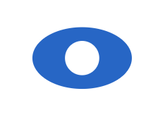 主要是做椭圆加上一个圆形的伪元素:
1.view-icon {
2    display: inline-flex;
3    justify-content: center;
4    align-items: center;
5    width: 58px;
6    height: 36px;
7    background-color: #06c;
8    border-radius: 50%;
9    &::after {
10        content: '';
11        display: inline-block;
12        width: 20px;
13        height: 20px;
14        border-radius: 50%;
15        background-color: #fff;
16    }
17}
导航图标
 原理类似,主要思想是画两个三较形,用伪元素的三角形遮住主元素底部即可:
1.gps-icon {
2    position: relative;
3    display: inline-flex;
4    justify-content: center;
5    align-items: center;
6    border-width: 30px 15px 30px 15px;
7    border-color: transparent;
8    border-style: solid;
9    border-bottom-color: #06c;
10    transform: translate(10px, -16px) rotate(32deg);
11    &::after {
12        position: absolute;
13        bottom: -48px;
14        content: '';
15        display: inline-block;
16        border-width: 10px 38px 30px 38px;
17        border-color: transparent;
18        border-style: solid;
19        border-bottom-color: #fff;
20    }
21}
实现心形图标
 原理就是用两个伪元素实现两个椭圆,旋转重合即可:
1.logo-x {
2    position: relative;
3    display: inline-flex;
4    width: 50px;
5    height: 50px;
6    border-radius: 50%;
7    background-color: rgb(212, 73, 17);
8    &::after {
9        position: absolute;
10        content: '';
11        left: 10px;
12        top: 12px;
13        display: inline-block;
14        width: 20px;
15        height: 30px;
16        border-radius: 50%;
17        background-color: #fff;
18        transform: rotate(135deg);
19    }
20    &::before {
21        position: absolute;
22        content: '';
23        right: 10px;
24        top: 12px;
25        display: inline-block;
26        width: 20px;
27        height: 30px;
28        border-radius: 50%;
29        background-color: #fff;
30        transform: rotate(-135deg);
31    }
32}
ps图标
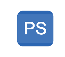 这个也是用伪元素,一个伪元素用来做文字图形,一个用来做遮罩,来形成伪立体感:
1.logo-ps {
2    position: relative;
3    display: inline-flex;
4    justify-content: center;
5    align-items: center;
6    width: 50px;
7    height: 50px;
8    border-radius: 8px;
9    background-color: rgb(15, 102, 184);
10    &::before {
11        position: absolute;
12        content: '';
13        display: inline-block;
14        width: 50px;
15        height: 40px;
16        background-color: rgba(255, 255, 255, .1);
17    }
18    &::after {
19        position: absolute;
20        content: 'PS';
21        font-size: 24px;
22        display: inline-block;
23        color: #fff;
24    }
25}
实现气泡对话框
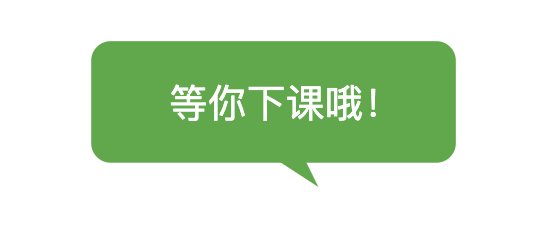 和微信图标类似:
1.logo-pp {
2    display: inline-block;
3    width: 150px;
4    height: 50px;
5    border-radius: 8px;
6    background-color: rgb(68, 170, 59);
7    &::before {
8        content: '等你下课哦!';
9        margin-top: 14px;
10        margin-left: -33px;
11        position: absolute;
12        color: #fff;
13    }
14    &::after {
15        content: '';
16        margin-top: 42px;
17        display: inline-block;
18        border-width: 6px 10px 6px 10px;
19        border-style: solid;
20        border-color: transparent;
21        border-top-color: rgb(68, 170, 59);
22        transform: rotate(-147deg) translate(-12px, 6px);
23    }
24}
由于篇幅原因,其他的图标就不一一实现了,原理都类似,笔者之前曾利用这个方案做过一套100个图标的库,成功应用于各个项目中,由于体积小不会造成额外请求,所以更加实用,但更复杂的图形就为了方便还是建议用字体图标或者svg,base64等。
最后
如果想了解更多css,javascript,nodeJS等前端知识和实战,欢迎在公众号《趣谈前端》加入我们一起学习讨论,共同探索前端的边界。

更多推荐
- 快速掌握es6+新特性及es6核心语法盘点
- 基于nodeJS从0到1实现一个CMS全栈项目(上)
- 基于nodeJS从0到1实现一个CMS全栈项目(中)
- 基于nodeJS从0到1实现一个CMS全栈项目(下)
- 基于nodeJS从0到1实现一个CMS全栈项目的服务端启动细节
- 《javascript高级程序设计》核心知识总结
- 用css3实现惊艳面试官的背景即背景动画(高级附源码)
- 记一次老项目中的跨页面通信问题和前端实现文件下载功能
- 5分钟教你用nodeJS手写一个mock数据服务器
- JavaScript 中的二叉树以及二叉搜索树的实现及应用
- 用 JavaScript 和 C3 实现一个转盘小游戏
- 教你用200行代码写一个爱豆拼拼乐H5小游戏(附源码)
- 基于react/vue生态的前端集成解决方案探索与总结
- 如何用不到200行代码写一款属于自己的js类库)
- 一张图教你快速玩转vue-cli3
- 3分钟教你用原生js实现具有进度监听的文件上传预览组件
- 使用Angular8和百度地图api开发《旅游清单》
- js基本搜索算法实现与170万条数据下的性能测试
- 《前端算法系列》如何让前端代码速度提高60倍
- vue高级进阶系列——用typescript玩转vue和vuex