
本文的文字及图片来源于网络,仅供学习、交流使用,不具有任何商业用途,如有问题请及时联系我们以作处理。
作者:godweiyang
来源:算法码上来
Python爬虫、数据分析、网站开发等案例教程视频免费在线观看
https://space.bilibili.com/523606542

有很多很牛b的作图教程,我也学不来,就扔给大家自己学吧:
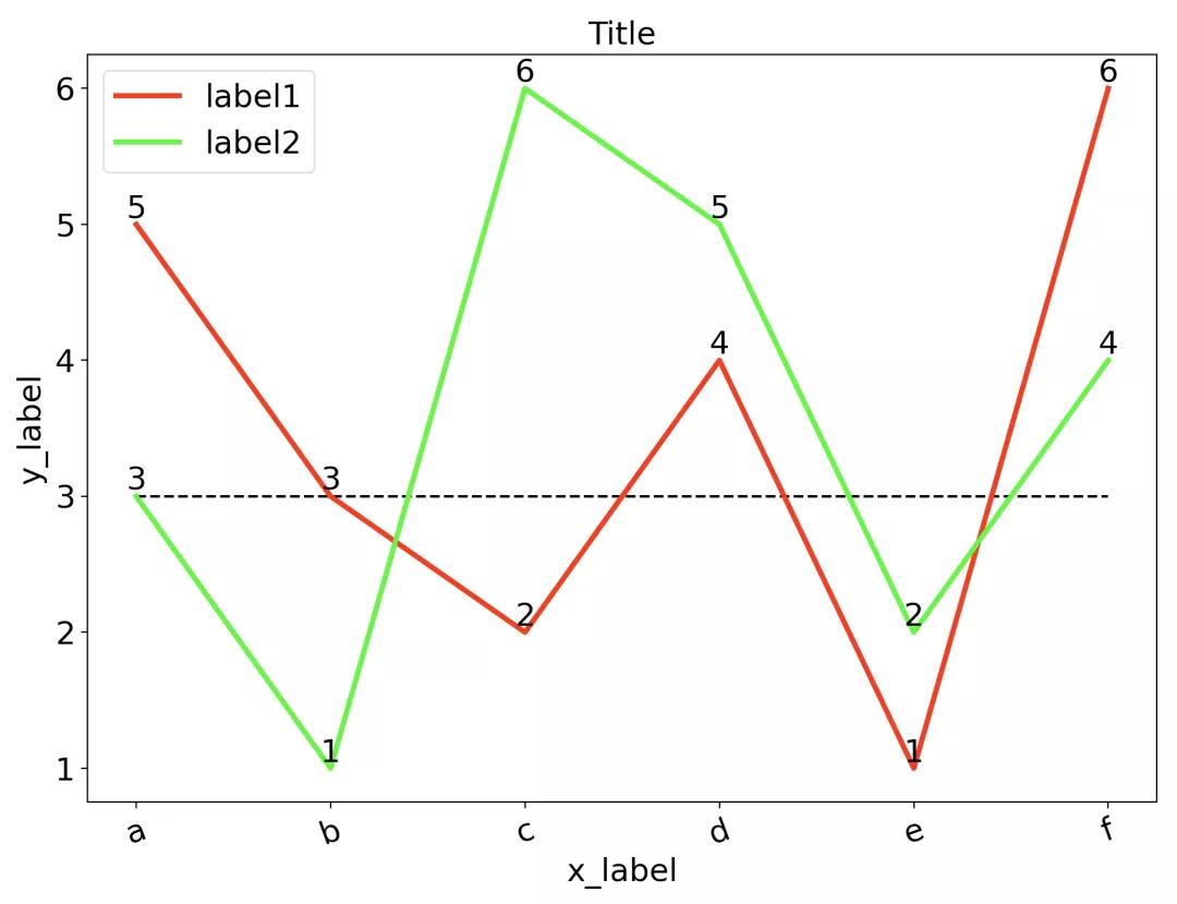
折线图
代码
1import numpy as np
2import matplotlib.pyplot as plt
3
4# x轴刻度标签
5x_ticks = ['a', 'b', 'c', 'd', 'e', 'f']
6# x轴范围(0, 1, ..., len(x_ticks)-1)
7x = np.arange(len(x_ticks))
8# 第1条折线数据
9y1 = [5, 3, 2, 4, 1, 6]
10# 第2条折线数据
11y2 = [3, 1, 6, 5, 2, 4]
12
13# 设置画布大小
14plt.figure(figsize=(10, 6))
15# 画第1条折线,参数看名字就懂,还可以自定义数据点样式等等。
16plt.plot(x, y1, color='#FF0000', label='label1', linewidth=3.0)
17# 画第2条折线
18plt.plot(x, y2, color='#00FF00', label='label2', linewidth=3.0)
19
20# 给第1条折线数据点加上数值,前两个参数是坐标,第三个是数值,ha和va分别是水平和垂直位置(数据点相对数值)。
21for a, b in zip(x, y1):
22    plt.text(a, b, '%d'%b, ha='center', va= 'bottom', fontsize=18)
23# 给第2条折线数据点加上数值
24for a, b in zip(x, y2):
25    plt.text(a, b, '%d'%b, ha='center', va= 'bottom', fontsize=18)
26
27# 画水平横线,参数分别表示在y=3,x=0~len(x)-1处画直线。
28plt.hlines(3, 0, len(x)-1, colors = "#000000", linestyles = "dashed")
29
30# 添加x轴和y轴刻度标签
31plt.xticks([r for r in x], x_ticks, fontsize=18, rotation=20)
32plt.yticks(fontsize=18)
33
34# 添加x轴和y轴标签
35plt.xlabel(u'x_label', fontsize=18)
36plt.ylabel(u'y_label', fontsize=18)
37
38# 标题
39plt.title(u'Title', fontsize=18)
40
41# 图例
42plt.legend(fontsize=18)
43
44# 保存图片
45plt.savefig('./figure.pdf', bbox_inches='tight')
46# 显示图片
47plt.show()
效果
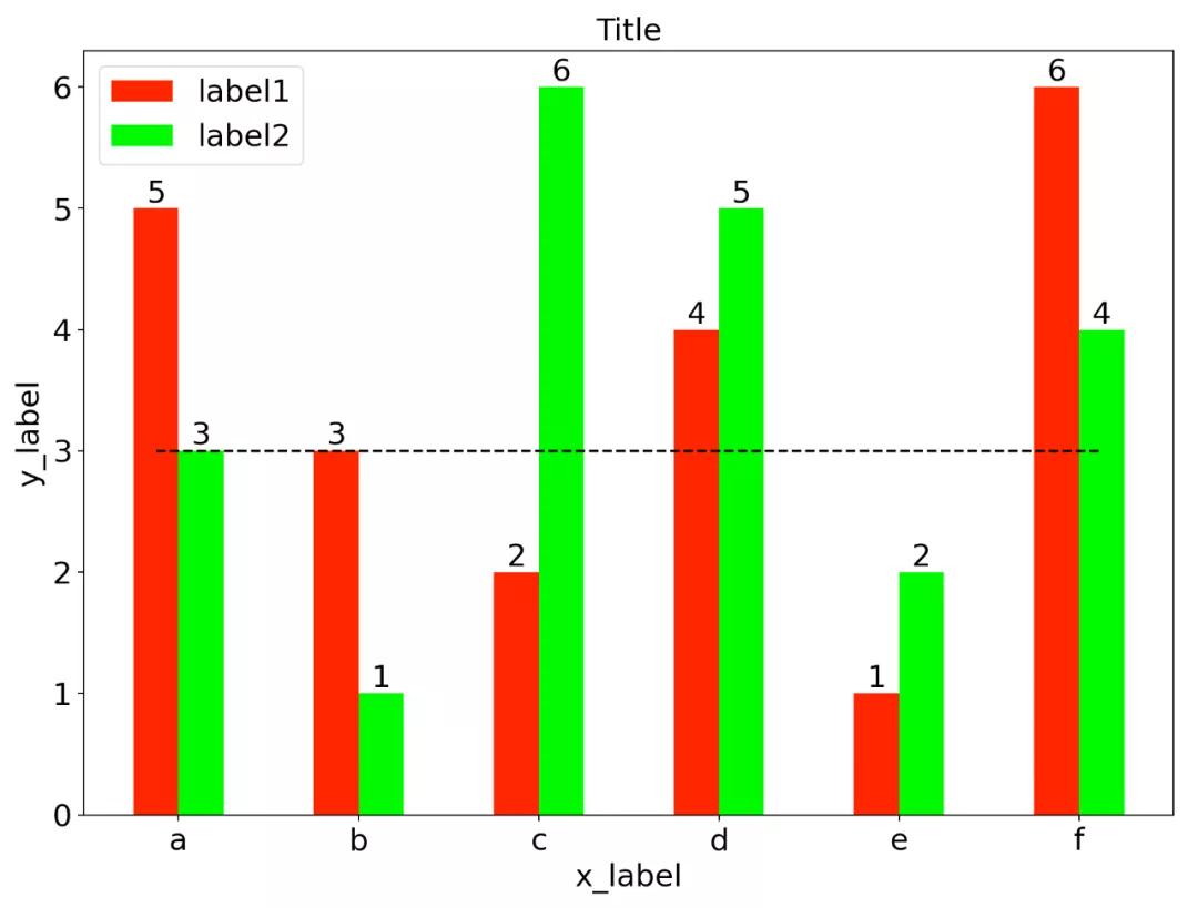
柱状图
代码
1import numpy as np
2import matplotlib.pyplot as plt
3
4# x轴刻度标签
5x_ticks = ['a', 'b', 'c', 'd', 'e', 'f']
6# 柱的宽度
7barWidth = 0.25
8# 第1个柱的x轴范围(每个柱子的中点)(0, 1, ..., len(x_ticks)-1)
9x1 = np.arange(len(x_ticks))
10# 第2个柱的x轴范围(每个柱子的中点)
11x2 = [x + barWidth for x in x1]
12# 第1个柱数据
13y1 = [5, 3, 2, 4, 1, 6]
14# 第2个柱数据
15y2 = [3, 1, 6, 5, 2, 4]
16
17# 设置画布大小
18plt.figure(figsize=(10, 6))
19# 画第1个柱
20plt.bar(x1, y1, color='#FF0000', width=barWidth, label='label1')
21# 画第2个柱
22plt.bar(x2, y2, color='#00FF00', width=barWidth, label='label2')
23
24# 给第1个柱数据点加上数值,前两个参数是坐标,第三个是数值,ha和va分别是水平和垂直位置(数据点相对数值)。
25for a, b in zip(x1, y1):
26    plt.text(a, b, '%d'%b, ha='center', va= 'bottom', fontsize=18)
27# 给第2个柱数据点加上数值
28for a, b in zip(x2, y2):
29    plt.text(a, b, '%d'%b, ha='center', va= 'bottom', fontsize=18)
30
31# 画水平横线
32plt.hlines(3, 0, len(x_ticks)-1+barWidth, colors = "#000000", linestyles = "dashed")
33
34# 添加x轴和y轴刻度标签
35plt.xticks([r + barWidth/2 for r in x1], x_ticks, fontsize=18)
36plt.yticks(fontsize=18)
37
38# 添加x轴和y轴标签
39plt.xlabel(u'x_label', fontsize=18)
40plt.ylabel(u'y_label', fontsize=18)
41
42# 标题
43plt.title(u'Title', fontsize=18)
44
45# 图例
46plt.legend(fontsize=18)
47
48# 保存图片
49plt.savefig('./figure.pdf', bbox_inches='tight')
50# 显示图片
51plt.show()
效果
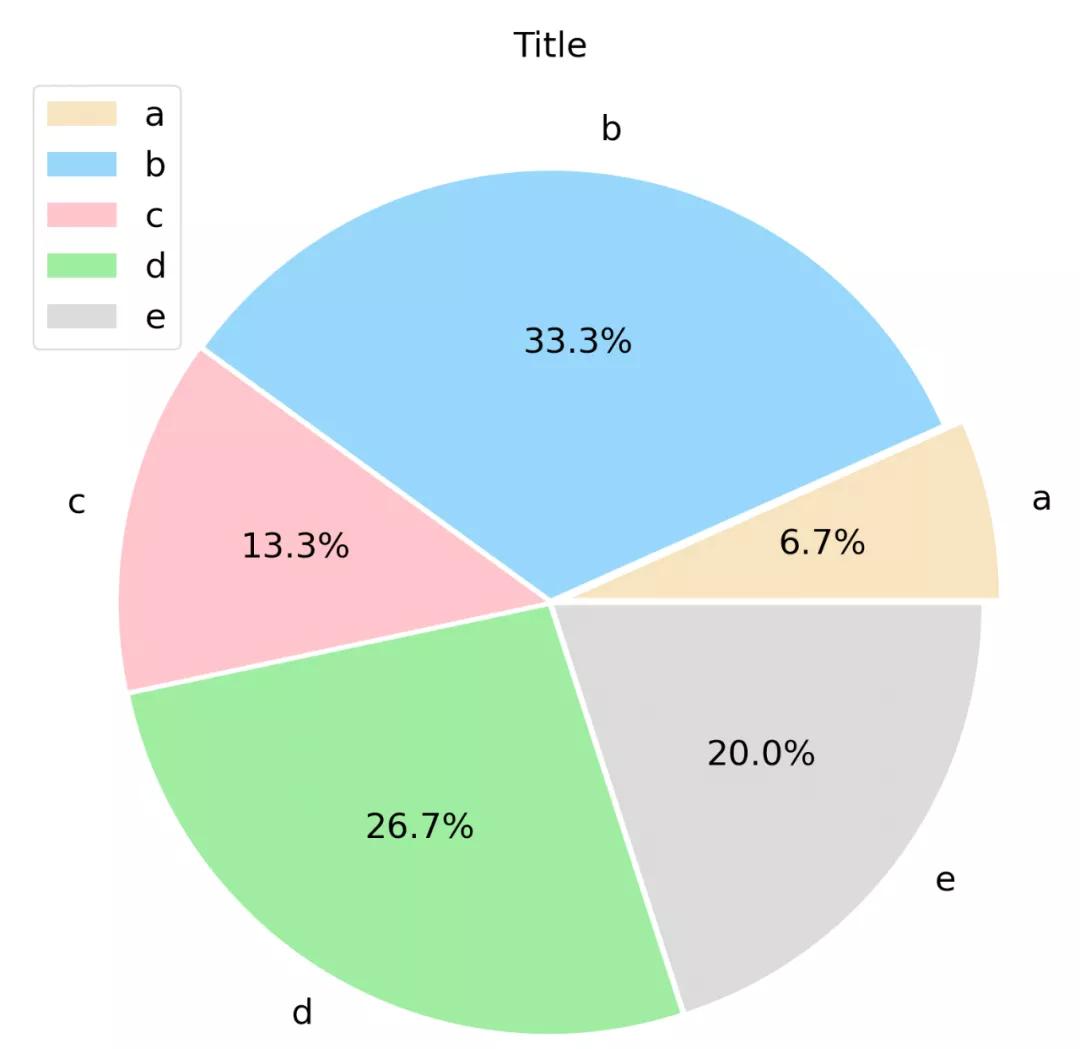
饼图
代码
1import numpy as np
2import matplotlib.pyplot as plt
3
4# 设置画布大小
5plt.figure(figsize=(10, 10))
6# 设置每块区域的标签
7labels = ['a', 'b', 'c', 'd', 'e']
8# 设置每块区域离圆心的距离,这里a区域凸出一点点
9explode = [0.05, 0.01, 0.01, 0.01, 0.01]
10# 设置每块区域的值
11values = [1, 5, 2, 4, 3]
12# 设置每块区域的颜色
13colors = ['#F5DEB3', '#87CEFA', '#FFB6C1', '#90EE90', '#D3D3D3']
14
15_, l_text, p_text = plt.pie(values, explode=explode, labels=labels, autopct='%1.1f%%', colors=colors)
16
17# 设置标签字体大小
18for t in l_text:
19    t.set_size(18)
20# 设置数值字体大小
21for t in p_text:
22    t.set_size(18)
23
24# 标题
25plt.title(u'Title', fontsize=18)
26
27# 图例
28plt.legend(fontsize=18)
29
30# 保存图片
31plt.savefig('./figure.pdf', bbox_inches='tight')
32# 显示图片
33plt.show()
效果
本文同步分享在 博客“松鼠爱吃饼干”(CSDN)。
如有侵权,请联系 support@oschina.cn 删除。
本文参与“OSC源创计划”,欢迎正在阅读的你也加入,一起分享。