
序言:总结一些常用CSS样式,方便以后使用
目录
- 一、多次调用单箭头
- 二、旋转边框直接绘制双箭头
一、多次调用单箭头
上文介绍2种实现单箭头的方式: 边框旋转、双三角覆盖。这次以边框旋转为例多次调用实现双箭头
1、边框旋转单箭头实现
1.arrow-right{
2  height: 120px;
3  width: 30px;
4  display :inline-block;
5  position: relative;
6}
7.arrow-right::after {
8  content: "";
9  height: 60px;
10  width: 60px;
11  top: 12px;
12  border-width: 8px 8px 0 0;
13  border-color: blue;
14  border-style: solid;
15  transform: matrix(0.71, 0.71, -0.71, 0.71, 0, 0);
16  position: absolute;
17}
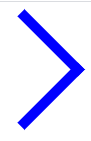
效果图如下:
2、多次使用单箭头
1<div>
2	<span class="arrow-right"/>
3    <span class="arrow-right"/>
4</div>
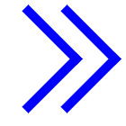
效果图如下:
二、旋转边框直接绘制双箭头
之前通过::after伪元素绘制单箭头,现在再加上::before伪元素再绘制一个单箭头就实现纯CSS绘制双箭头了
1.arrow-right{
2  height: 120px;
3  width: 30px;
4  display :inline-block;
5  position: relative;
6}
7.arrow-right::before {
8  content: "";
9  height: 60px;
10  width: 60px;
11  top: 12px;
12  left: 30px;
13  border-width: 8px 8px 0 0;
14  border-color: blue;
15  border-style: solid;
16  transform: matrix(0.71, 0.71, -0.71, 0.71, 0, 0);
17  position: absolute;
18}
19.arrow-right::after {
20  content: "";
21  height: 60px;
22  width: 60px;
23  top: 12px;
24  border-width: 8px 8px 0 0;
25  border-color: blue;
26  border-style: solid;
27  transform: matrix(0.71, 0.71, -0.71, 0.71, 0, 0);
28  position: absolute;
29}
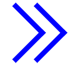
效果图如下:
双三角覆盖这种方式也能直接绘制双箭头,但是实现比较麻烦,不如边框旋转方式好实现就不讲了,请大家多多指教,能get到知识点不要忘了关注点个赞~