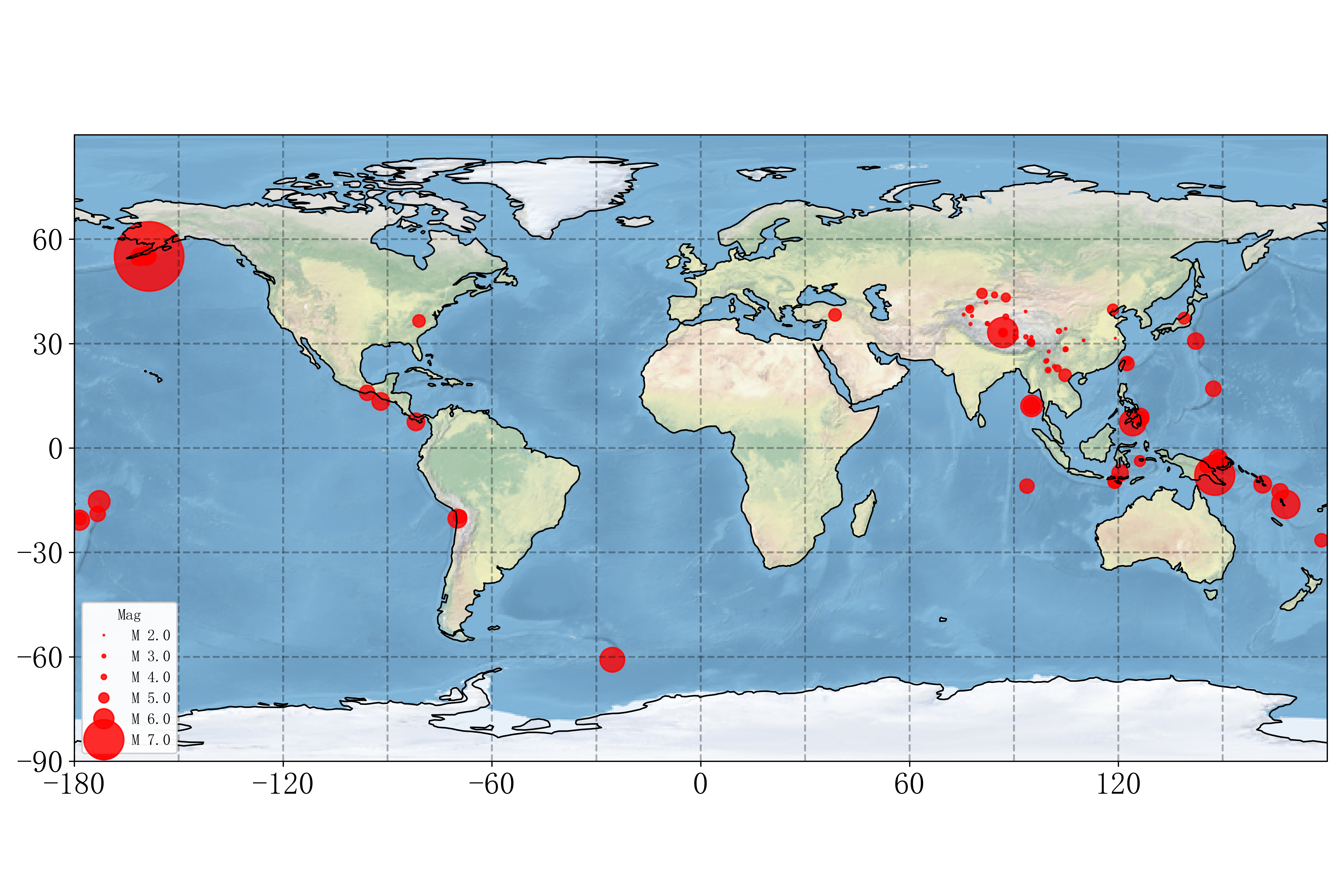
1import cartopy.crs as ccrs
2import matplotlib.pyplot as plt
3from cartopy.mpl.gridliner import LONGITUDE_FORMATTER, LATITUDE_FORMATTER
4import matplotlib.ticker as mticker
5import numpy as np
6import pandas as pd
7import requests
8from bs4 import BeautifulSoup
9
10def get_catalog():
11    url = 'http://news.ceic.ac.cn/index.html'
12    web_data = requests.get(url)
13    web_data.encoding = web_data.apparent_encoding
14    web_data = web_data.text
15    f = open('earthquake.csv', 'w')
16    Date = []
17    Latitude = []
18    Longitude = []
19    Magnitude = []
20    soup = BeautifulSoup(web_data, 'lxml')
21
22    rows = soup.find_all('tr')
23    for i in rows:
24        cols = i.find_all('td')
25        if len(cols) != 0:
26            Magnitude.append(cols[0].text)
27            Date.append(cols[1].text.split()[0])
28            Latitude.append(cols[2].text)
29            Longitude.append(cols[3].text)
30    f.write('Date,Latitude,Longitude,Magnitude\n')
31    for i in range(len(Date)):
32        line = Date[i] + ',' + Latitude[i] + ',' + Longitude[i] + ',' + Magnitude[i]
33        print(Date[i] + ',' + Latitude[i] + ',' + Longitude[i] + ',' + Magnitude[i])
34        f.write(line + '\n')
35    f.close()
36
37def plot_map():
38    plt.figure(figsize=(12, 8))
39    plt.rcParams['font.sans-serif'] = 'FangSong' # 设置中文字体为仿宋
40    plt.rcParams['axes.unicode_minus'] = False  # 正常显示坐标轴上的铀号
41    ax = plt.axes(projection=ccrs.PlateCarree())
42    ax.coastlines()
43    ax.stock_img()  # 将参考底图图像添加到地图,如果没有这条命令,底图是没有背景色的
44    # 画经纬度网格
45    gl = ax.gridlines(crs=ccrs.PlateCarree(), draw_labels=False, linewidth=1.2, color='k', alpha=0.3, linestyle='--')
46    gl.xlabels_top = False  # 关闭顶端的经纬度标签
47    gl.ylabels_right = False  # 关闭右侧的经纬度标签
48    gl.xformatter = LONGITUDE_FORMATTER  # x轴设为经度的格式
49    gl.yformatter = LATITUDE_FORMATTER  # y轴设为纬度的格式
50
51    #设置经纬度网格的间隔
52    gl.xlocator = mticker.FixedLocator(np.arange(-180, 180, 30))
53    gl.ylocator = mticker.FixedLocator(np.arange(-90, 90, 30))
54    # 设置显示范围
55    ax.set_extent([-180, 180, -90, 90],crs=ccrs.PlateCarree())
56    #设置坐标标签
57    ax.set_xticks(list(range(-180,180,60)), crs=ccrs.PlateCarree())
58    ax.set_yticks(list(range(-90,90,30)), crs=ccrs.PlateCarree())
59    plt.xticks(fontsize = 20)
60    plt.yticks(fontsize = 20)
61
62    # 填加大地测量座标系下的线条
63    # ny_lon, ny_lat = -75, 43
64    # delhi_lon, delhi_lat = 77.23, 28.61
65    # plt.plot([ny_lon, delhi_lon], [ny_lat, delhi_lat],
66    #         color='blue', linewidth=2, marker='o',
67    #         transform=ccrs.Geodetic(),
68    #         )
69    # 填加直角座标系下的线条
70    # plt.plot([ny_lon, delhi_lon], [ny_lat, delhi_lat],
71    #           color='red', linestyle='--',
72    #           transform=ccrs.PlateCarree(),
73    #           )
74    # 填加文字
75    # plt.text(ny_lon - 3, ny_lat - 12, '纽约',
76    #           horizontalalignment='right', color = 'red',
77    #           transform=ccrs.Geodetic())
78    # plt.text(delhi_lon + 3, delhi_lat - 12, 'Delhi',
79    #           horizontalalignment='left', color = 'red',
80    #           transform=ccrs.Geodetic())
81
82    # 画震中分布
83    data = pd.read_csv('earthquake.csv')
84    scatter = ax.scatter(data.Longitude, data.Latitude,
85               s= (0.2* 2 ** data.Magnitude)**2,
86               c='red', alpha=0.8,
87               # c=data.depth / data.depth.max(), alpha=0.8,
88               transform=ccrs.PlateCarree())
89    # 填加图例
90    kw = dict(prop="sizes", num=5, color='red', fmt="M {x:.1f}",
91              func=lambda s: np.log2(np.sqrt(s)/0.2))
92    legend2 = ax.legend(*scatter.legend_elements(**kw),
93                        loc="lower left", title="Mag")
94    ax.add_artist(legend2)
95
96    plt.tight_layout()
97    plt.savefig('world.png',dpi = 600)
98    # plt.show()
99
100#################主程序###################
101get_catalog()
102plot_map()