
网页是由不同内容块构成的:标题、段落、链接、列表、图片、视频,等等。
1.定位
定位并不适合总体布局,因为它会把元素拉出页面的正常流。
- 元素的初始定位方式为静态定位(
static),即块级元素垂直堆叠。 - 把元素设置为相对定位(
relative),然后可以相对于其原始位置控制该元素的偏移量,同时又不影响其周围的元素。 - 绝对定位(
absolute)支持精确定位元素,相对于其最近的定位上下文。 - 固定定位(
fixed)的定位上下文为浏览器视口。
1.1 绝对定位
1.1.1 绝对定位的应用场景
绝对定位非常适合创建弹出层、提示和对话框这类覆盖于其他内容之上的组件。
如果没有显式声明元素大小,那么绝对定位元素的大小由自身包含内容的多少来决定。如果相对于定位上下文的各个边声明偏移量,那么元素会被拉伸以满足设定的规则。
1<header class="photo-header">
2    <img src="images/big_spaceship.jpg" alt="An artist’s mockup of the ”Dragon” spaceship">
3    <div class="photo-header-plate">
4        <h1>SpaceX unveil the Crew Dragon</h1>
5        <p>Photo from SpaceX on <a href="https://www.flickr.com/photos/spacexphotos/16787988882/">Flickr</a></p>
6    </div>
7</header>
8
9
10.photo-header {
11    position: relative;
12}
13
14.photo-header-plate {
15    position: absolute;
16    right: 4em;
17    bottom: 4em;
18    left: 4em;
19    /* 省略 */
20}
1.1.2 定位与z-index
z-index是堆叠元素的次序。 静态定位(static)以外的元素会根据它们在代码树中的深度依次叠放。就像打扑克发牌一样,后发的牌会压在先发的牌上面。它们的次序可以通过z-index来调整。 设置了z-index的元素,只要值是正值,就会出现在没有设置z-index的元素上方。尚未设置z-index的元素在z-index值为负的元素上方。 **堆叠上下文:**所有z-index不是auto的定位元素都会在这个上下文中排序。 堆叠上下文是由特定属性和值创建的。 在一个堆叠上下文内部,无论z-index值多大或多小,都不会影响其他堆叠上下文。 设置小于1的opacity值也可以触发新的堆叠上下文。
2.水平布局
通常,页面会随内容增加沿垂直方向扩展。后来添加的任何块容器(div、article、h1~h6,等等)都会垂直堆放起来,因为块级元素的宽度是自动计算的。
2.1 使用浮动
很多CSS布局会用到的一种基本技术:让浮动的元素构成一行中的列。
1figure {
2  float: right;
3  max-width: 50%;
4}
因为浏览器对浮动的支持极为普遍,所以浮动也成为了各种水平布局中的常用技术。
2.2 行内块布局
1<p class="author-meta">
2  <!-- image from Jeremy Keith on Flickr: https://flic.kr/p/dwFRgH -->
3  <img class="author-image" src="images/author.jpg" alt="Arthur C. Lark">
4  <span class="author-info">
5	<span class="author-name">Written by Arthur C. Lark</span>
6	<a class="author-email" href="mailto:arthur.c.lark@example.com">arthur.c.lark@example.com</a>
7  </span>
8</p>
9
10
11.author-image,
12.author-info {
13  display: inline-block;
14  /* 将这个行内块的垂直中心点与这行文本x高度的中心点对齐。 */
15  vertical-align: middle;
16}
17.author-name,
18.author-email {
19  display: block;
20}
对于每个块都占据确切宽度的水平布局而言,空白是一个突出的问题。
1.navbar ul {
2  /* 省略 */
3  list-style: none;
4  padding: 0;
5  font-size:0;
6}
7
8.navbar li {
9  text-transform: uppercase;
10  display: inline-block;
11  text-align: center;
12  width: 25%;
13  /* 使用box-sizing: border-box 确保每一项的边框及内边距都包含在各自25%的宽度以内。 */
14  box-sizing: border-box;
15  font-size:1rem;
16}
17
18.navbar li a {
19  display: block;
20  text-decoration: none;
21  line-height: 1.75em;
22  padding: 1em;
23}
<font color="red">HTML源代码中的换行符被渲染成了空白符。</font> <font color="red">把包含元素的font-size设置为0,从而让每个空格的宽度为0。</font>
使用表格显示属性实现布局:
1.navbar ul {
2  display: table;
3  table-layout: fixed;
4  width: 100%;
5  height: 100px; /* 结合vertical-align: middle使用以实现垂直对齐 */
6}
7.navbar li {
8  display: table-cell;
9  width: 25%;
10  vertical-align: middle; /* 垂直对齐 */
11}
表格行中每一列的宽度有两种算法。
- 默认情况下,浏览器会使用"自动"算法。根据自身单元格内容所需的宽度来决定整个表格的宽度。
- "固定"表格布局(
table-layout:fixed)。列宽由表格第一行的列决定。
3.Flexbox
Flexbox是CSS提供的用于布局的一套新属性。这套属性包含针对容器(弹性容器,flex container)和针对对其直接子元素(弹性项,flex item)的两类属性。 Flexbox已经得到主流浏览器新版本的广泛支持。
3.1 理解Flex方向:主轴与辅轴
Flexbox可以针对页面中某一区域,控制其中元素的顺序、大小、分布及对齐。这个区域的盒子默认沿水平方向排列(这个排列方向称为主轴)。 与主轴垂直的方向称为辅轴。 Flexbox布局中最重要的尺寸是主轴方向的尺寸(主尺寸):水平布局时的宽度或垂直布局时的高度。
1.navbar ul {
2    display: flex; /* 默认flex-direction: row */
3}

导航条的链接项水平排列,而且根据各自的内容进行了收缩适应。 所有链接项集中在左侧,是从左到右书写的语言环境下的默认行为。我们可以使用flex-direction设置为row-reverse,那么所有链接项就会集中到右侧。 如果不指定大小,Flex容器内的项目会自动收缩。也就是说,一行中的各项会收缩到各自的最小宽度。 对Flex的子项指定值为auto外边距:
1.navbar li:first-child {
2    margin-right: auto;
3}

3.2 对齐与空间
Flexbox对子项的排列有多种方式。沿主轴的排列叫排布(justification),沿辅轴的排列则叫对齐(alignment)。 用于指定排布方式的属性是justify-content,其默认值是flex-start,表示按照当前文本方向排布(向左对齐)。 Flexbox不允许指定个别项的排布方式。
1.navbar ul {
2    justify-content: flex-end; /* 向右对齐 */
3}
默认情况下,Flex子项会沿辅轴方向填满Flex容器。 控制辅轴对齐的属性align-items,其默认值是stretch(拉伸)。也就是说,子项默认拉伸,以填满可用空间。
1.navbar ul {
2    align-items: flex-start;
3    min-height: 100px;
4}

我们还可以使用align-items: baseline将子项中文本的基线与容器基线对齐。
除了同时对齐所有项,还可以在辅轴上指定个别项的对齐方式。
1.navbar ul {
2    align-items: flex-end;
3    min-height: 100px;
4}
5.navbar li:first-child {
6    align-self: flex-start; /* 指定个别项的对齐方式 */
7    margin-right: auto;
8}

Flex中的垂直对齐:
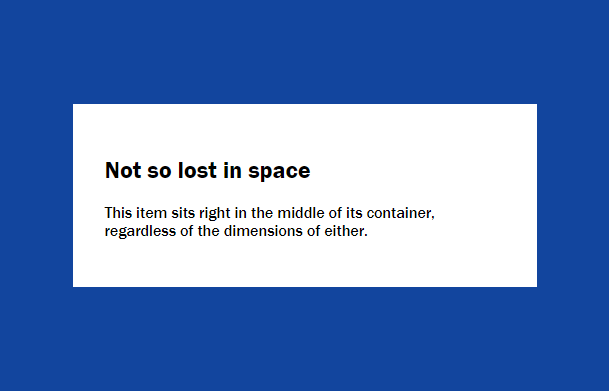
1<div class="flex-container">
2    <div class="flex-item">
3        <h2>Not so lost in space</h2>
4        <p>This item sits right in the middle of its container, regardless of the dimensions of either.</p>
5    </div>
6</div>
7
8
9.flex-container {
10    height: 100%;
11    display: flex; /* 将容器设置为flex。 */
12    background-color: #12459e;
13}
14.flex-item {
15    max-width: 25em;
16    padding: 2em;
17    margin: auto; /* 容器中的各项的自动外边距会扩展相应方向的空间。 */
18    background-color: #fff;
19}
Flex容器中有多个元素的垂直对齐:
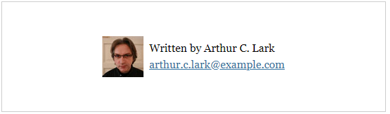
1<p class="author-meta">
2    <img class="author-image" src="images/author.jpg" alt="Arthur C. Lark">
3    <span class="author-info">
4        <span class="author-name">Written by Arthur C. Lark</span>
5        <a class="author-email" href="mailto:arthur.c.lark@example.com">arthur.c.lark@example.com</a>
6    </span>
7</p>
8
9
10.author-meta {
11    display: flex;
12    align-items: center; /* 垂直对齐 */
13    justify-content: center; /* 水平排布 */
14}
15.author-name,
16.author-email {
17    display: block;
18}
3.3 可伸缩的尺寸
Flexbox支持对元素大小的灵活控制。这一点既是实现精确内容布局的关键,也是迄今为止Flexbox中最复杂的环节。 Flex的意思是“可伸缩”,体现在3个属性中:
flex-basis(控制主轴方向上的“首选”大小,默认值为auto。)flex-grow(弹性系数 ,默认为0。)flex-shrink(弹性系数,默认为1。)
使用flex简写属性一次性设置flex-grow、flex-shrink和flex-basis属性,值以空格分隔:
1.navbar li {
2    flex: 1 0 0%; /* flex: flex-grow  flex-shrink  flex-basis */
3}
flex-grow: 1 中的1表示占整体的“几份”。 简写法中的flex-basis必须带单位,因此这里要么加百分号,要么就写成0px。 把flex-basis的值设置为0,那在这一步就不会给项目分配空间了。这种情况下,容器内部的全部空间都会留到第二步再分配(这里第二步使用flex-grow: 1 来确定具体项目的尺寸)。 当项目宽度总和超过容器宽度时,Flexbox会按照flex-shrink属性来决定如何收缩它们: 每个项目先用自己的flex-shrink乘以自己的flex-basis,然后再用乘积除以每一项的flex-shrink与flex-basis的乘积之和,最后再拿得到的比例系数去乘以超出的宽度,从而得到该项目要收缩的空间数量。 推荐阅读:flex - CSS(层叠样式表) | MDN
3.4 Flexbox布局
Flexbox支持让内容排布到多行或多列。
1<ul class="tags">
2    <li><a href="https://my.oschina.net/Binary_planet">Binary planet</a></li>
3    <li><a href="https://my.oschina.net/Carbon_planet">Carbon planet</a></li>
4    <--! 还有更多··· -->
5</ul>
6
7
8.tags {
9    display: flex;
10    flex-wrap: wrap; /* 允许折行 */
11    margin: 0;
12    padding: 1em;
13    list-style: none;
14}
15.tags li {
16    display: inline-block; /* 行内块 */
17    margin: .5em;
18}

相关阅读:行内元素和块元素以及行内块元素的特点
折行与方向:
1.tags {
2    /* 省略 */
3    flex-direction: row-reverse; /* 从右向左排布 */
4}

1.tags {
2    /* 省略 */
3    flex-direction: row-reverse; /* 从右向左排布 */
4    flex-wrap: wrap-reverse; /* 向上折行 */
5}

多行布局中可伸缩的大小:
1.tags li {
2    flex: 1 0 auto;
3}
稍微缩小一点浏览器窗口,就会导致最后一个标签折行。 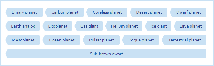
使用max-width限制可伸缩的范围。
1.tags li {
2    flex: 1 0 auto;
3    max-width: 14em;
4}

在多行布局中,我们可以相对于容器来对齐行或列。
1.tags {
2    display: flex;
3    flex-wrap: wrap;
4    align-content: stretch; /* 默认值 */
5    min-height: 300px;
6}
align-content: stretch 表示每一行都会拉伸以填充自己应占的容器高度。
3.5 列布局与个别排序
Flexbox的order属性:默认情况下,每个项目的order值都为0,意味着按照它们在源代码中的顺序出现。
1<div class="article-teaser">
2    <h2>The Dragon and other spaceships</h2>
3    <div class="article-teaser-text">
4        <p>There are actual spaceships, flying in space right now, probably. For example, there’s the International
5        Space Station, which is a spaceship of sorts. Well, actually it’s a space station, which is even cooler!</p>
6    </div>
7    <img src="images/medium_spaceship.jpg" alt="The Dragon spaceship in orbit around Earth.">
8    <p class="article-teaser-more">
9        <a href="https://my.oschina.net/spaceships">Read the whole Spaceship article</a>
10    </p>
11</div>
12
13
14.article-teaser {
15    display: flex;
16    flex-direction: column;
17}
18.article-teaser img {
19    order: -1; /* order的值比较小的元素先出现。 */
20}
order的值不一定要连续,而且正、负值都可以。只要是可以比较大小的数值,相应的项就会调整次序。
3.6 嵌套的Flexbox布局
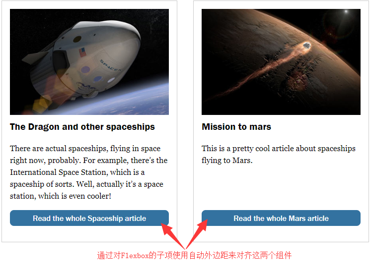
1<div class="article-teaser-group">
2	<div class="article-teaser">
3		<h2>The Dragon and other spaceships</h2>
4		<div class="article-teaser-text">
5			<p>There are actual spaceships,
6			flying in space right now, probably. For example, there’s the International Space Station, which is
7			a spaceship of sorts. Well, actually it’s a space station, which is even cooler!</p>
8		</div>
9		<img src="images/medium_spaceship.jpg" alt="The Dragon spaceship in orbit around Earth.">
10		<p class="article-teaser-more">
11			<a href="https://my.oschina.net/spaceships">Read the whole Spaceship article</a>
12		</p>
13	</div>
14	<div class="article-teaser">
15		<!-- 省略 -->
16	</div>
17</div>
18
19
20.article-teaser-group {
21  display: flex;
22}
23
24.article-teaser {
25  display: flex;
26  flex-direction: column;
27  /* 省略 */
28}
29.article-teaser-more {
30  margin-top: auto;
31}
Flexbox的bug与提示:
- 图片、视频,以及其他带有固定宽高比的对象,在作为可伸缩项时可能会有问题。解决方案是给这些对象加个包装元素,让包装元素作为可伸缩项。
- Flex的可伸缩项具有所谓的“隐性最小宽度”。
参考资料: