
绘制散点图(scatterplots)使用geom_point()函数,气泡图(bubblechart)也是一个散点图,只不过点的大小由一个变量(size)来控制。散点图潜在的最大问题是过度绘图:当一个位置或相邻的位置上出现有多个点,就可能把点绘制在彼此之上, 这会严重扭曲散点图的视觉外观,你可以通过使点变得透明(geom_point(alpha = 0.05))或者设置点的形状(geom_point(shape = "."))来帮助解决该问题。
1geom_point(mapping = NULL, data = NULL, stat = "identity",
2  position = "identity", ..., na.rm = FALSE, show.legend = NA,
3  inherit.aes = TRUE)
参数注释:
- stat:统计转换(statistical transformation),默认值是identity,表明变量的值是就是统计的值;而统计函数count 需要对变量的值进行计数,统计值是计数的结果。
- position:位置调整(Position adjustment),默认值是identity,不调整
- mapping:映射参数
点的位置调整(Position adjustment)有多种方式:
- identity:不调整
- dodge:垂直方向不调整,只调整水平位置
- nudge:在一定的范围内调整水平和垂直位置
- jitter:抖动,当具有离散位置和相对较少的点数时,抖动很有用
- jitterdodge:同时jitter和 dodge
- stack:堆叠,
- fill:填充,用于条形图
每个位置调整都对应一个函数position_xxx()。
使用aes()函数来设置映射参数,geom_point()函数可以使用的映射有:
- x
- y
- alpha:设置点重叠部分的透明度
- colour:点的颜色
- fill:点的填充色
- group:分组
- shape:点形状
- size:点的大小
- stroke:描边
这些参数用于修改散点图的图形属性。
一,绘制基本的点图
使用mtcars数据集来绘制散点图,并根据cyl字段来设置每个点的颜色:
1library(ggplo2)
2
3ggplot(mtcars, aes(wt, mpg))+
4  geom_point(aes(colour = factor(cyl)))
二,绘制气泡图
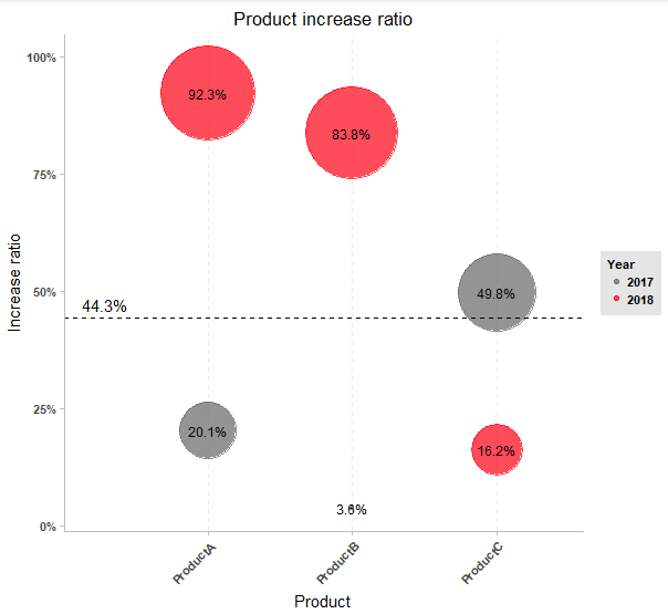
使用geom_point(),绘制气泡图,并添加水平线:
1library(ggplot2)
2
3#win.graph(width=5, height=4,pointsize=8)
4
5df <- data.frame(year=rep(c(2017,2018),3),
6                 product=rep(c('ProductA','ProductB','ProductC'),2),
7                 ratio=runif(6, min = 0, max = 1))
8
9df <- df[order(df$year),]df <- within(df,{bubblesize<- sqrt(df$ratio*10/pi)})
10df$product <- factor(df$product,levels=unique(df$product),ordered=TRUE)
11ratio.mean <- mean(df$ratio)
12y.min <- min(df$ratio)
13
14mytheme <- theme_minimal()+
15  theme(
16    panel.grid.major.y=element_blank(),
17    panel.grid.minor.y=element_blank(),
18    axis.text.x = element_text(angle = 45, hjust = 1),
19    plot.title=element_text(hjust =0.5),
20    axis.line.y=element_line(linetype=1,color='grey'),
21    axis.line.x=element_line(linetype=1,color='grey'),
22    axis.ticks = element_line(linetype=2,color='grey'),
23    panel.grid=element_line(linetype=2,color='grey'),
24    legend.background = element_rect(fill="gray90", size=0,color='white'),
25    legend.text=element_text(face="bold",size=8),
26    legend.title=element_text(face="bold",size=8),
27    axis.text=element_text(face="bold",size=8)
28  )
29
30ggplot(data=df, mapping=aes(x=product,y=ratio,color=factor(year)))+
31  geom_point(stat= "identity",aes(size=bubblesize),alpha=0.7,show.legend = TRUE)+
32  guides(color=guide_legend(title="Year"))+
33  scale_size(range = c(1, 30),guide=FALSE)+
34  scale_color_manual(values=c("#666666","#FF0016"))+
35  scale_y_continuous(labels = scales::percent,limits=c(y.min,1))+
36  labs(x='Product',y='Increase ratio',title='Product increase ratio')+
37  geom_text(aes(y=ratio,label=scales::percent(ratio),hjust=0.5), size=3,color="black",position = position_dodge(width=0.00),check_overlap = FALSE) +
38  mytheme+
39  geom_hline(yintercept = ratio.mean,linetype='dashed')+
40  annotate(geom='text',x=0,y=ratio.mean,label=scales::percent(ratio.mean),hjust=-0.4,vjust=-0.5);
其中,scale_size()图层用于指定bubble的大小,annotate()函数用于为水平线添加文本说明:
参考文档: