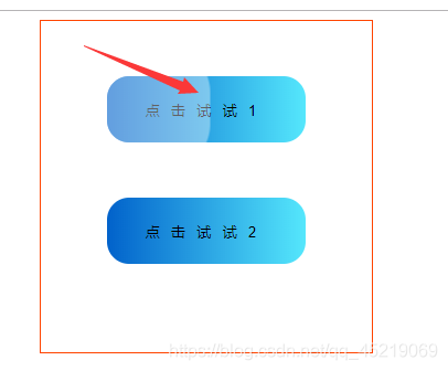
有时候我们为了增加用户体验,可能会有一些点击样式 类似框架中的haver-class 这里简单用 js+css 实现一个点击效果(类似水波纹)
大体思路 1.获取点击时 鼠标坐标(相对于父元素) 2.在当前点 创建 节点(设置对应的样式) 3.设置定时器,移除节点--Ok
1js + dom
2
3<div class="box">
4        <button>点击试试1</button>
5        <button>点击试试2</button>
6    </div>
7    <script>
8        const btn = document.querySelectorAll('button')
9        btn.forEach((item)=>{
10            item.addEventListener('click',function(e){
11                // clientX-距离浏览器左边界  e.target.offsetLeft--目标容器左边界
12               let x = e.clientX - e.target.offsetLeft
13               let y = e.clientY - e.target.offsetTop
14                // 创建 span
15               let ripples = document.createElement('span')
16                // 设置 span位置
17               ripples.style.left = x + 'px'
18               ripples.style.top = y + 'px'
19                // 添加节点
20               this.appendChild(ripples)
21                // 移除
22               setTimeout(() => {
23                ripples.remove()
24               }, 2000);
25            },false)
26        })
27    </script>
1部分css
2.box{
3            margin-top: 50px;
4            width: 300px;
5            height: 300px;
6            margin: 0 auto;
7            border: 1px solid #f40;
8            text-align: center;
9            line-height: 100px;
10        }
11        button{
12                width: 180px;
13                height: 60px;
14                text-align:center;
15                border-radius: 20px;
16                background: linear-gradient(90deg,#0162cb,#55e7fc);
17                letter-spacing: 10px;
18                display: block;
19                border: none;
20                margin: 50px auto;
21                position: relative;
22                overflow: hidden;
23                outline: none;
24            }
25        span{
26            position: absolute;
27            background: #ffffff;
28            /* border-radius: 50%; */
29            transform: translate(-50%,-50%);
30            pointer-events: none;
31            animation: animate 2s linear infinite;
32
33        }
34        @keyframes animate {
35            0%{
36                width: 0px;
37                height: 0px;
38                opacity: .5;
39                border-radius: 50%;
40            }
41            100%{
42                width: 500px;
43                height: 500px;
44                opacity: 0;
45            }
46        }
效果图