
使用Plotly绘制基本的柱状图,需要用到的函数是graph_objs 中 Bar函数
通过参数,可以设置柱状图的样式。
通过barmod进行设置可以绘制出不同类型的柱状图出来。
我们先来实现一个简单的柱状图:
1# -*- coding: utf-8 -*-
2import plotly as py
3import plotly.graph_objs as go
4pyplt = py.offline.plot
5# Trace
6trace_basic = [go.Bar(
7            x = ['Variable_1', 'Variable_2', 'Variable_3','Variable_4','Variable_5'],
8            y = [1, 2, 3, 2, 4],
9    )]
10# Layout
11layout_basic = go.Layout(
12            title = 'The Graph Title',
13            xaxis = go.XAxis(range = [-0.5,4.5], domain = [0,1])
14    )
15# Figure
16figure_basic = go.Figure(data = trace_basic, layout = layout_basic)
17# Plot
18pyplt(figure_basic, filename='tmp/1.html')
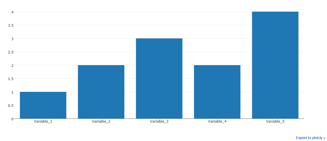
上面这个例子,就是一个简单的柱状图。
下面我们讲下另外一种图,柱状簇
实现过程则是,在基本的柱状图中,加入多租数据即可实现,柱状簇
1import plotly as py
2import plotly.graph_objs as go
3pyplt = py.offline.plot
4# Traces
5trace_1 = go.Bar(
6            x = ["西南石油", "东方明珠", "海泰发展"],
7            y = [4.12, 5.32, 0.60],
8            name = "201609"
9    )
10trace_2 = go.Bar(
11            x = ["西南石油", "东方明珠", "海泰发展"],
12            y = [3.65, 6.14, 0.58],
13            name = "201612"
14    )
15
16trace_3 = go.Bar(
17            x = ["西南石油", "东方明珠", "海泰发展"],
18            y = [2.15, 1.35, 0.19],
19            name = "201703"
20    )
21trace = [trace_1, trace_2, trace_3]
22# Layout
23layout = go.Layout(
24            title = '净资产收益率对比图'
25    )
26# Figure
27figure = go.Figure(data = trace, layout = layout)
28# Plot
29pyplt(figure, filename='tmp/2.html')
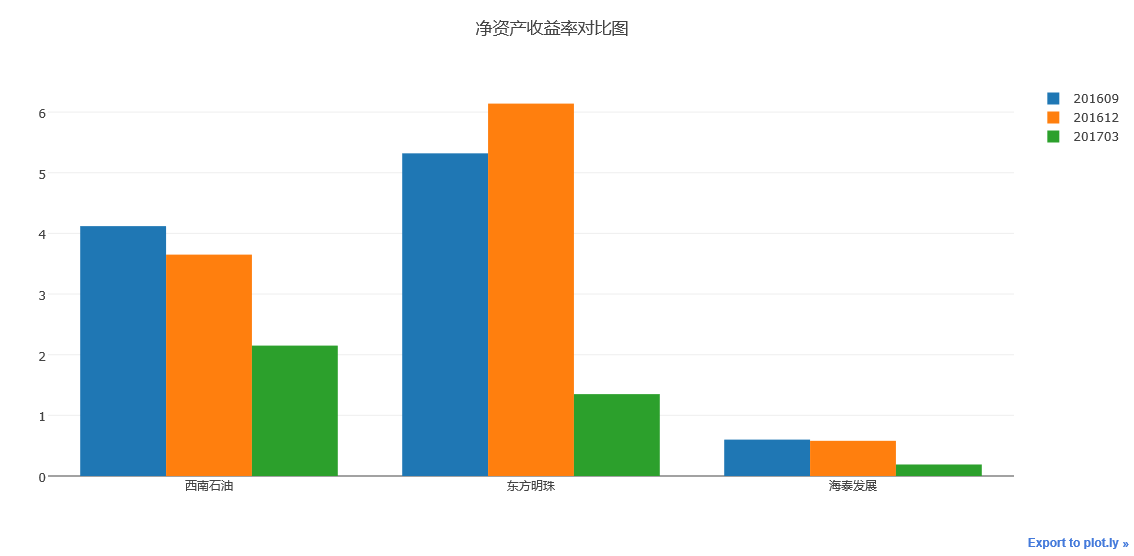
执行上述代码,我们可以看到如上图所示柱状簇图例
可将数据堆叠生成。
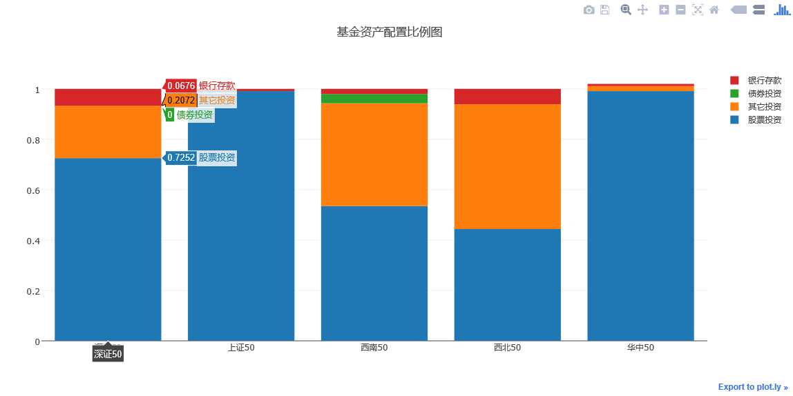
接下来在讲讲如何绘制层叠柱状图
层叠柱状图的绘制方法与柱状簇的绘制方法基本差不多
也就是对同一个柱状簇进行叠加,实现方法是对Layout中的barmode属性进行设置
barmode = 'stack'
其余参数,与柱状簇相同。
1# -*- coding: utf-8 -*-
2import plotly as py
3import plotly.graph_objs as go
4pyplt = py.offline.plot
5
6# Stacked Bar Chart
7trace_1 = go.Bar(
8    x = ['深证50', '上证50', '西南50', '西北50','华中50'],
9    y = [0.7252, 0.9912, 0.5347, 0.4436, 0.9911],
10    name = '股票投资'
11)
12
13trace_2 = go.Bar(
14    x = ['深证50', '上证50', '西南50', '西北50','华中50'],
15    y = [0.2072, 0, 0.4081, 0.4955, 0.02],
16    name='其它投资'
17)
18
19trace_3 = go.Bar(
20    x = ['深证50', '上证50', '西南50', '西北50','华中50'],
21    y = [0, 0, 0.037, 0, 0],
22    name='债券投资'
23)
24
25trace_4 = go.Bar(
26    x = ['深证50', '上证50', '西南50', '西北50','华中50'],
27    y = [0.0676, 0.0087, 0.0202, 0.0609, 0.0087],
28    name='银行存款'
29)
30
31trace = [trace_1, trace_2, trace_3, trace_4]
32layout = go.Layout(
33    title = '基金资产配置比例图',
34    barmode='stack'
35)
36
37fig = go.Figure(data = trace, layout = layout)
38pyplt(fig, filename='tmp/1.html')
瀑布式柱状图
瀑布式柱状图是层叠柱状图的另外一种表现
可以选择性地显示层叠部分来实现柱状图的悬浮效果。
1# -*- coding: utf-8 -*-
2import plotly as py
3import plotly.graph_objs as go
4pyplt = py.offline.plot
5
6x_data = ['资产1', '资产2',
7          '资产3','资产4', '总资产']
8y_data = [56000000, 65000000, 65000000, 81000000, 81000000]
9text = ['666,999,888万元', '8,899,666万元', '88,899,666万元', '16,167,657万元', '888,888,888万元']
10
11# Base
12trace0 = go.Bar(
13    x=x_data,
14    y=[0, 57999848, 0, 66899764, 0],
15    marker=dict(
16        color='rgba(1,1,1, 0.0)',
17    )
18)
19# Trace
20trace1 = go.Bar(
21    x=x_data,
22    y=[57999848, 8899916, 66899764,16167657, 83067421],
23    marker=dict(
24        color='rgba(55, 128, 191, 0.7)',
25        line=dict(
26            color='rgba(55, 128, 191, 1.0)',
27            width=2,
28        )
29    )
30)
31
32data = [trace0, trace1]
33layout = go.Layout(
34    title = '测试图例',
35    barmode='stack',
36    showlegend=False
37)
38
39annotations = []
40
41for i in range(0, 5):
42    annotations.append(dict(x=x_data[i], y=y_data[i], text=text[i],
43                                  font=dict(family='Arial', size=14,
44                                  color='rgba(245, 246, 249, 1)'),
45                                  showarrow=False,))
46    layout['annotations'] = annotations
47
48fig = go.Figure(data=data, layout=layout)
49pyplt(fig, filename = 'tmp/1.html')
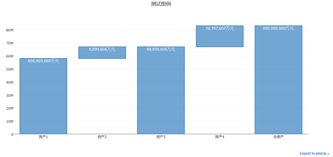
运行上述代码,可以得到如上图所示的瀑布式柱状图。
下面我们说说,图形样式的设置。
对于柱状图颜色与样式的设置可以通过设置下面这个案例来说明。
1import plotly as py
2import plotly.graph_objs as go
3pyplt = py.offline.plot
4
5# Customizing Individual Bar Colors
6volume = [0.49,0.71,1.43,1.4,0.93]
7width = [each*3/sum(volume) for each in volume]
8trace0 = go.Bar(
9    x = ['AU.SHF', 'AG.SHF', 'SN.SHF',
10       'PB.SHF', 'CU.SHF'],
11    y = [0.85, 0.13, -0.93, 0.46, 0.06],
12    width = width,
13    marker = dict(
14        color=['rgb(205,38,38)', 'rgb(205,38,38)',
15               'rgb(34,139,34)', 'rgb(205,38,38)',
16               'rgb(205,38,38)'],
17        line=dict(
18            color='rgb(0,0,0)',
19            width=1.5,
20        )),
21        opacity = 0.8,
22)
23
24data = [trace0]
25layout = go.Layout(
26    title = '有色金属板块主力合约日内最高涨幅与波动率图',
27    xaxis=dict(tickangle=-45),
28)
29
30fig = go.Figure(data=data, layout=layout)
31pyplt(fig, filename='tmp/4.html')
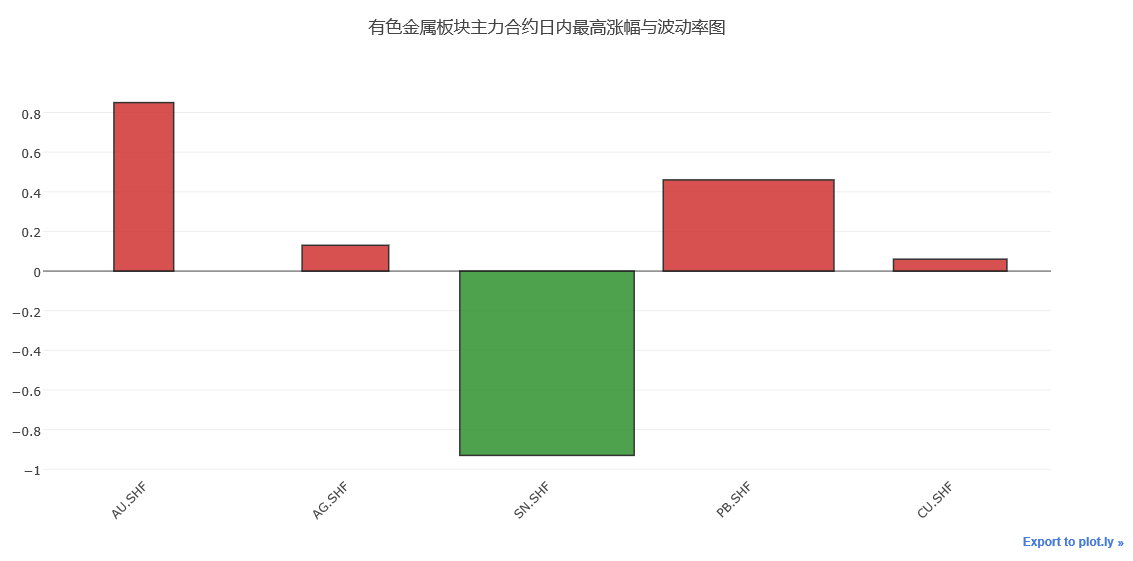
运行上述代码,可以看到上图所示图例
柱状图展示了5种金属,在某个交易日的最高涨幅与波动率情况,柱形图宽度表示相对波动率的高低
柱形图越宽,波动率越大,高度表示涨幅,红色表示上涨,绿色表示下跌。
用line设置柱状图外部线框,用width设置柱状图的宽度,用opacity设置柱状图颜色的透明度情况。
基本的柱状图情况,就讲到这里。